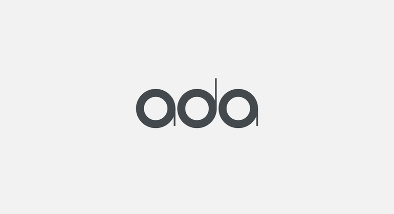
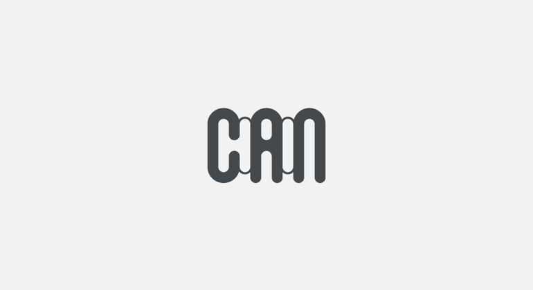
The following case study shows a variety of brandmarks – symbols, logotypes, wordmarks, and icons – that have been created over the last 20+ years. There are marks that are out in the wild, pitched ideas, forgotten sketches, and ones that got away.
A logo can be considered as a signature of the brand's personality – much like any human personality – attitude, style, and tone of voice may change but a signature often remains unchanged. This is true for a brand, while other identity elements evolve as the brand adapts to changes in the market often the brandmark is the one constant.
Although a logo is a relatively small aspect of a brand's overall identity, it’s unarguably an integral one and one that is often the most memorable for consumers and therefore the brand element with the greatest perceived equity. Often the most successful brandmarks are simple and so memorable, ownable within their market, exude the energy and attitude of the brand, and are always fit for purpose.
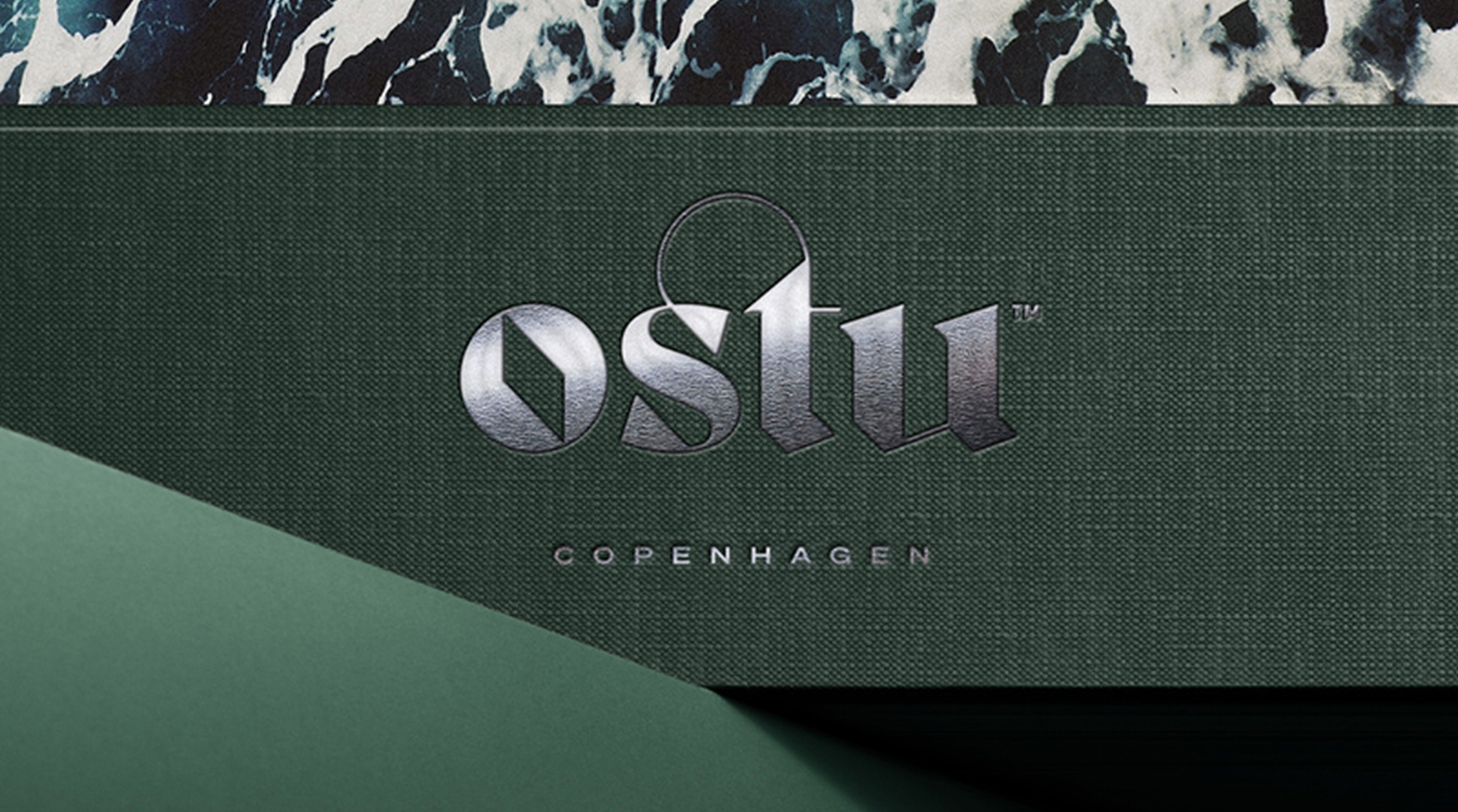
Various Clients Design & Concept, 2000-23
A logo can be considered as a signature of the brand's personality – much like any human personality – attitude, style, and tone of voice may change but a signature often remains unchanged. This is true for a brand, while other identity elements evolve as the brand adapts to changes in the market often the brandmark is the one constant.
Although a logo is a relatively small aspect of a brand's overall identity, it’s unarguably an integral one and one that is often the most memorable for consumers and therefore the brand element with the greatest perceived equity. Often the most successful brandmarks are simple and so memorable, ownable within their market, exude the energy and attitude of the brand, and are always fit for purpose.


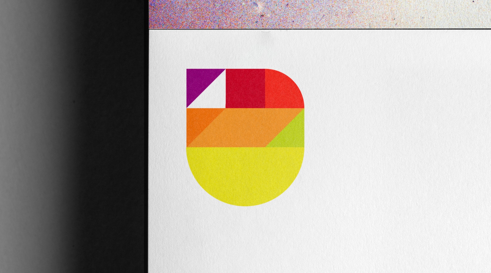
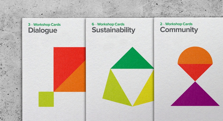
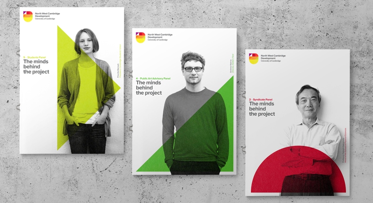
Some marks not only act as a signature that encapsulates an idea, they also help to inform the visual language and design system, helping to build a robust and cohesive brand identity.


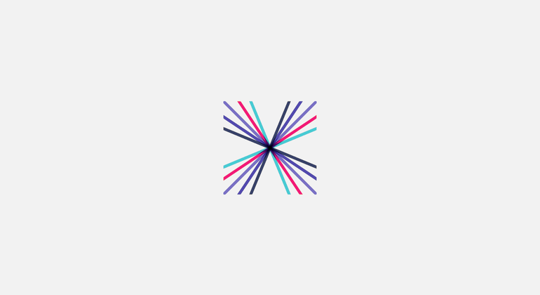


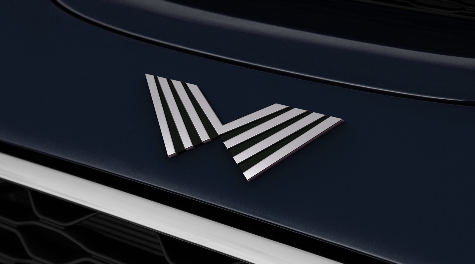
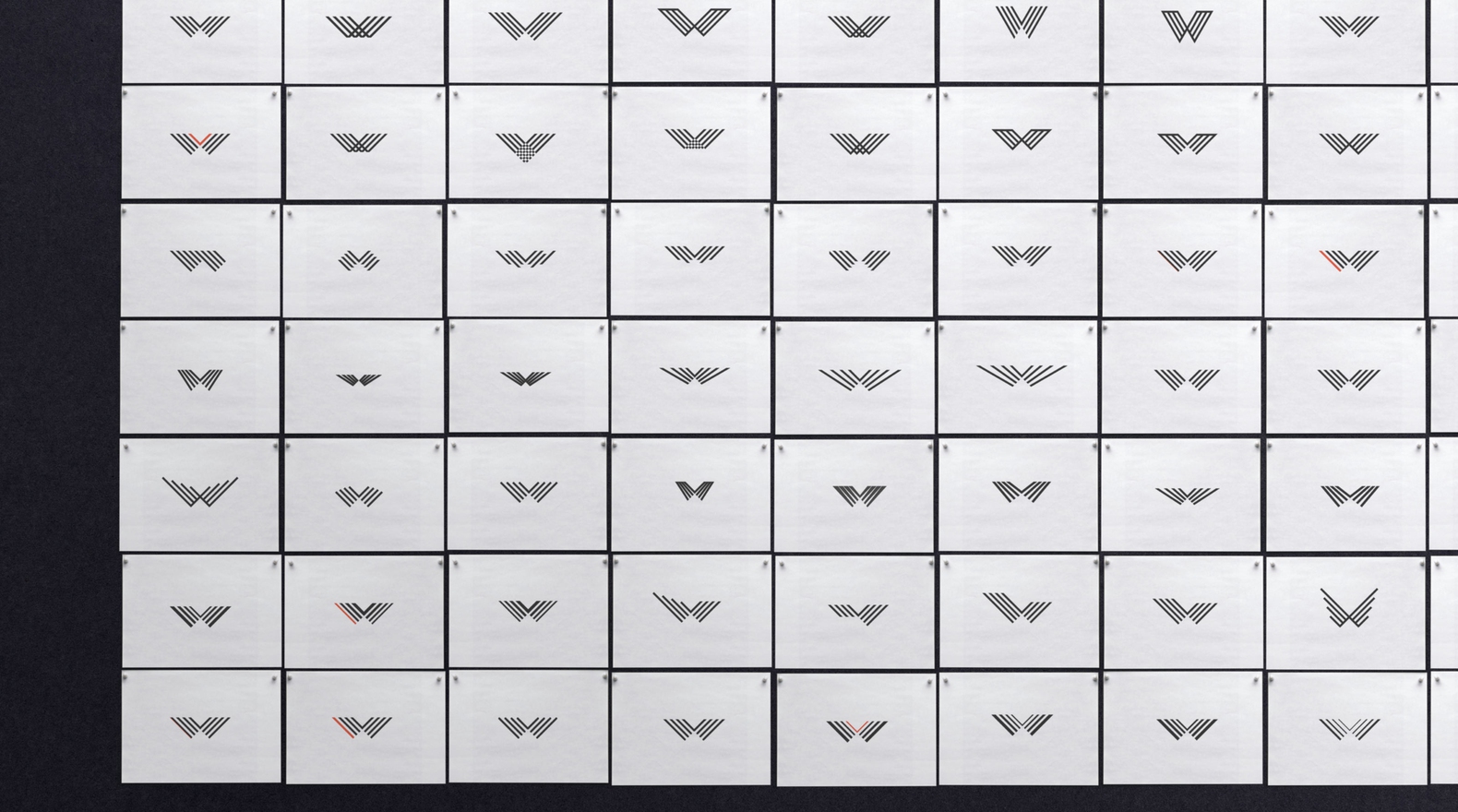
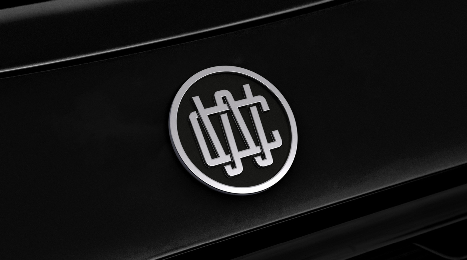
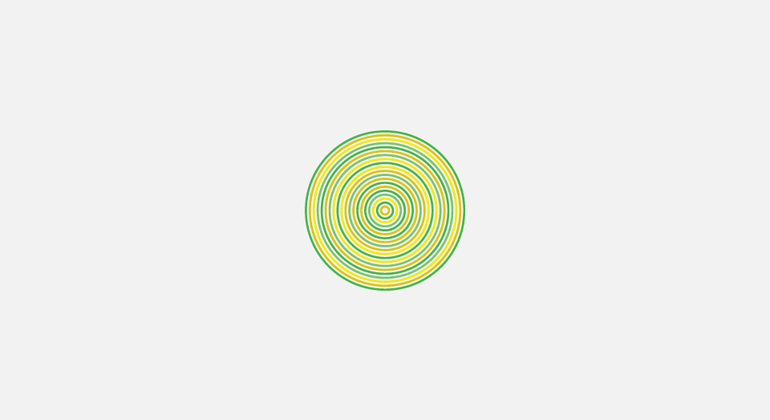
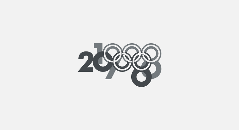
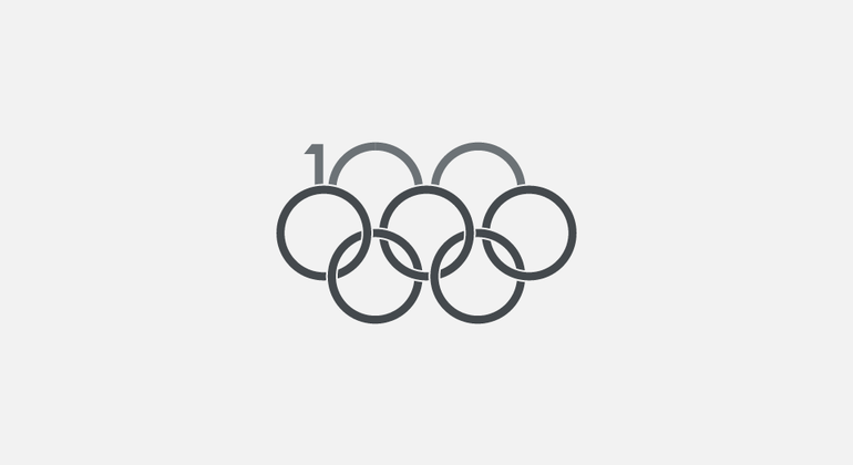
Above, an example of tight iterative exploration based around just one graphic execution, together with the final result. Created for an exclusive in-house tuning, development, and international automotive racing division for well a known British car manufacturer.


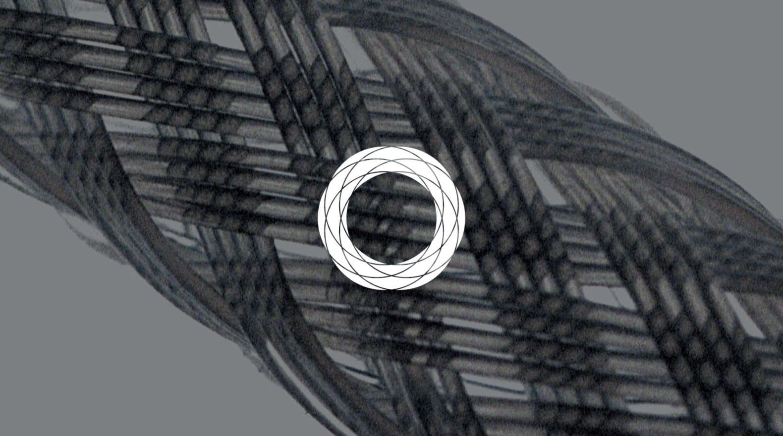

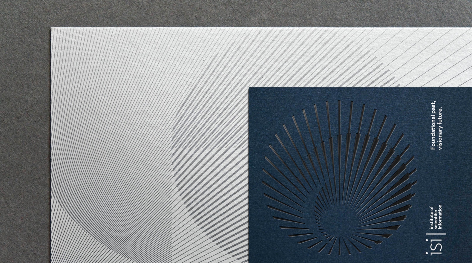

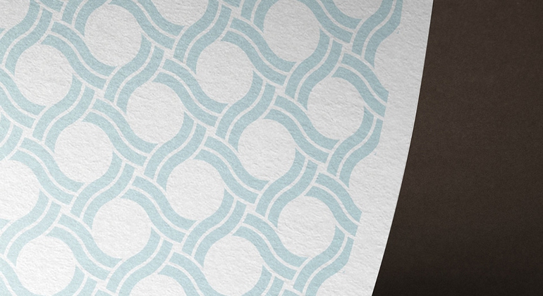

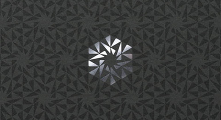
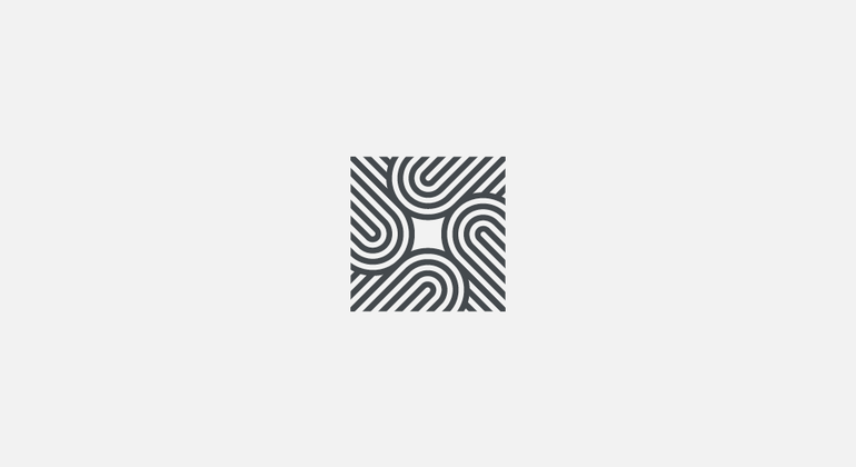
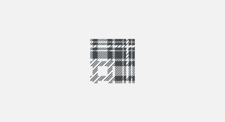
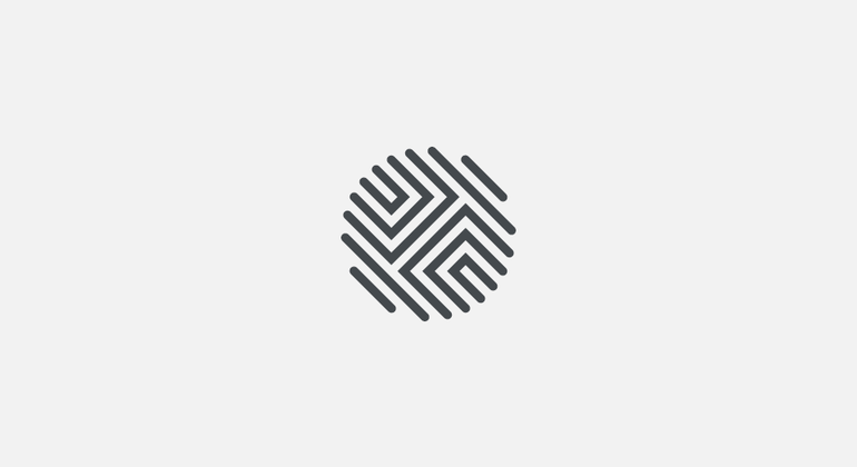
Pattern creation inspired by the graphic language of brandmarks.


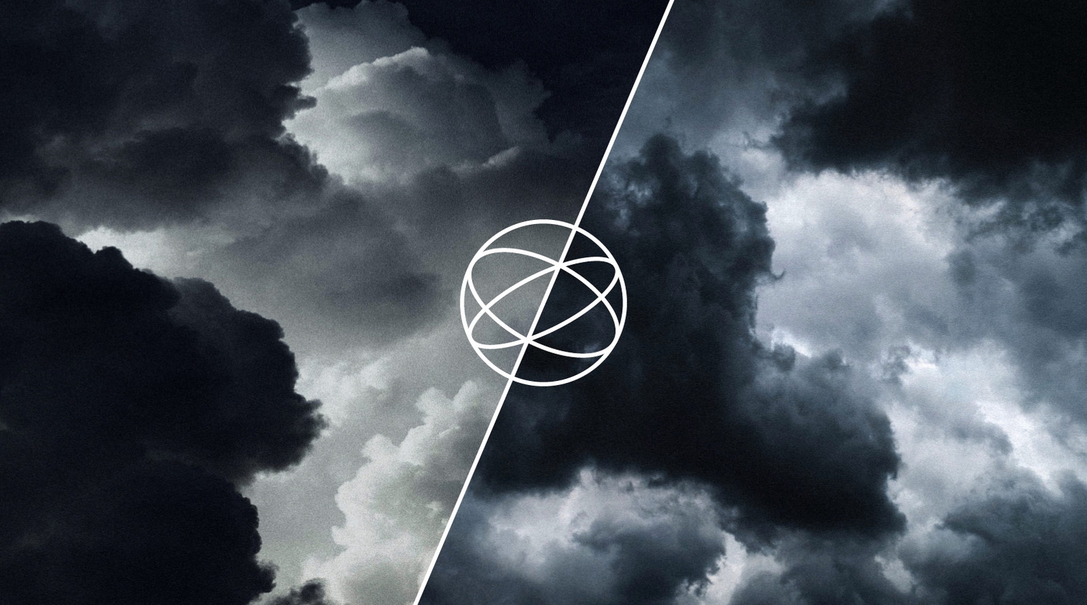
Defining the way a brandmark animates – moves, reacts, lives and breathes – is an essential aspect of any identity in our digital, motion-driven, and interactive world.