Simon is a London-based designer with over 25 years of experience specialising in brand identity and art direction. His work combines a modernist sensibility with strategic thinking shaped at leading studios and agencies, centred on clear, intelligent ideas executed with precision.
Intentionally hands-on, Simon works fluidly across different contexts. For design and branding agencies, he is a senior, dependable presence – comfortable taking direction, integrating quickly into established teams, and strengthening creative output at a high level.
For private clients, Simon operates as a self-sufficient Creative Director, leading projects end to end. He defines strategy, develops concepts, and builds and directs bespoke teams to deliver cohesive brand identities from initial thinking through to guidelines, implementation, and production.
The following projects provide a snapshot of his recent work.
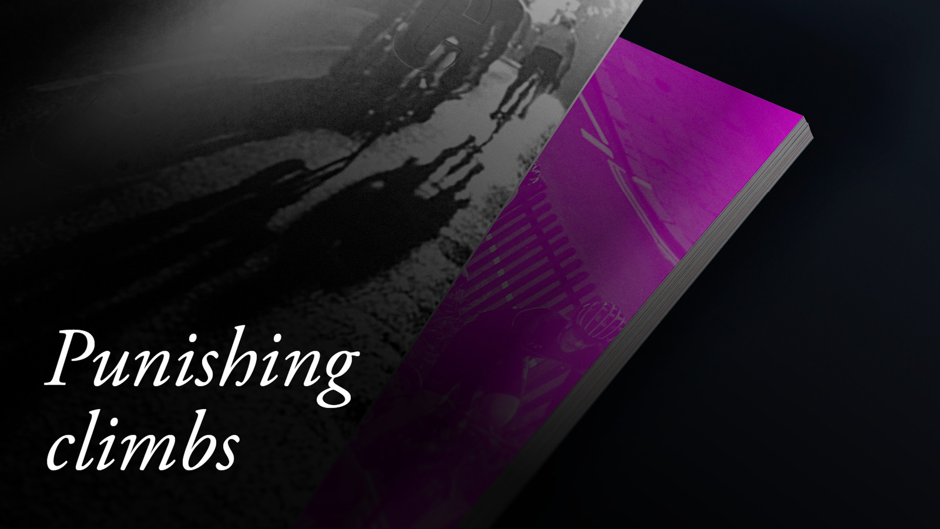
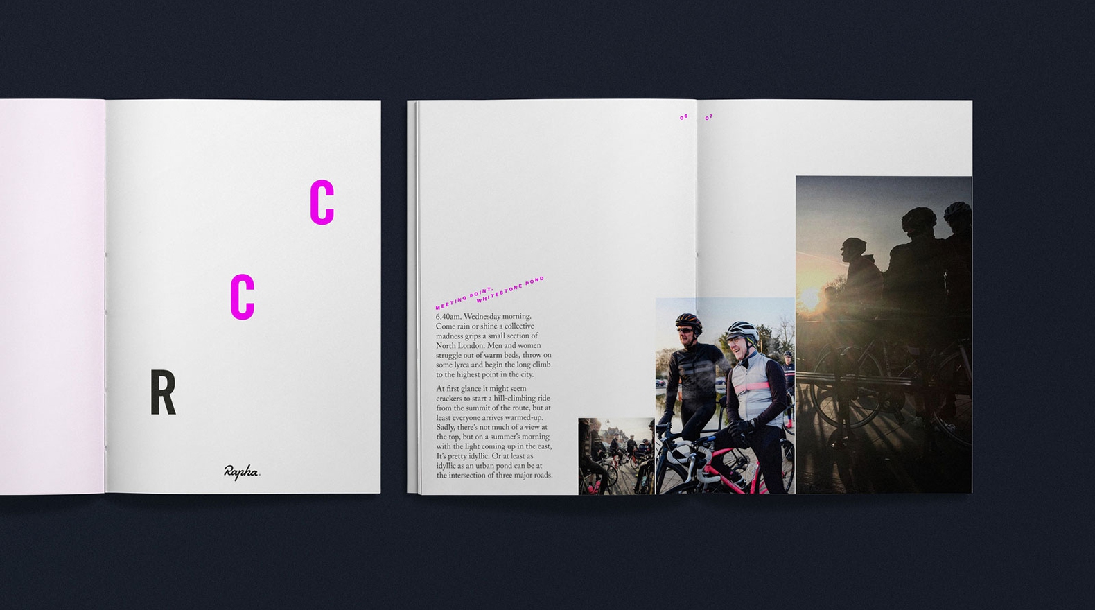
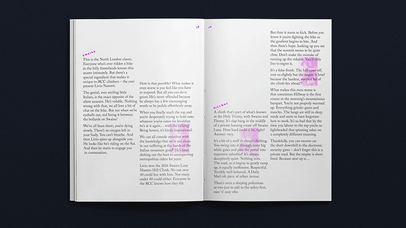
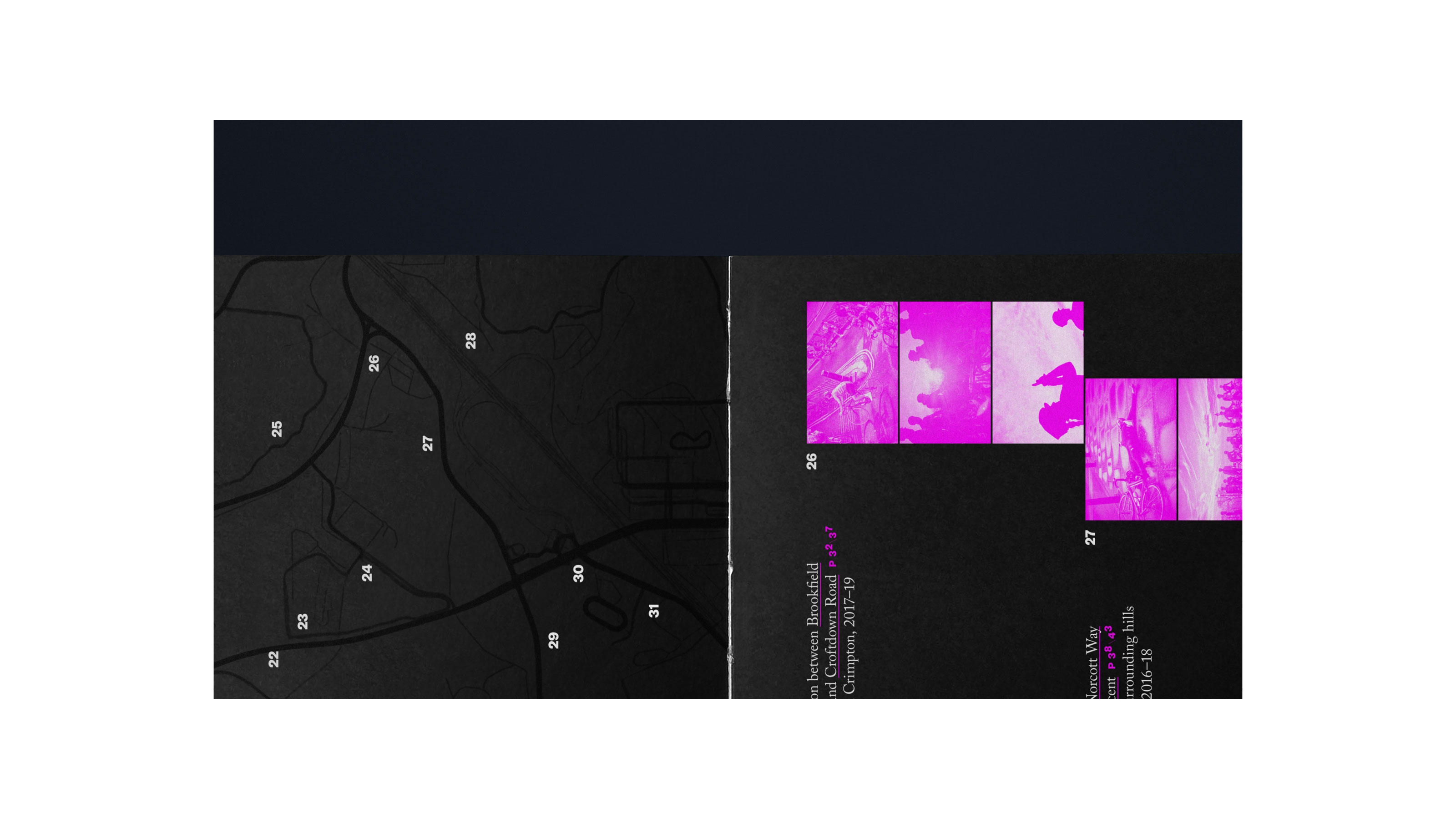
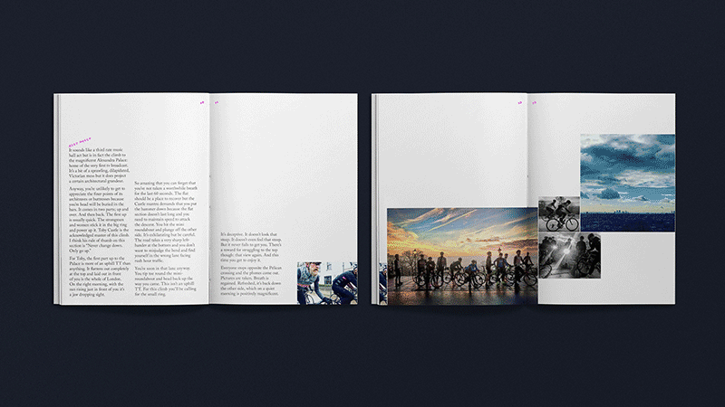
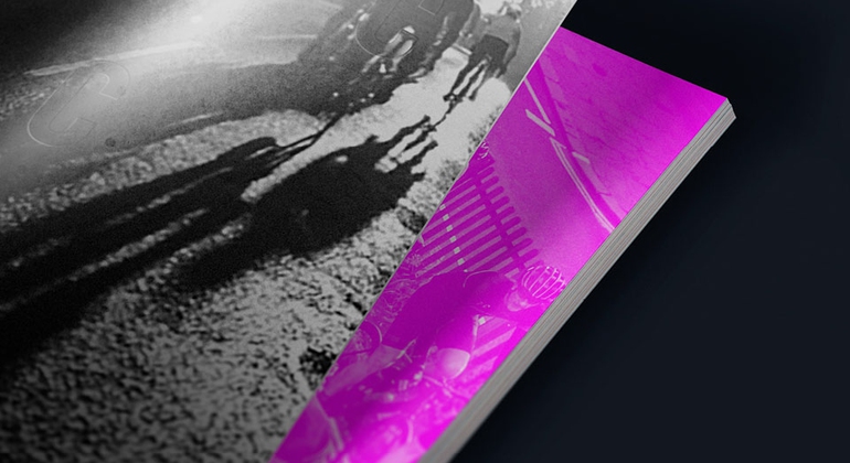
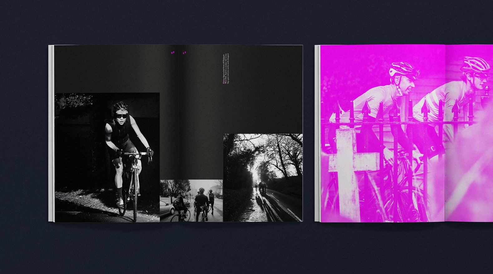
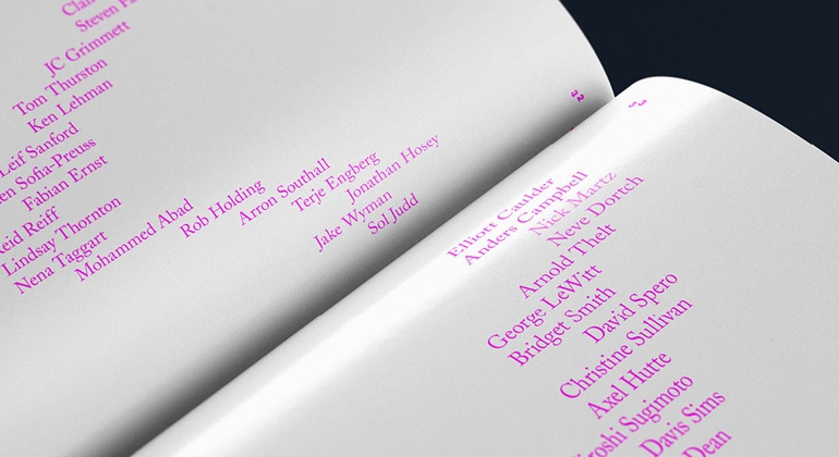
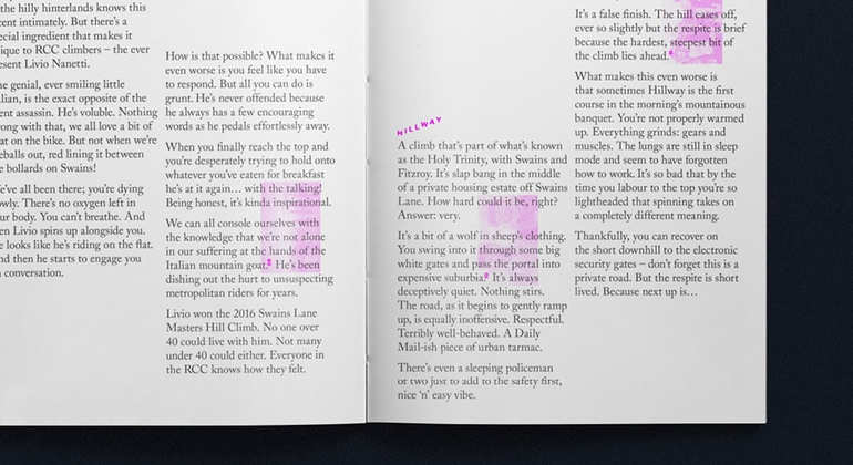
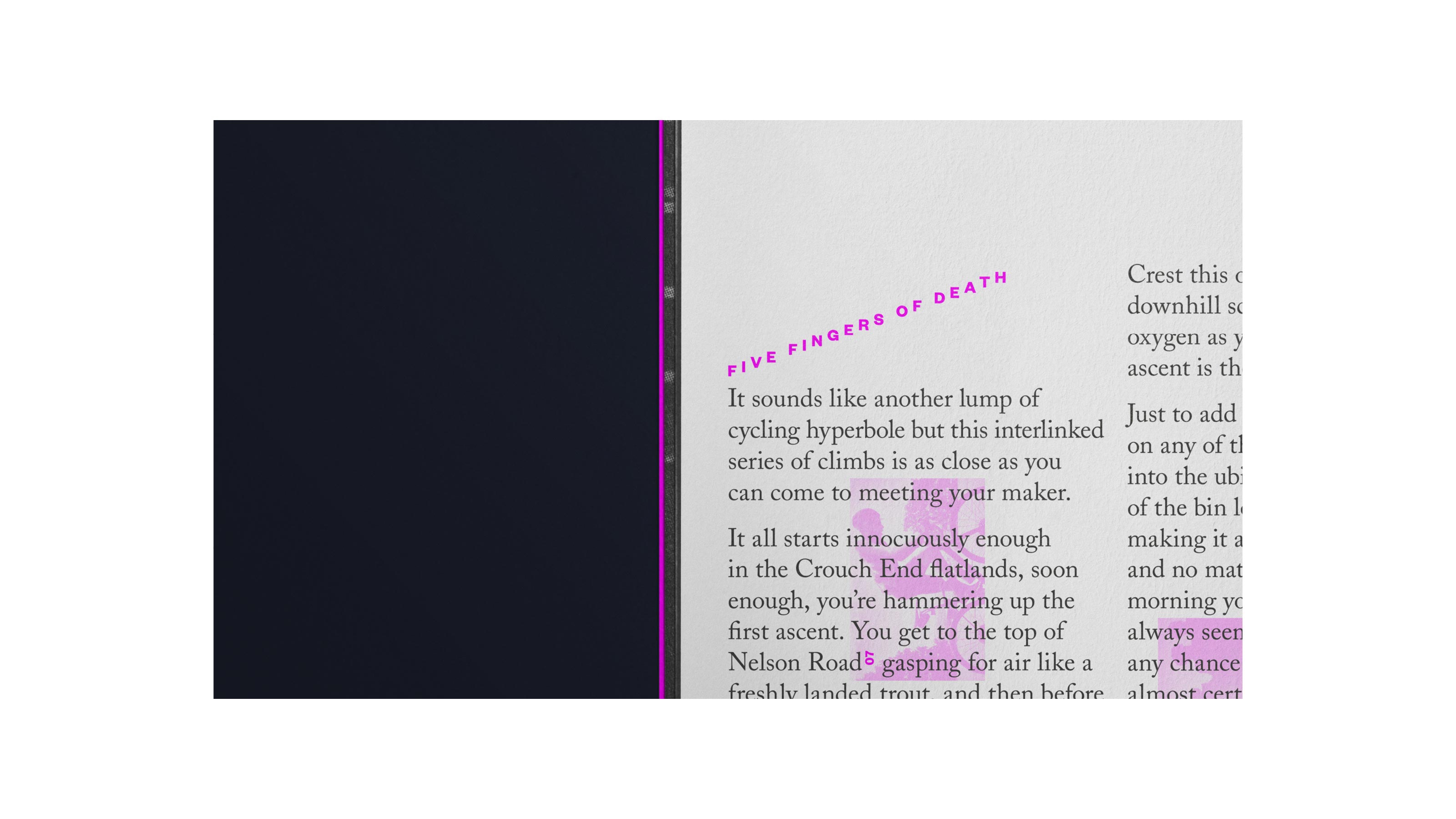
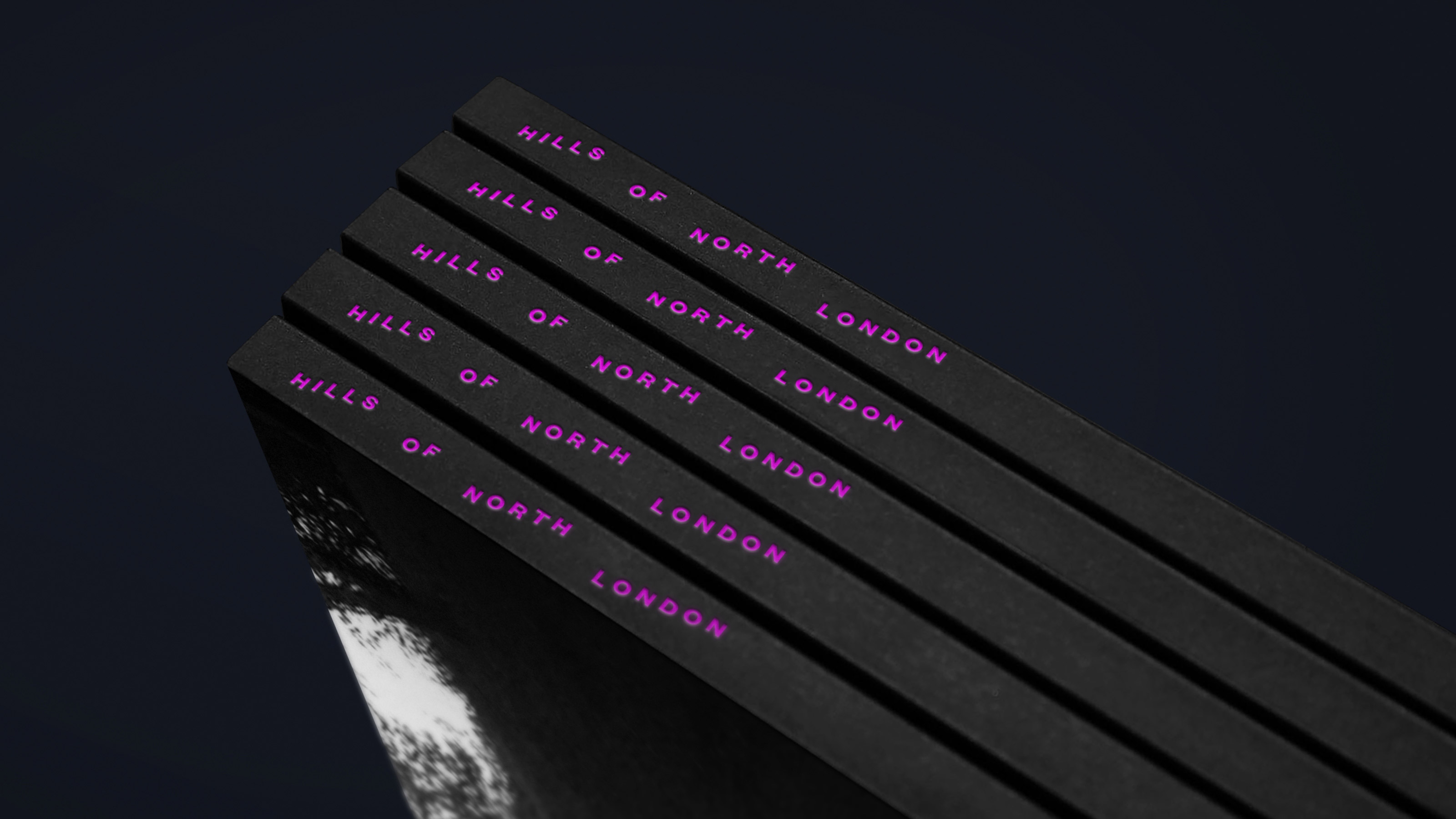
Rapha Cycling Club — Book & Editorial Design
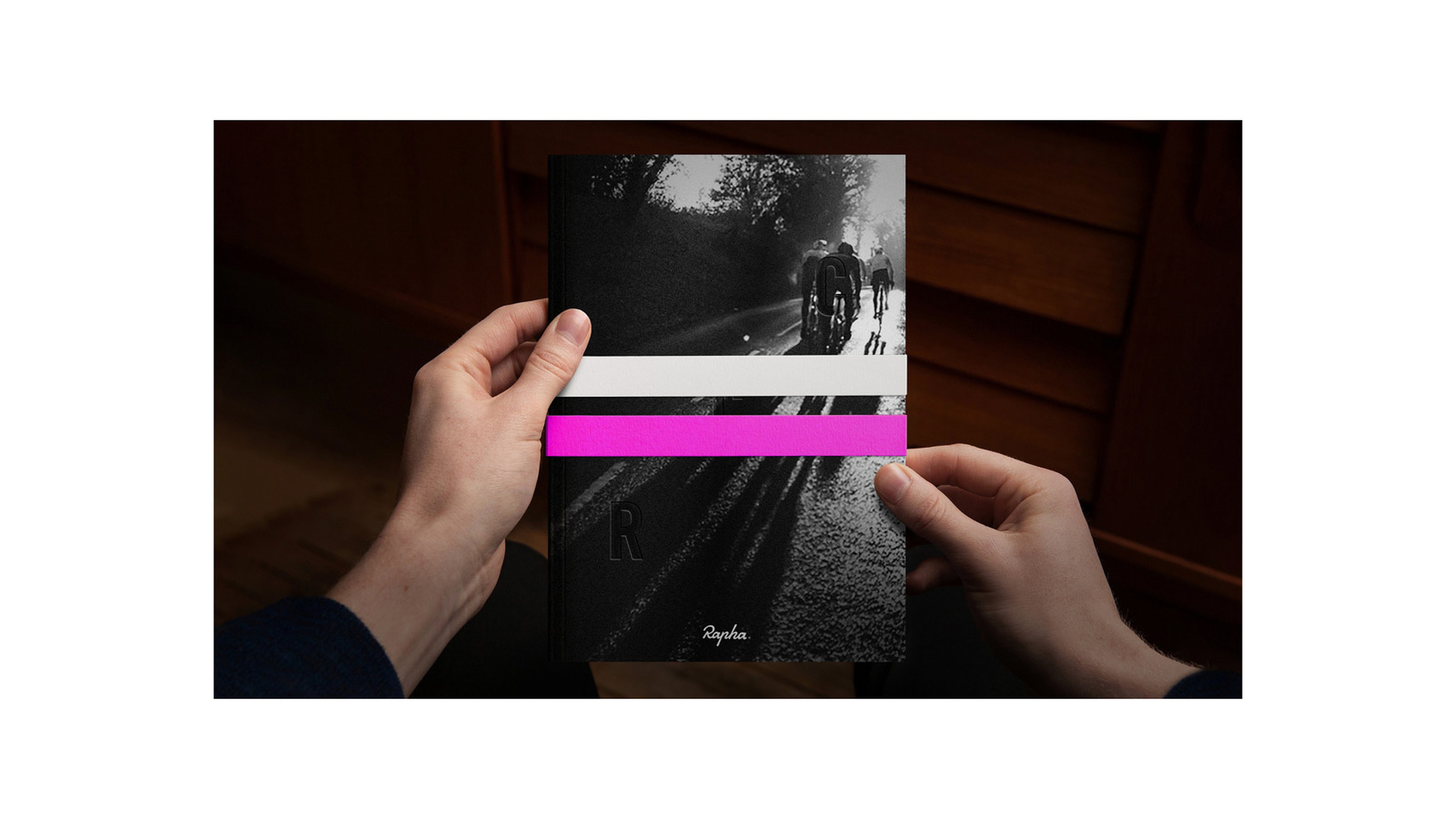
The Rapha Cycling Club (RCC) is a global community of passionate, active cyclists. This book documents the members’ exploits on the punishing hills of North London.
Photography by members of the London RCC
Re Agency, M+C Saatchi Book & Editorial Design
Photography by members of the London RCC
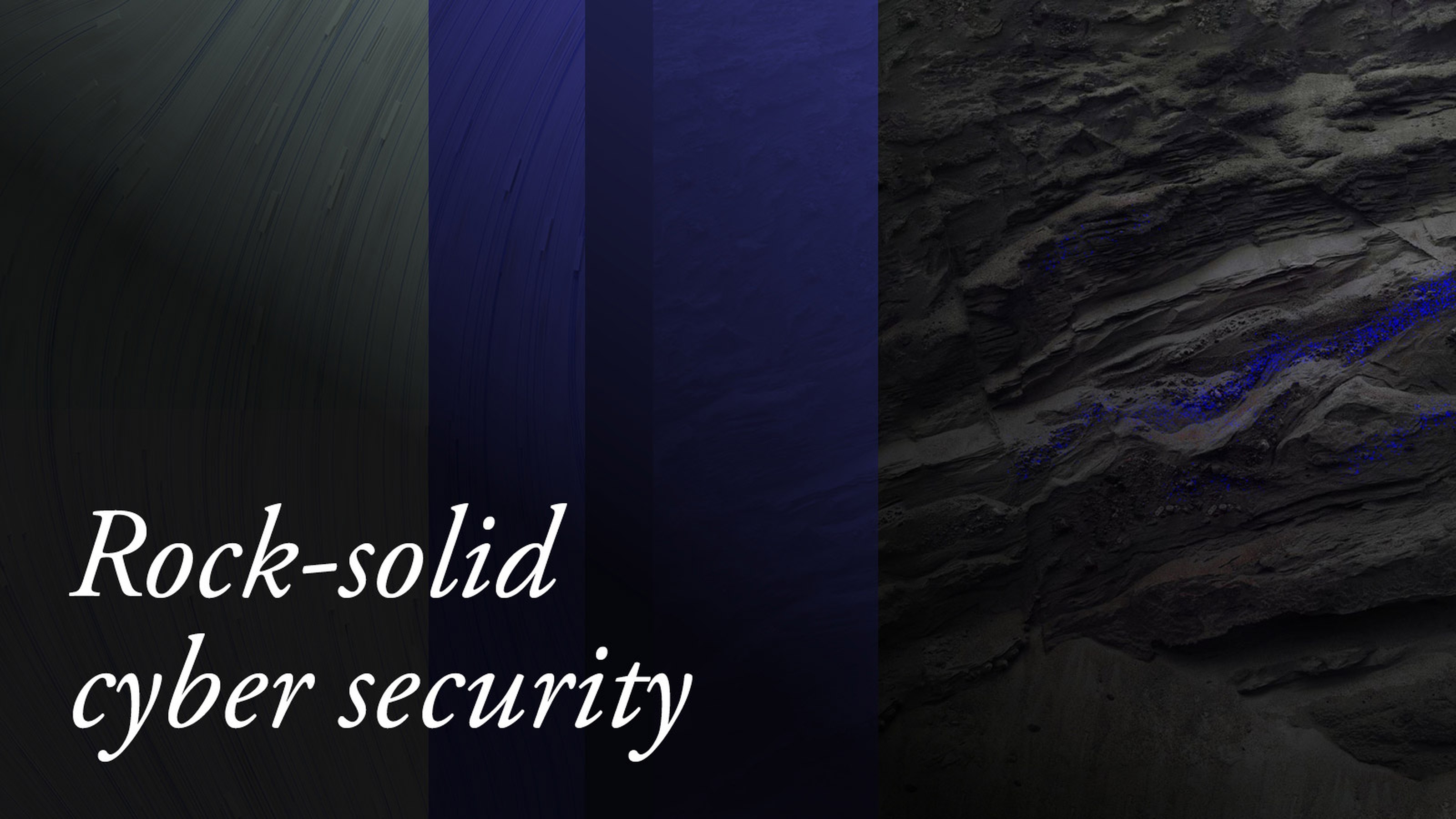
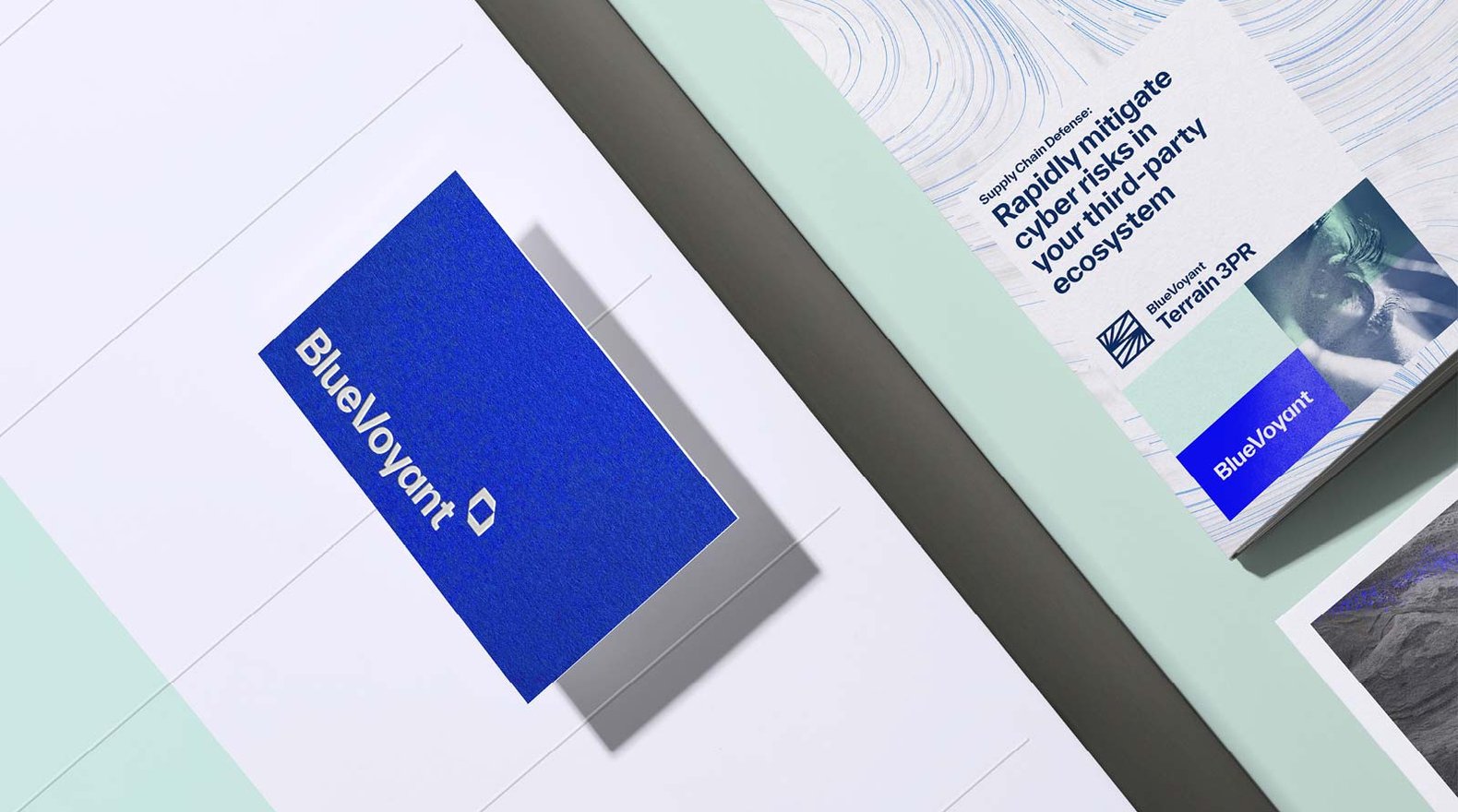
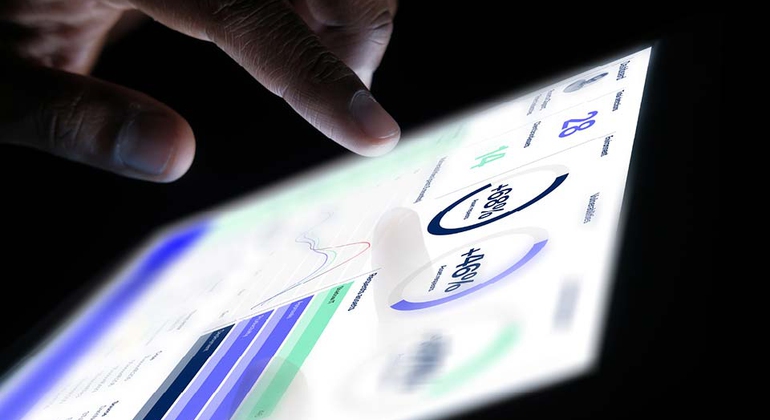
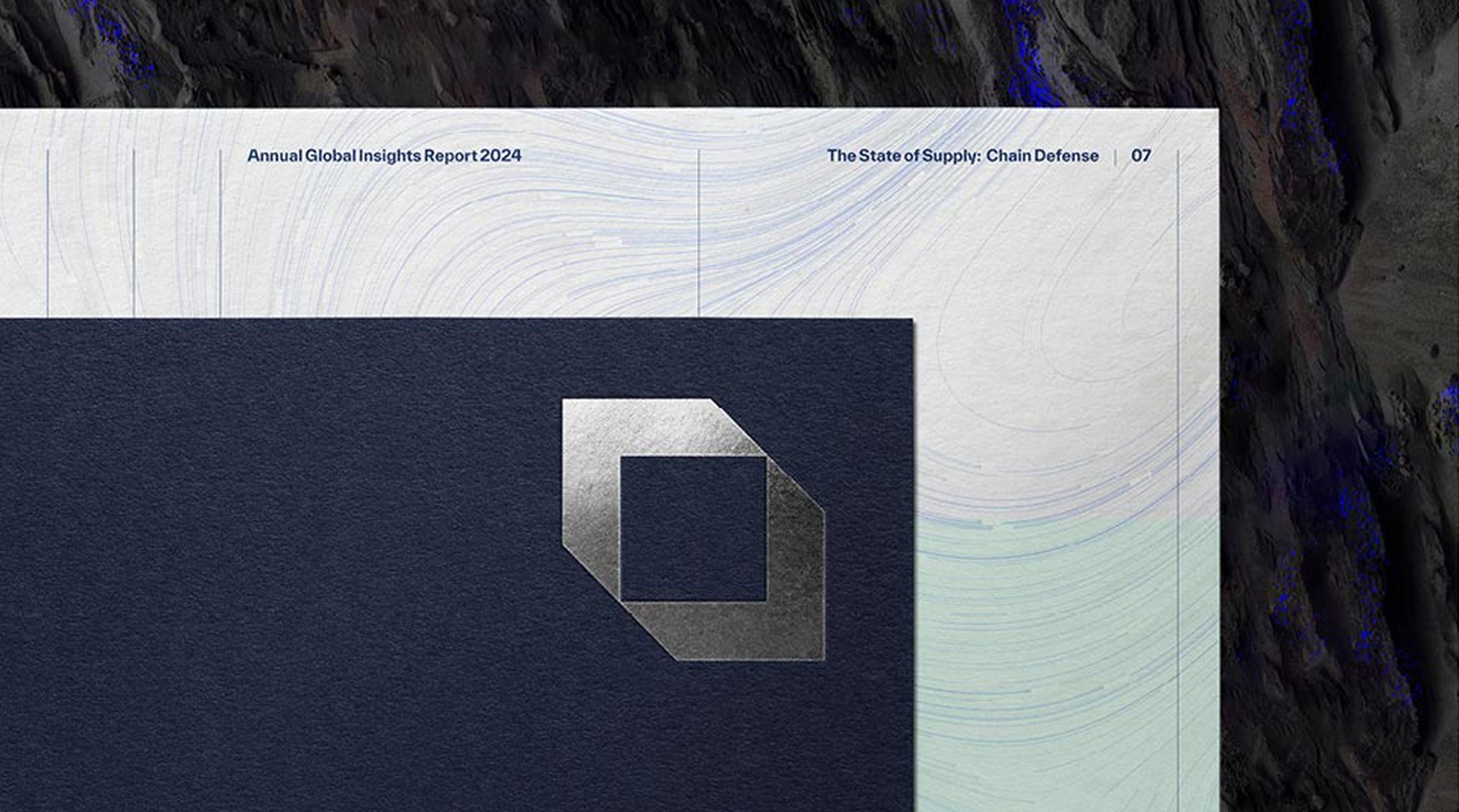
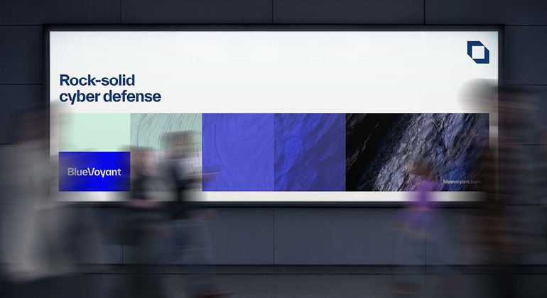
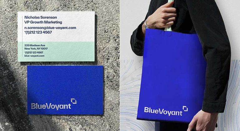
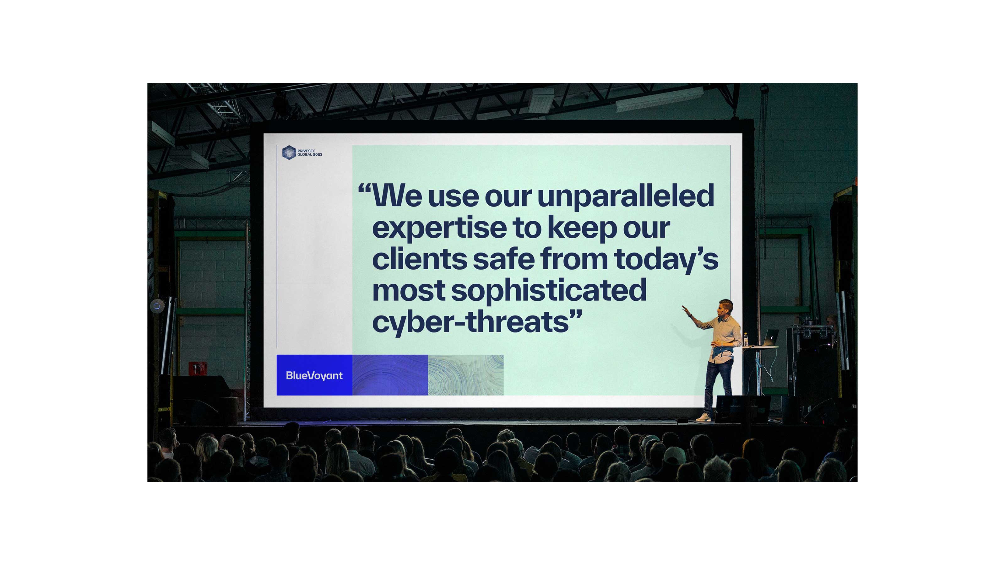
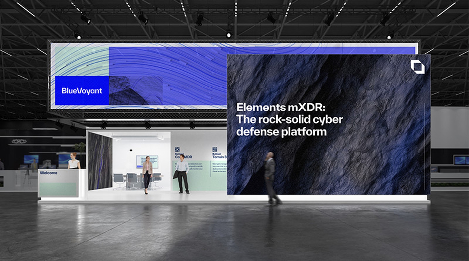
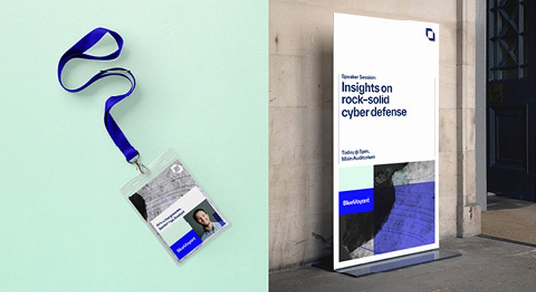
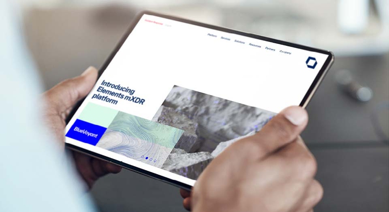
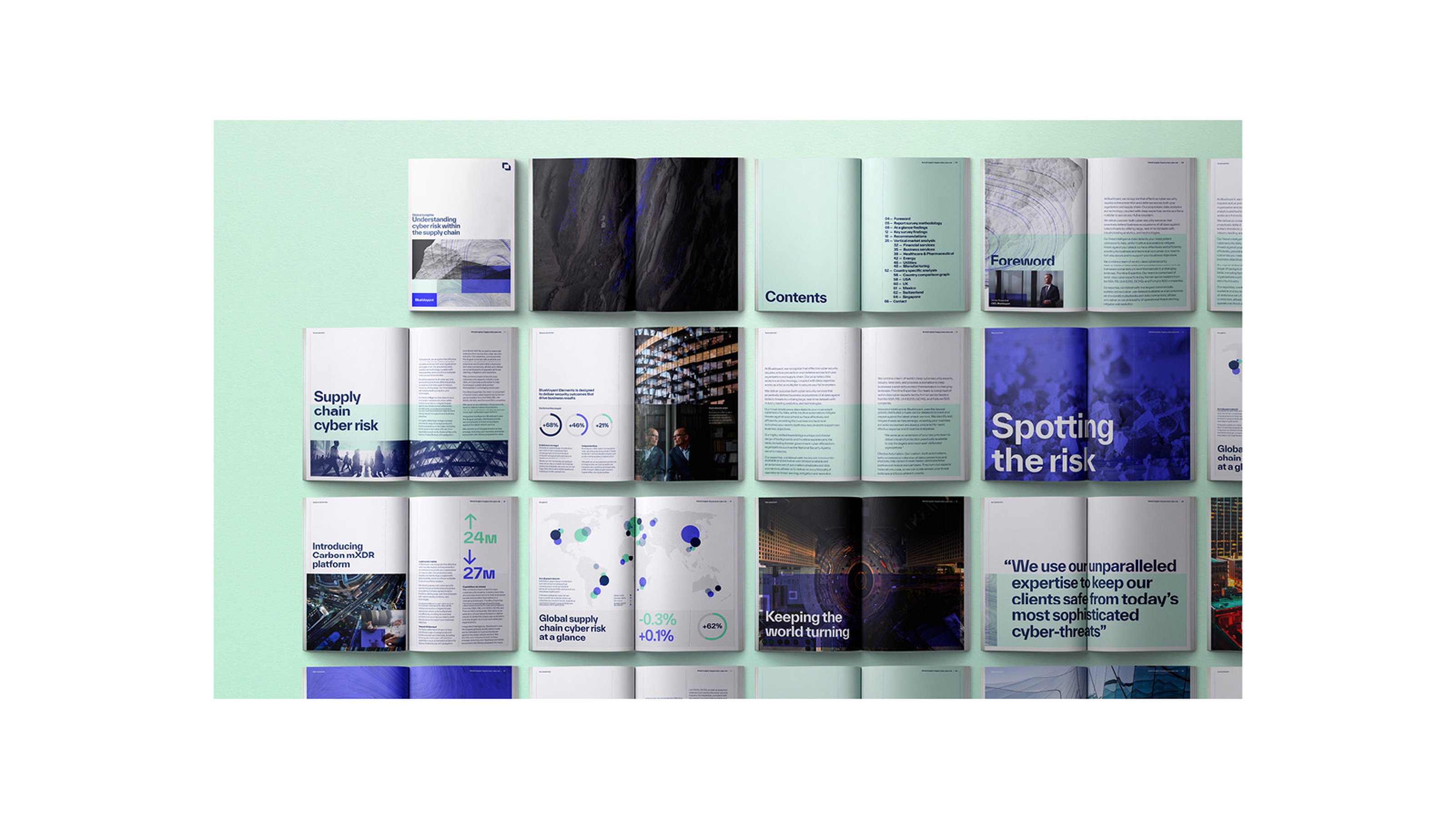
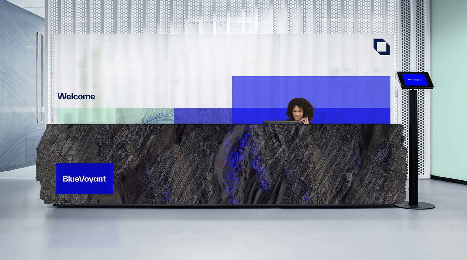
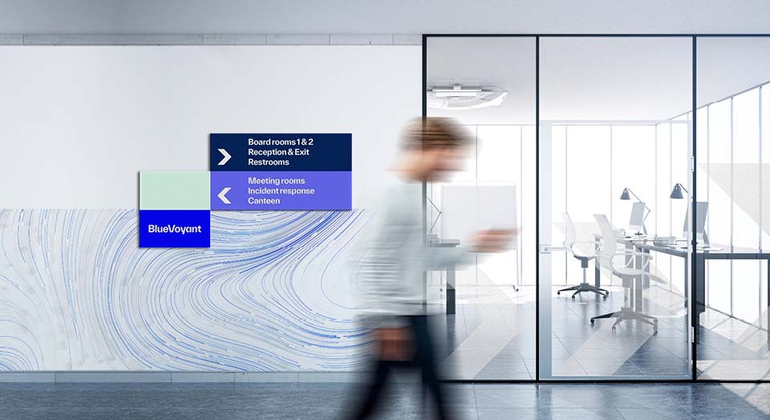
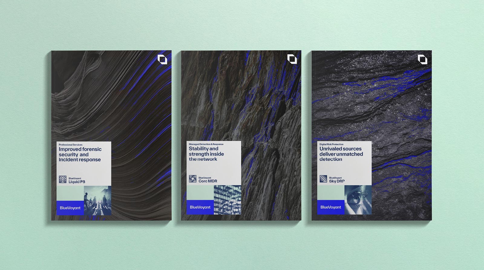
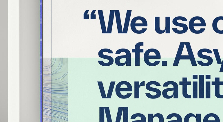
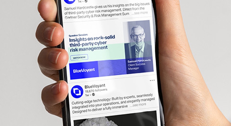
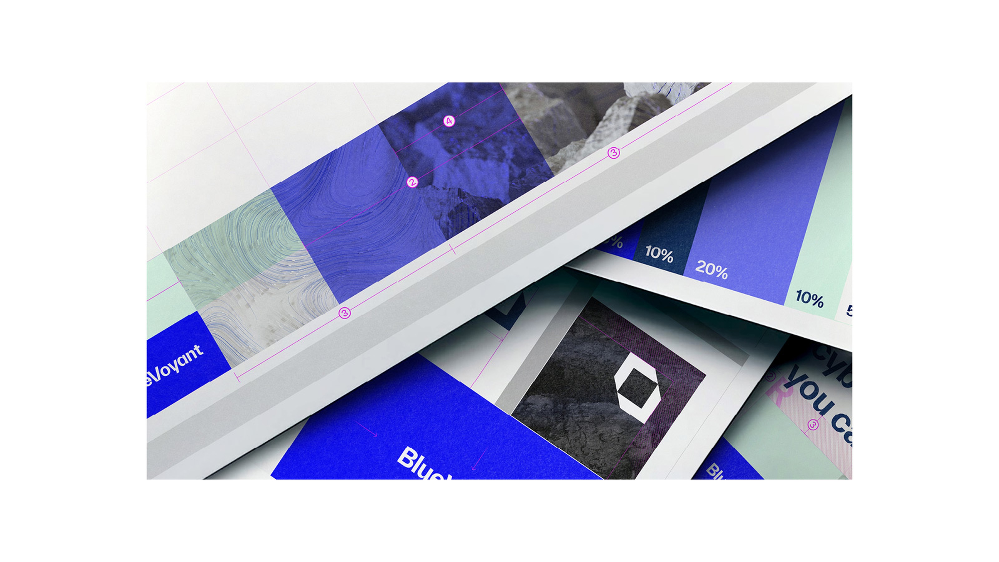
Bluevoyant — Brand Identity
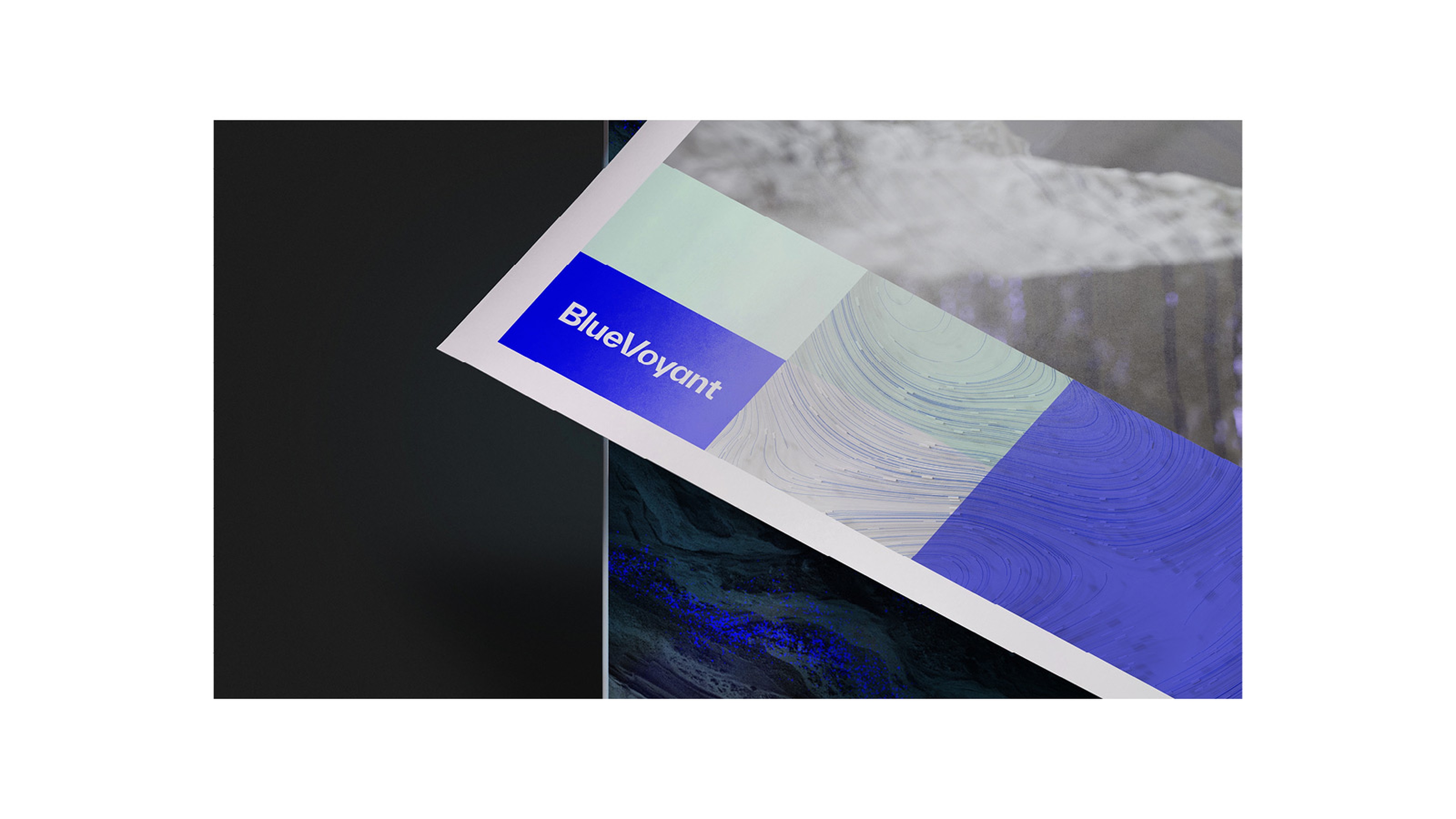
BlueVoyant is a cybersecurity firm founded and operated by industry experts, headquartered in the US. To underscore their robust and uncompromising approach to cyber threat, an identity was crafted around the core message: Rock-solid cyber defense. This approach enables BlueVoyant to articulate its fundamental principles while setting itself apart from competitors.
The distinctive design system is built from the ground up, with the wordmark serving as the foundational cornerstone upon which all other design elements are structured. This system comprises a wide range of elements, including the brand symbol, product symbols, icon library, custom CG imagery, and its application at the brand level, effectively showcasing the identity's adaptability and versatility. The work involved the development of a comprehensive set of brand guidelines, meticulously detailing the visual identity system.
Territory Studio Concept & Brand Identity
The distinctive design system is built from the ground up, with the wordmark serving as the foundational cornerstone upon which all other design elements are structured. This system comprises a wide range of elements, including the brand symbol, product symbols, icon library, custom CG imagery, and its application at the brand level, effectively showcasing the identity's adaptability and versatility. The work involved the development of a comprehensive set of brand guidelines, meticulously detailing the visual identity system.


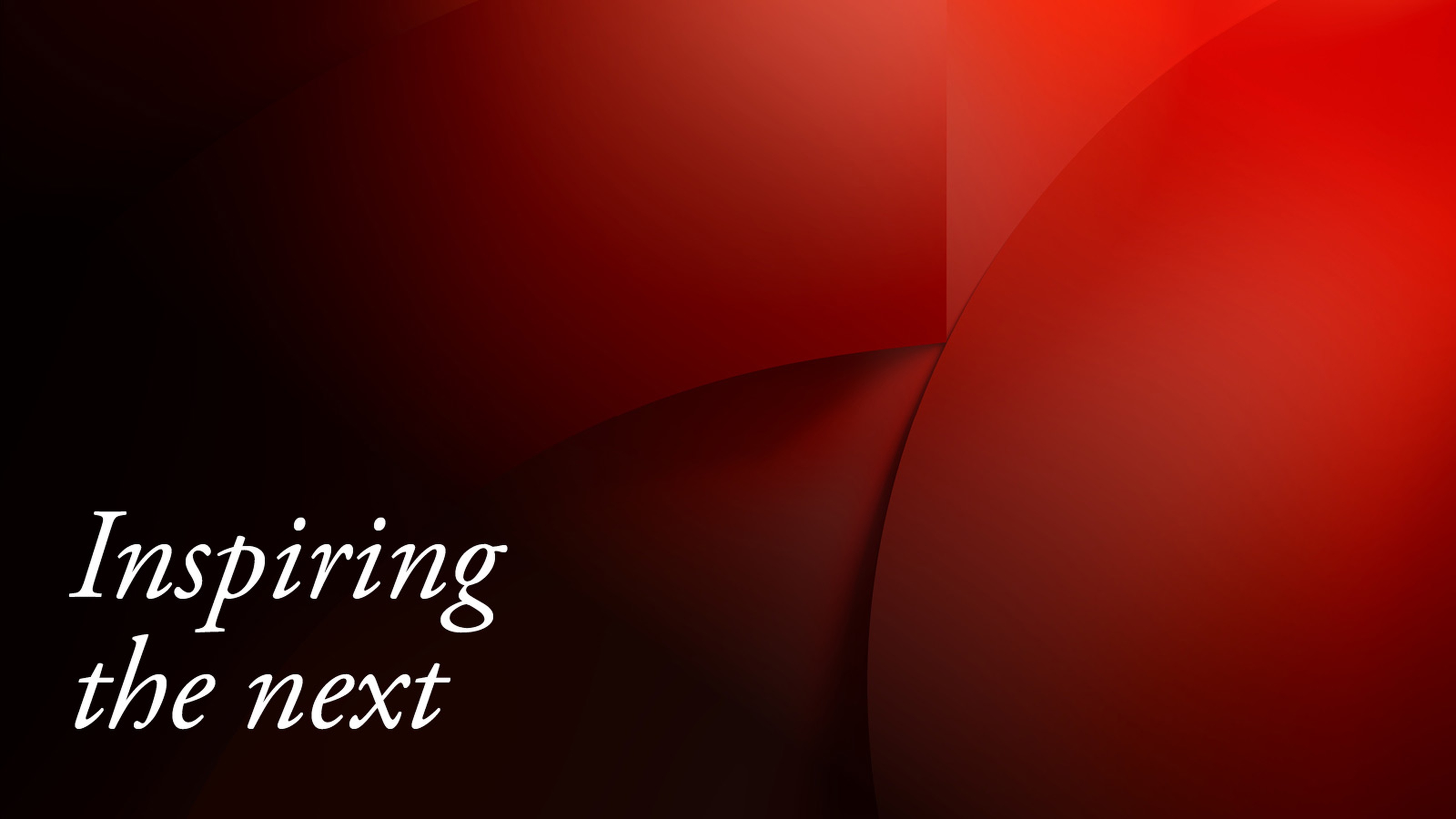
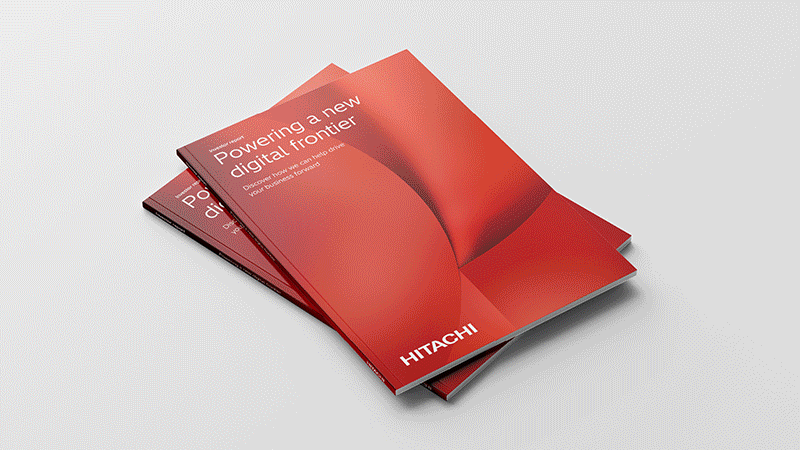
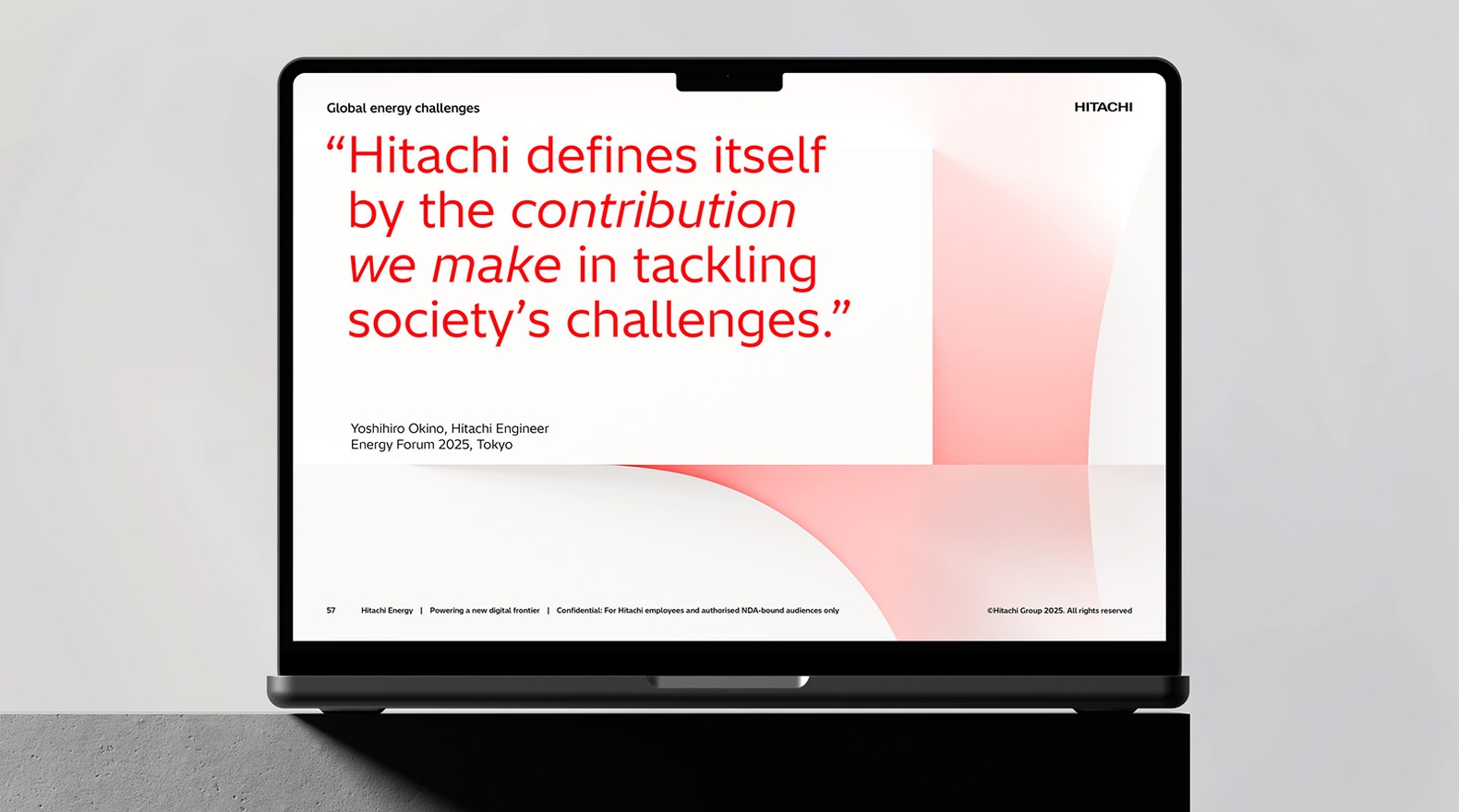
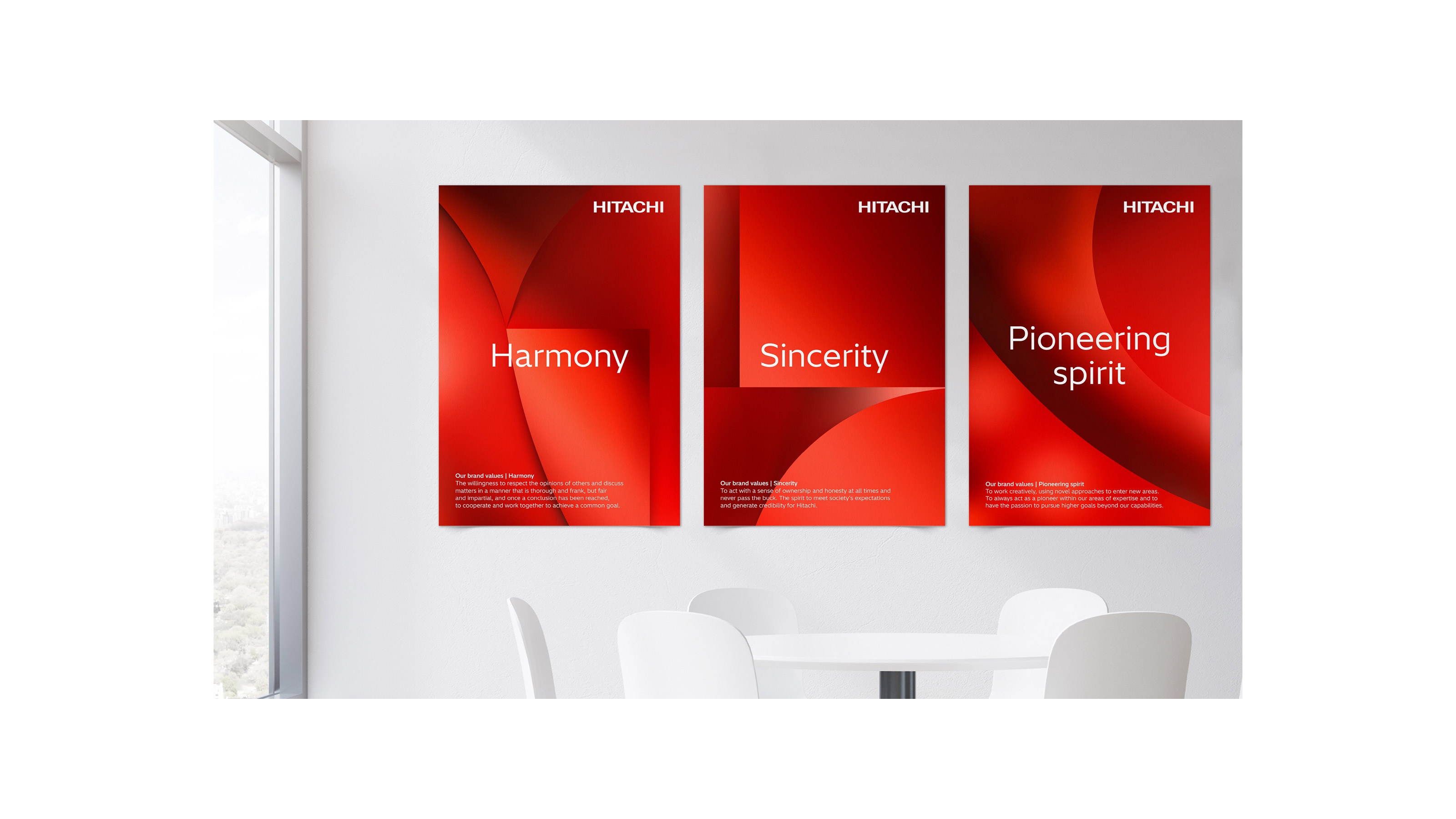
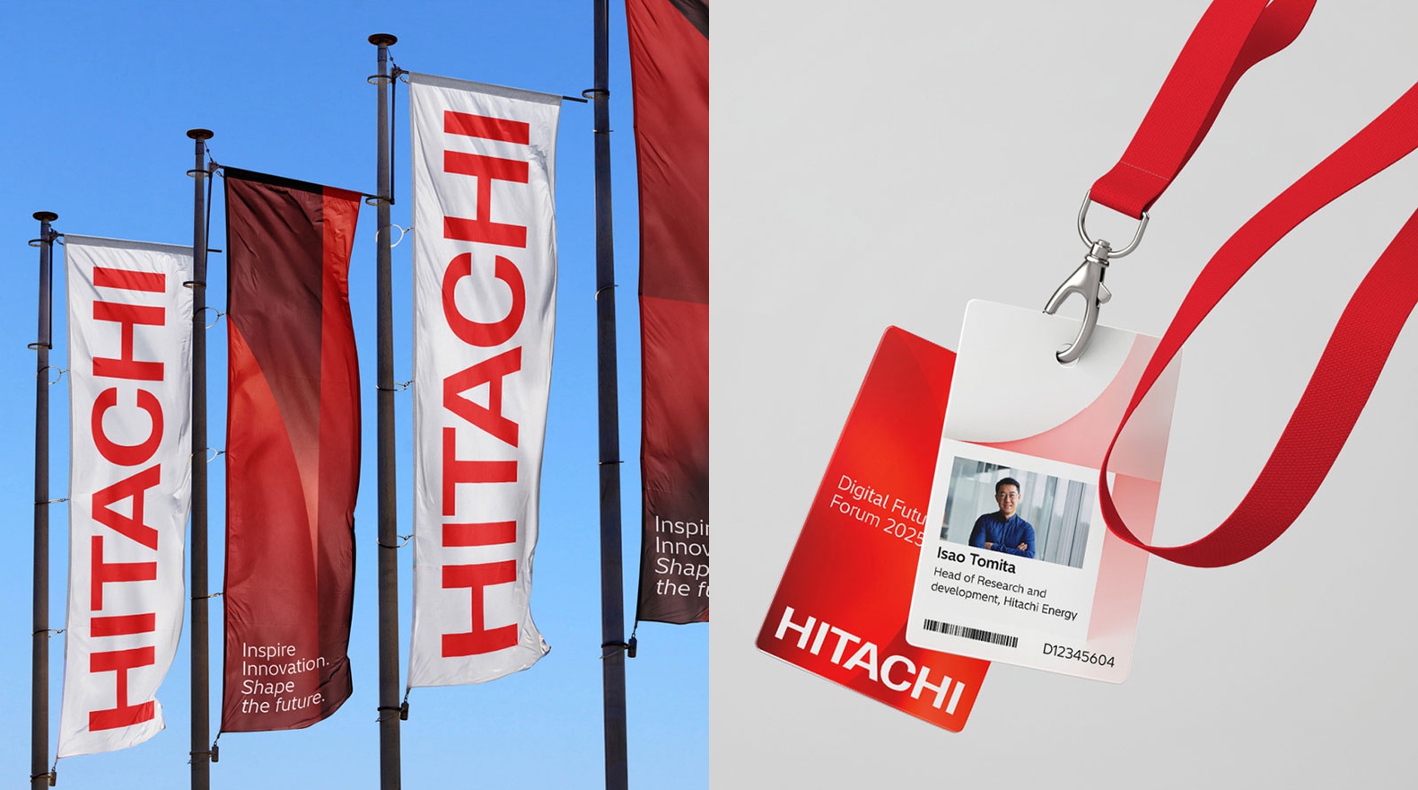
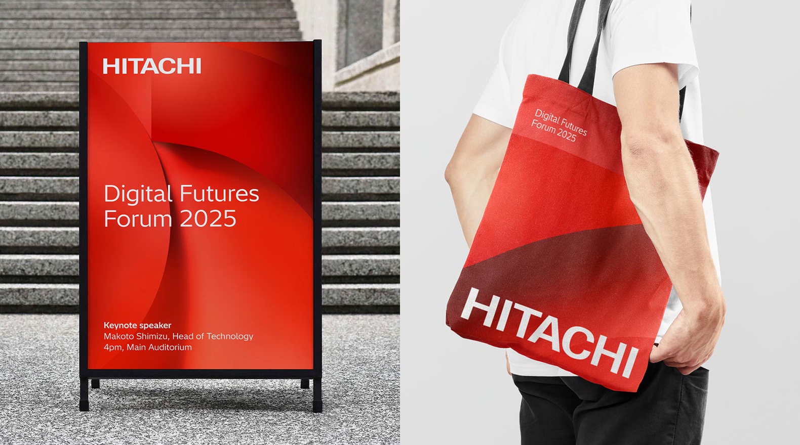
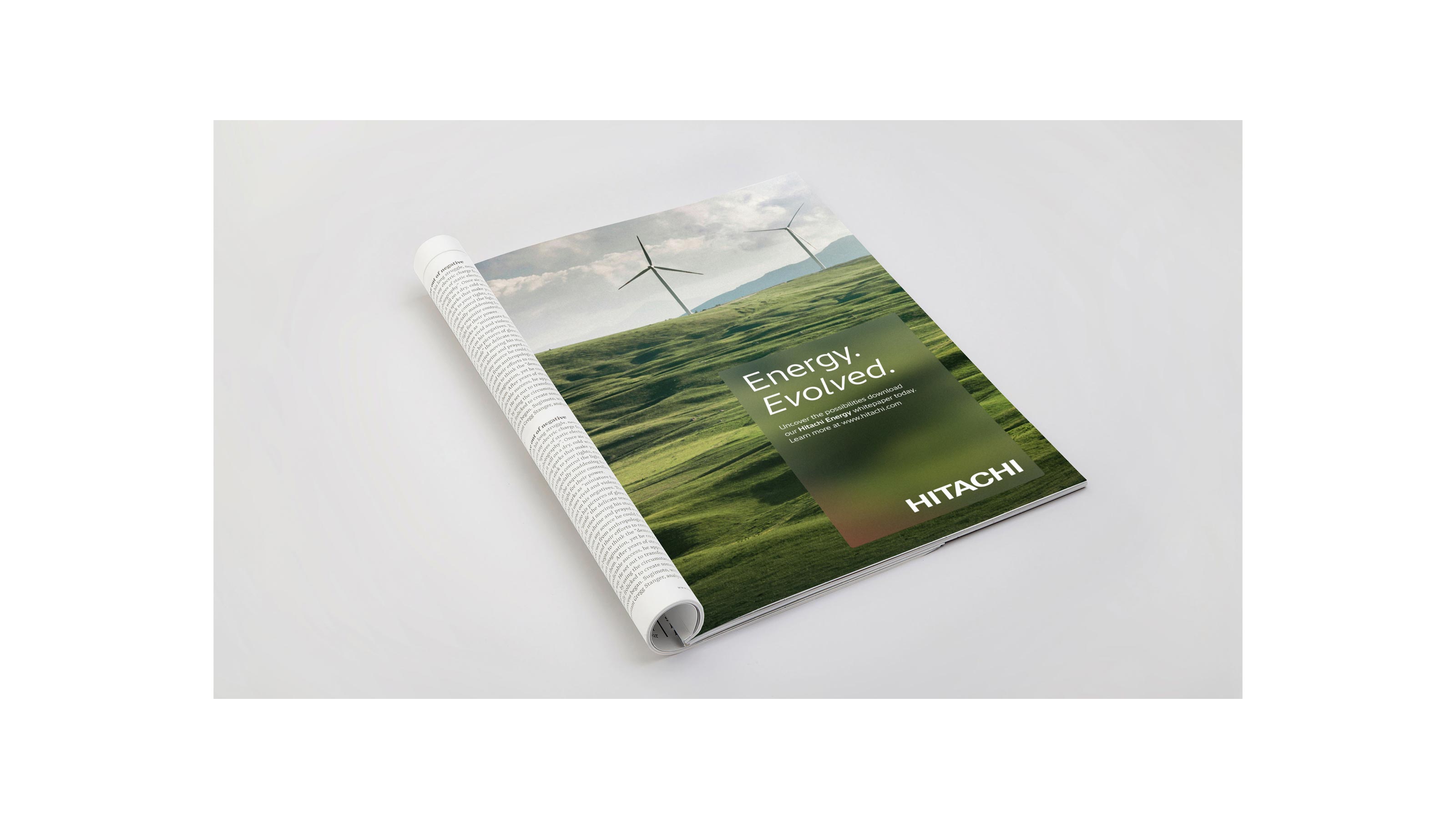
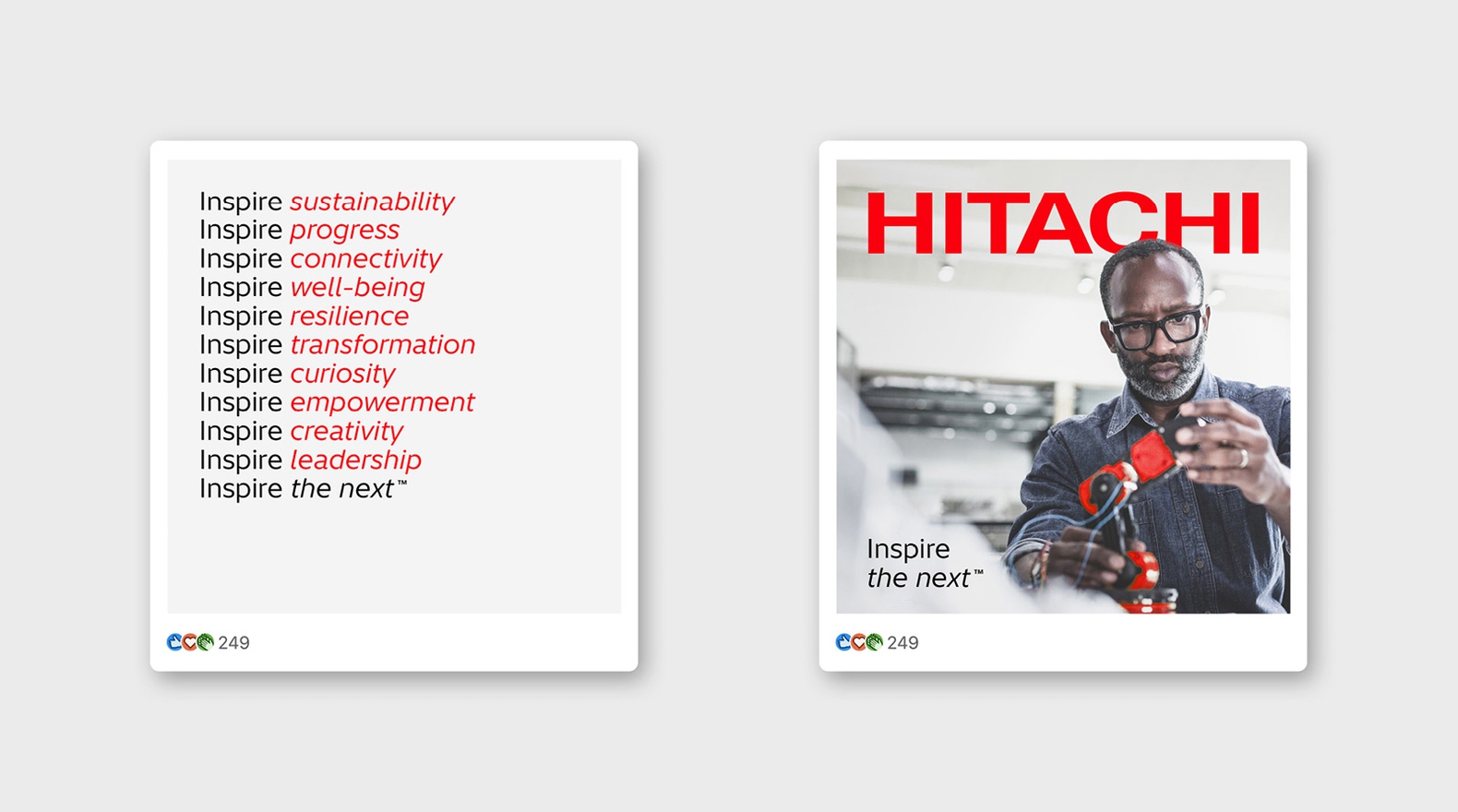
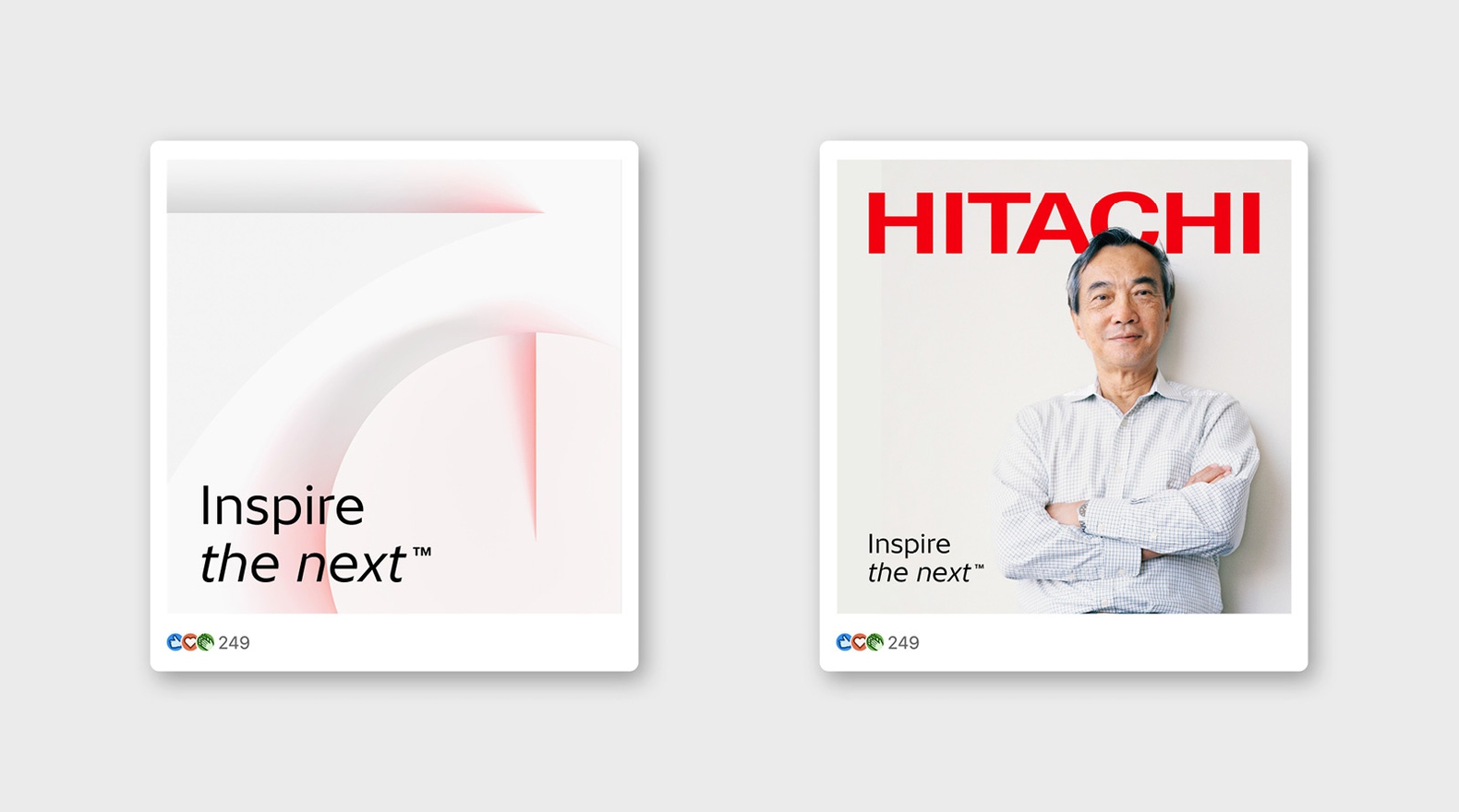
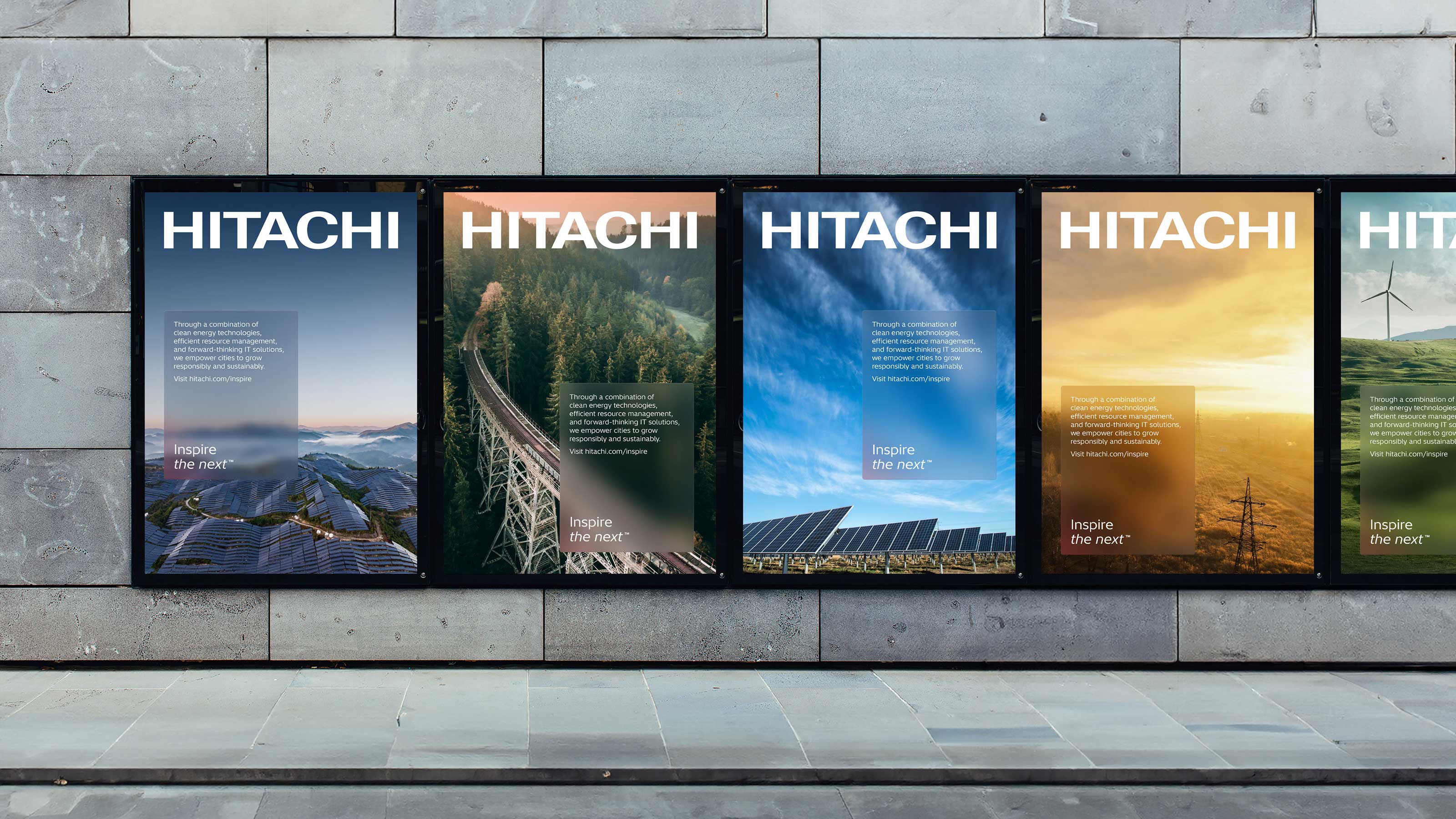
Hitachi — Brand System, Implementation & Campaign
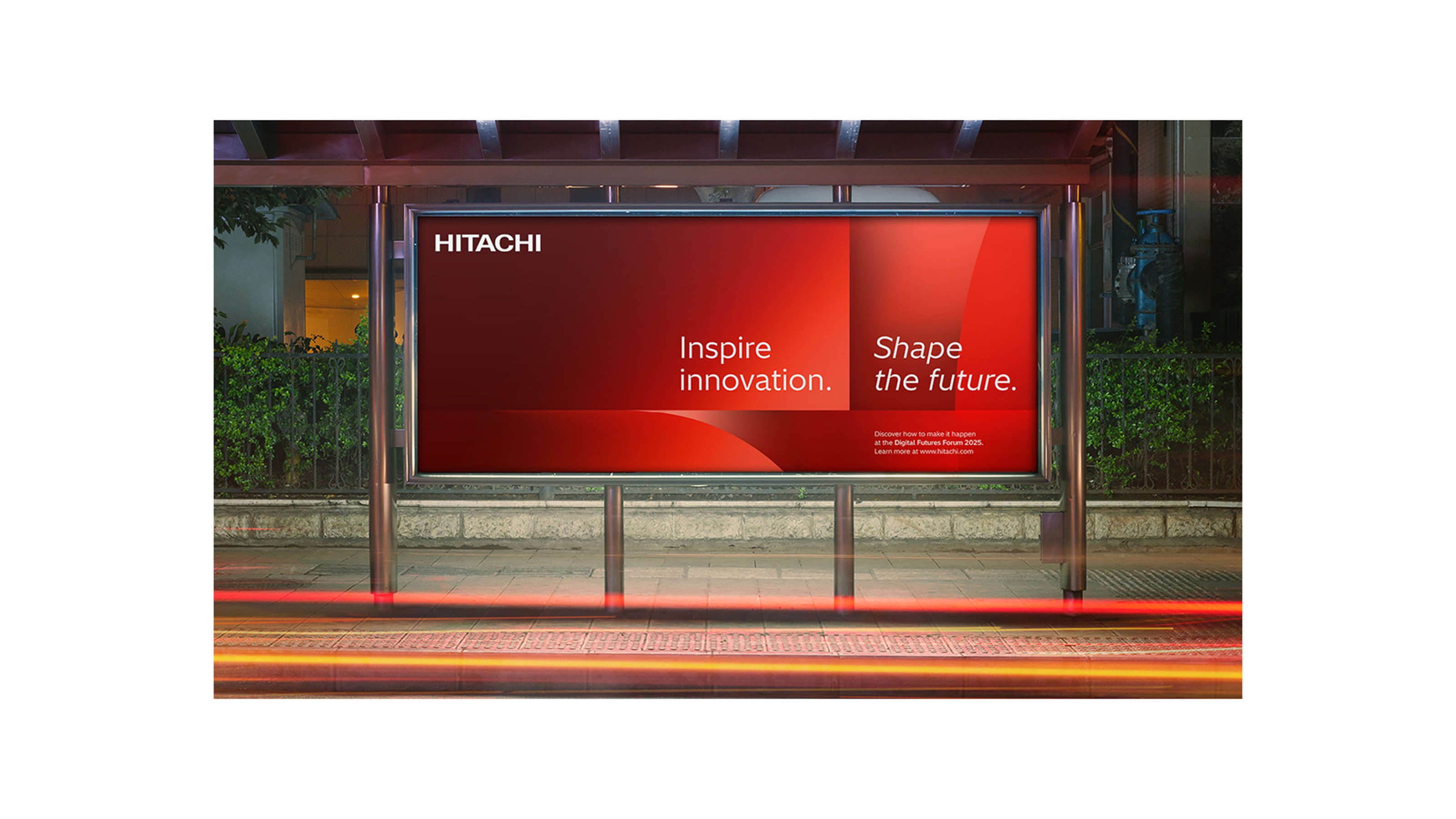
Hitachi’s new identity brings all its global businesses together under a unified visual system. Building on the brand originally developed at Moving Brands, the focus was on translating the identity into a practical, scalable design system – developing detailed guidelines, implementing the system within Frontify, and delivering campaign work that brought the Inspire the Next strategy to life.
Hitachi Global Brand System, Implementation & Campaign
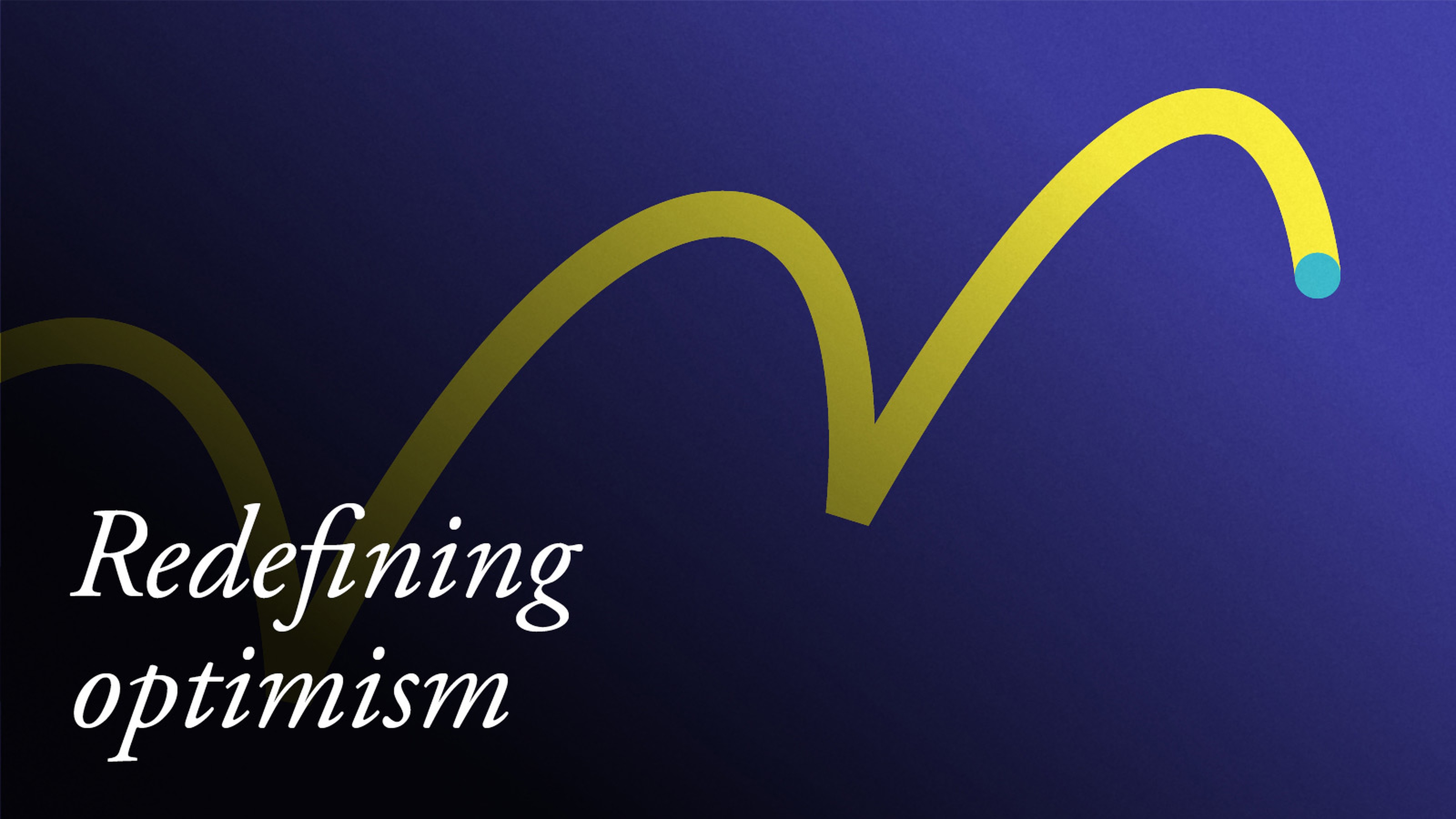
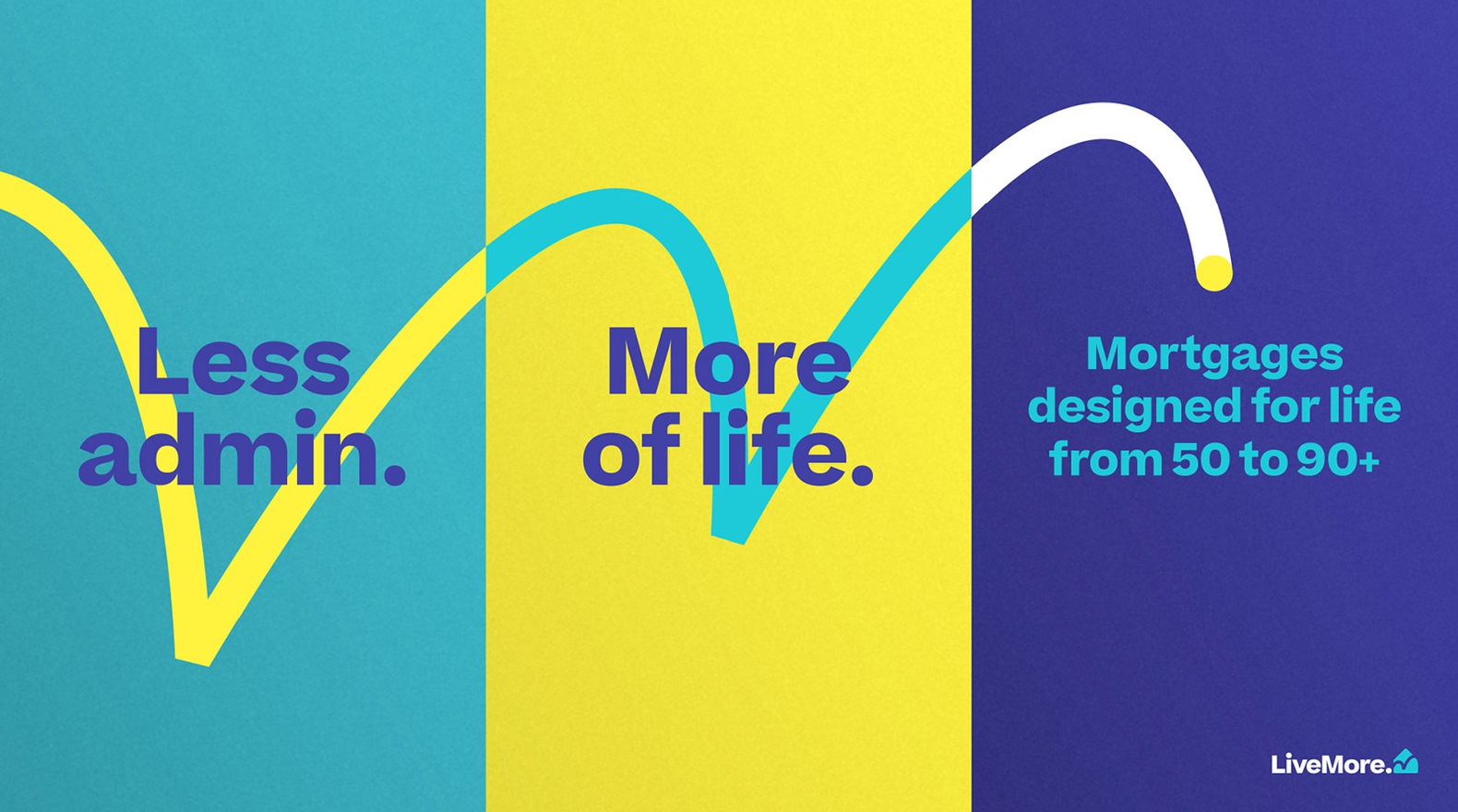
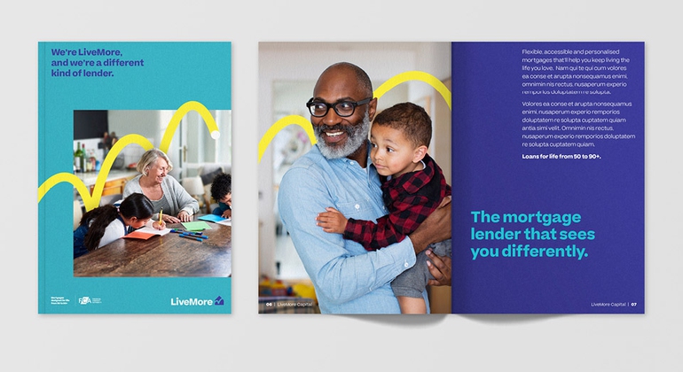
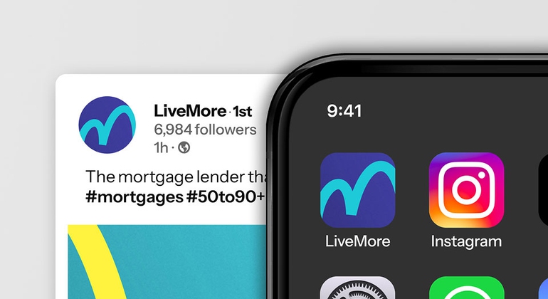
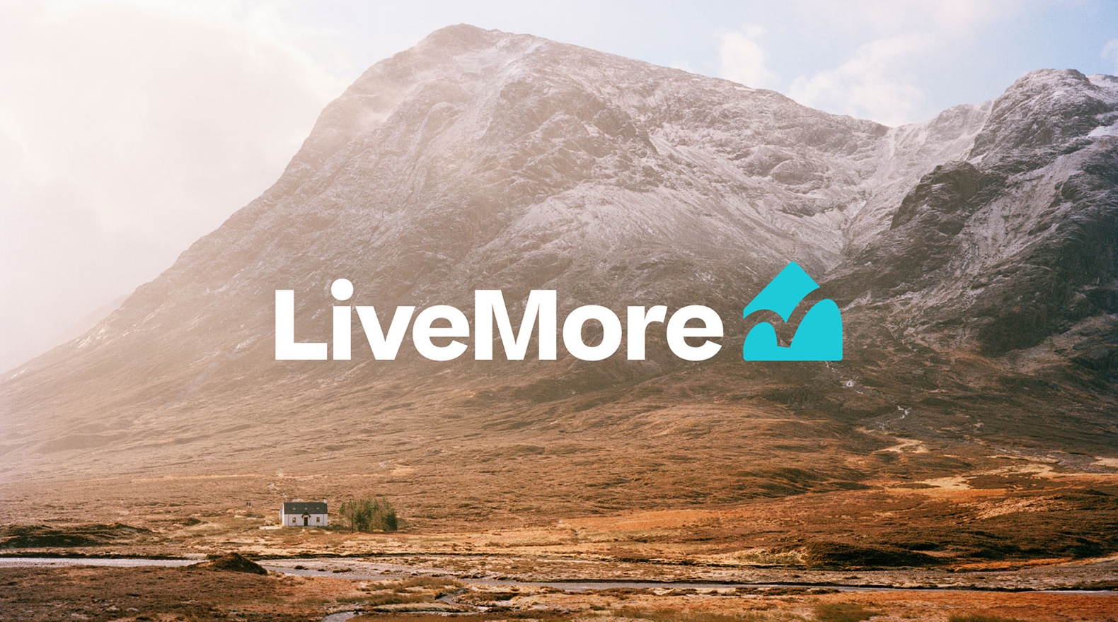
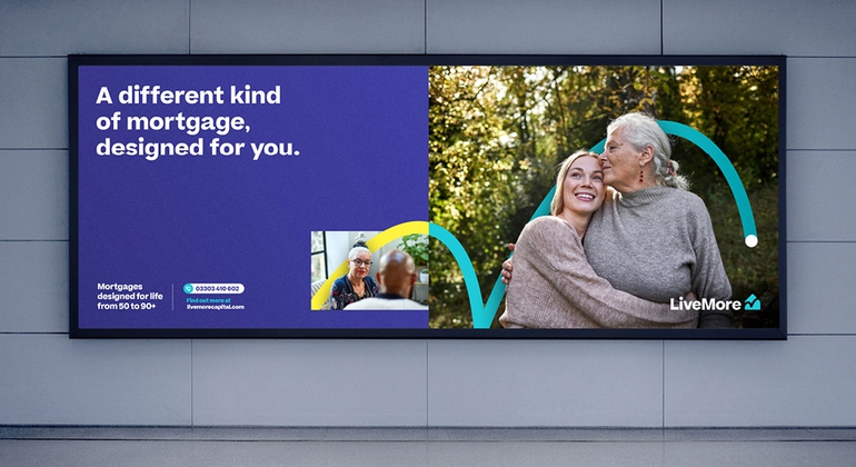
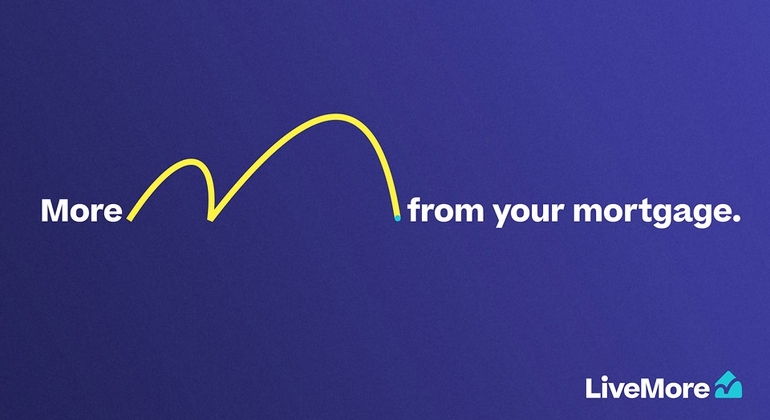
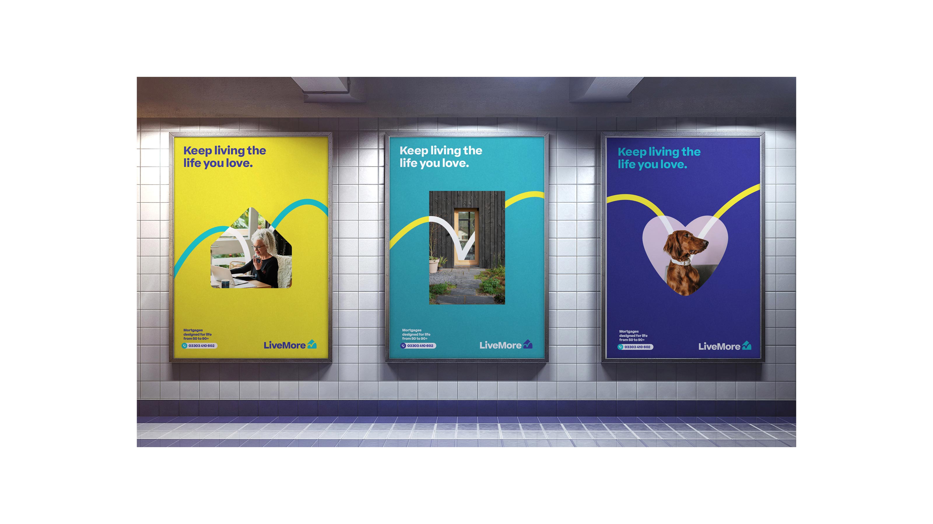
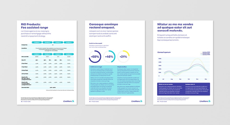
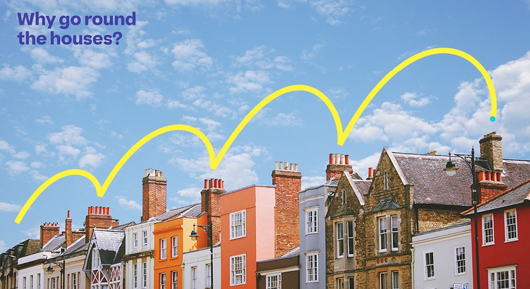
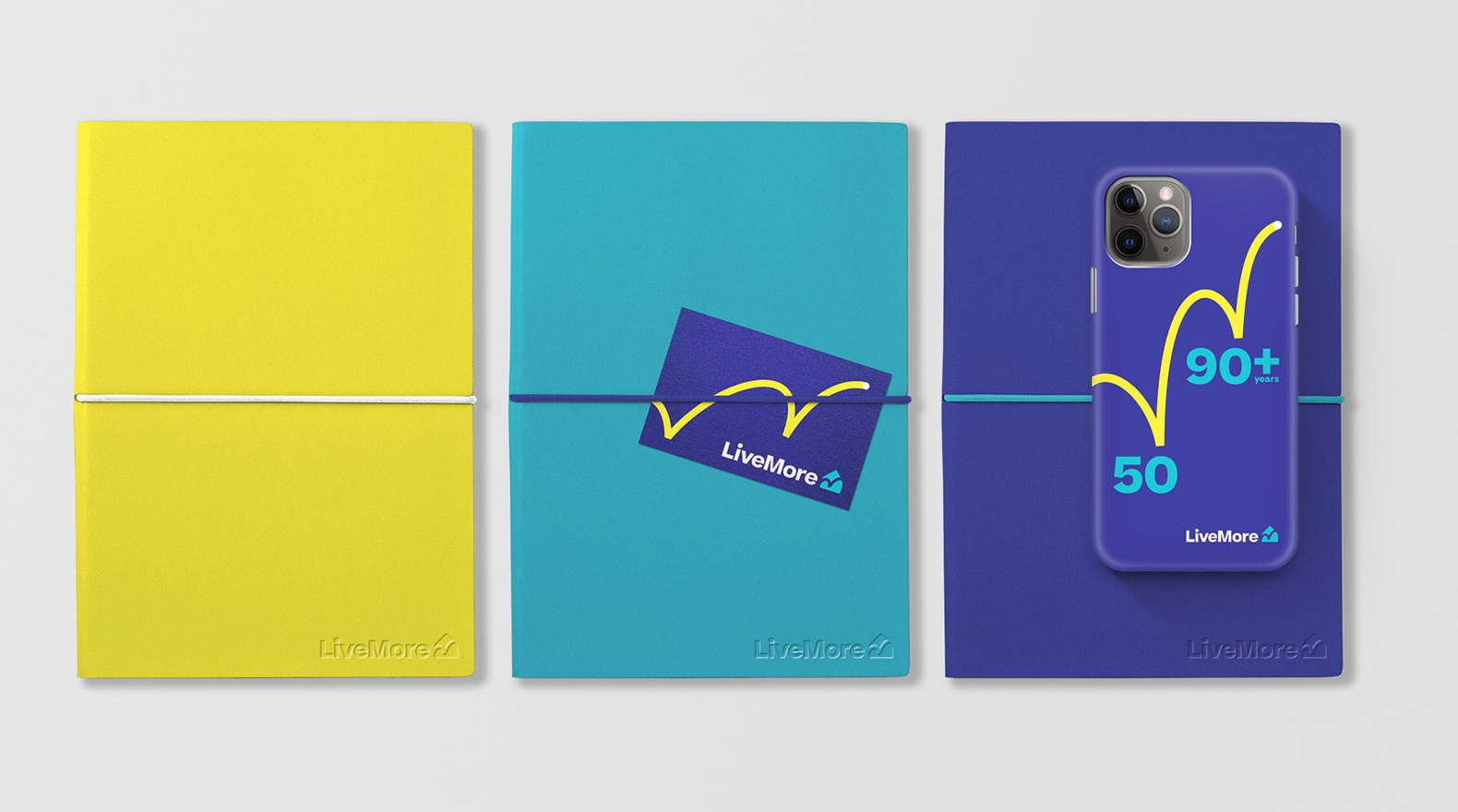
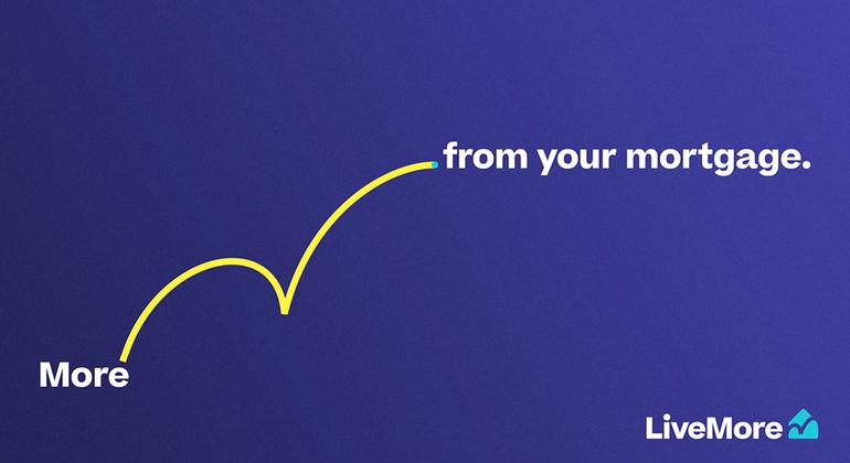
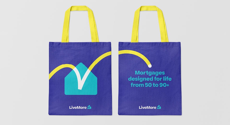
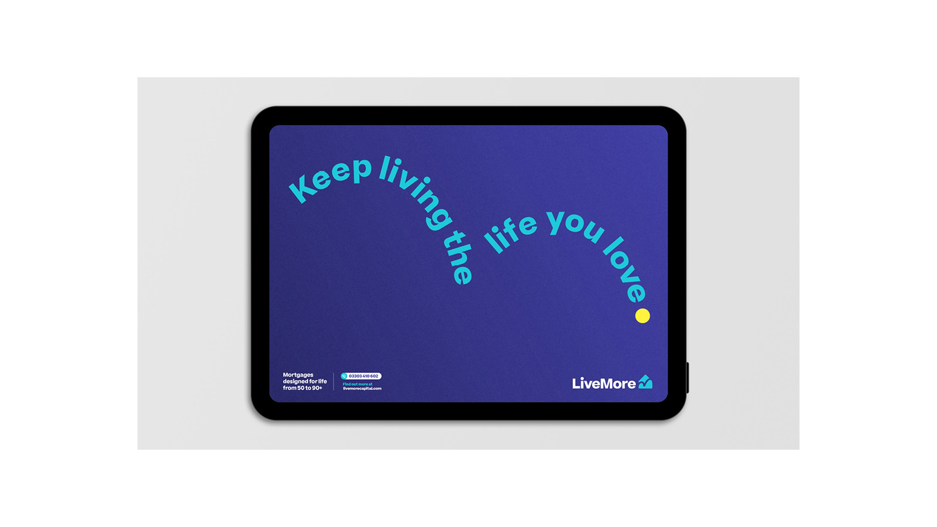
LiveMore — Brand Identity
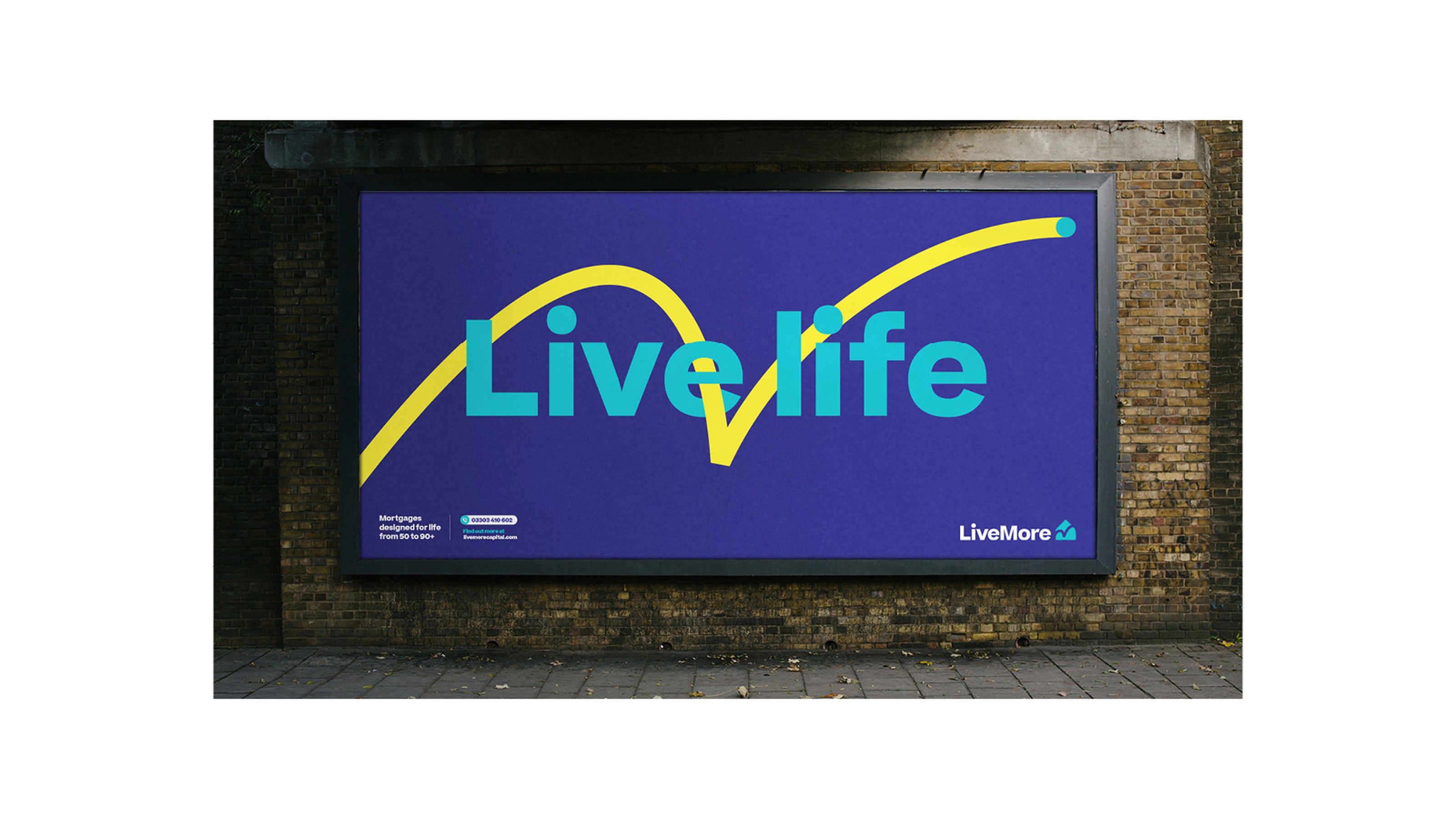
LiveMore is redefining how later-life lending connects with a new generation of over-50s. The identity celebrates real life and optimism – moving beyond clichés to reflect a vibrant, tech-savvy community focused on family, freedom, and the joy of everyday moments.
Styles+Partners Brand Identity
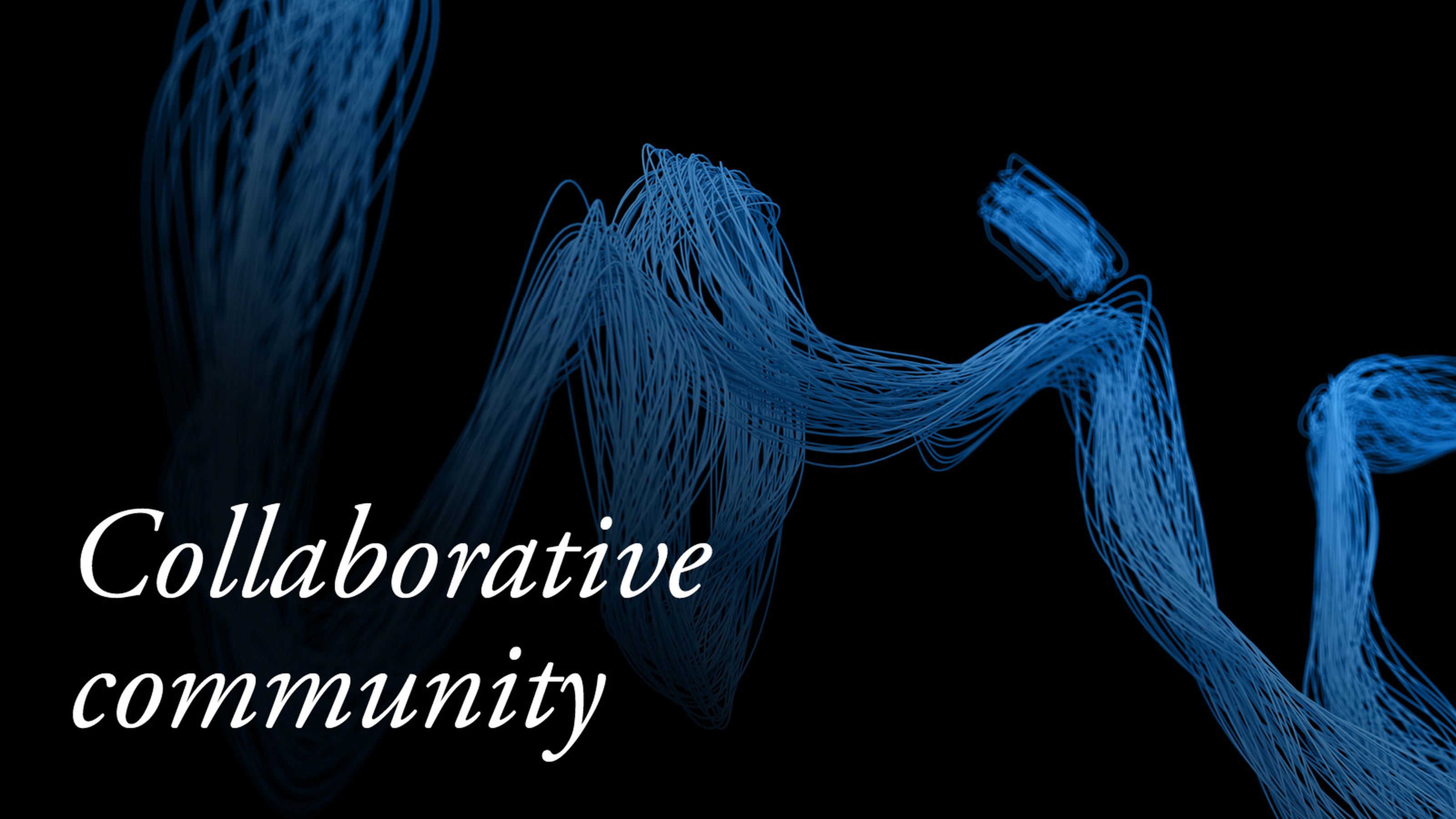
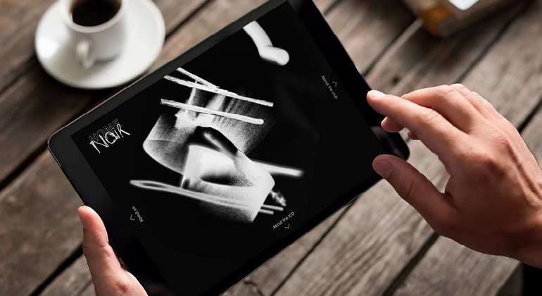
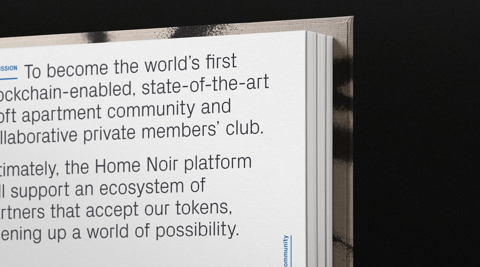
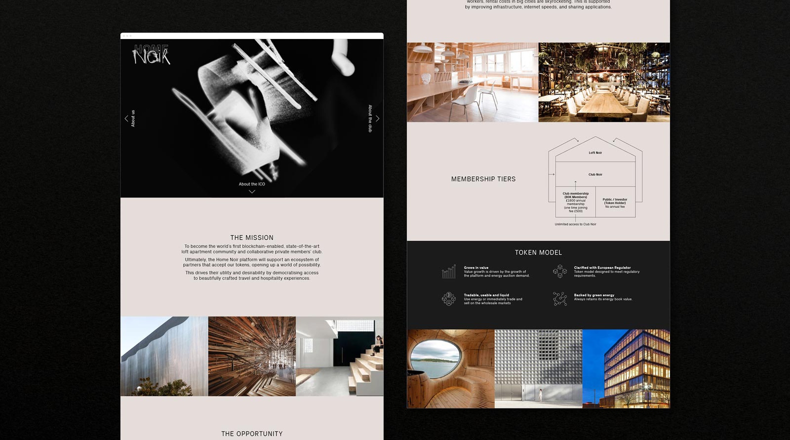
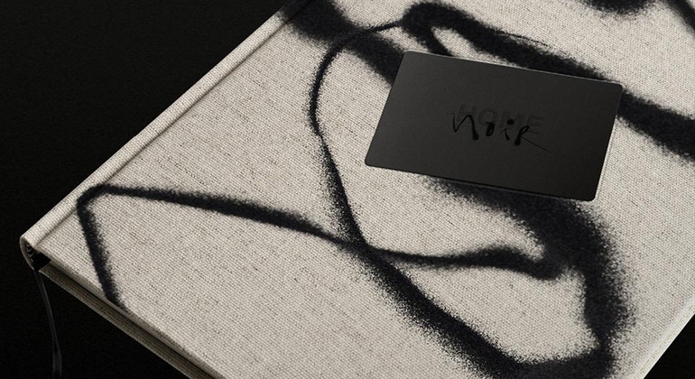
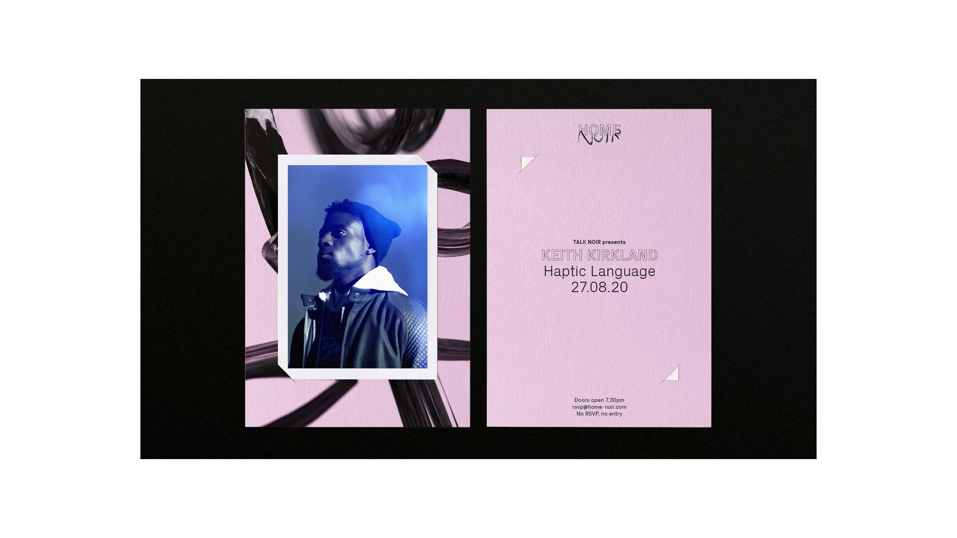
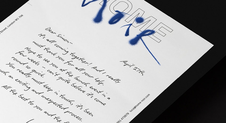
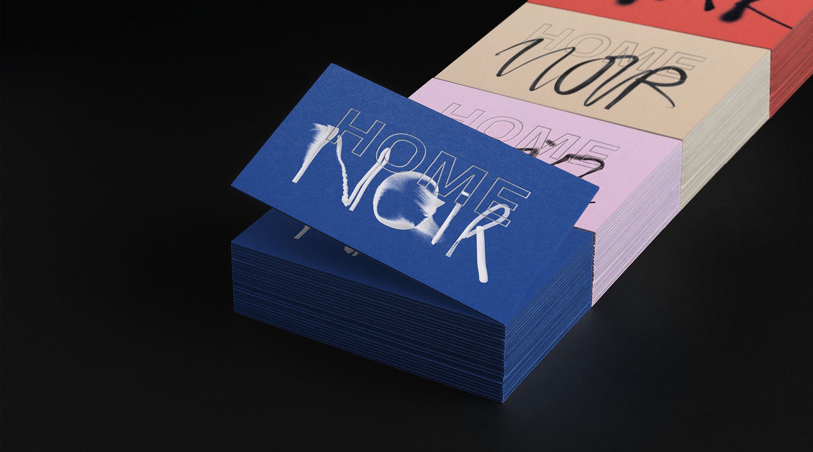
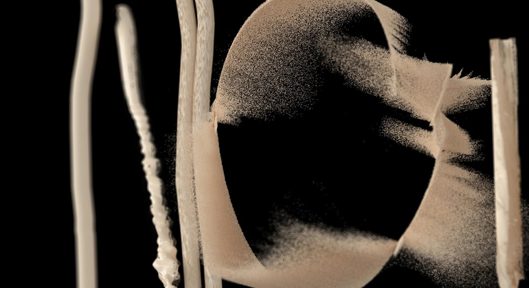
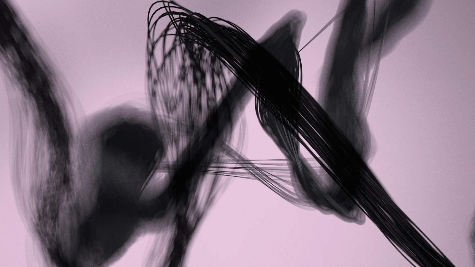
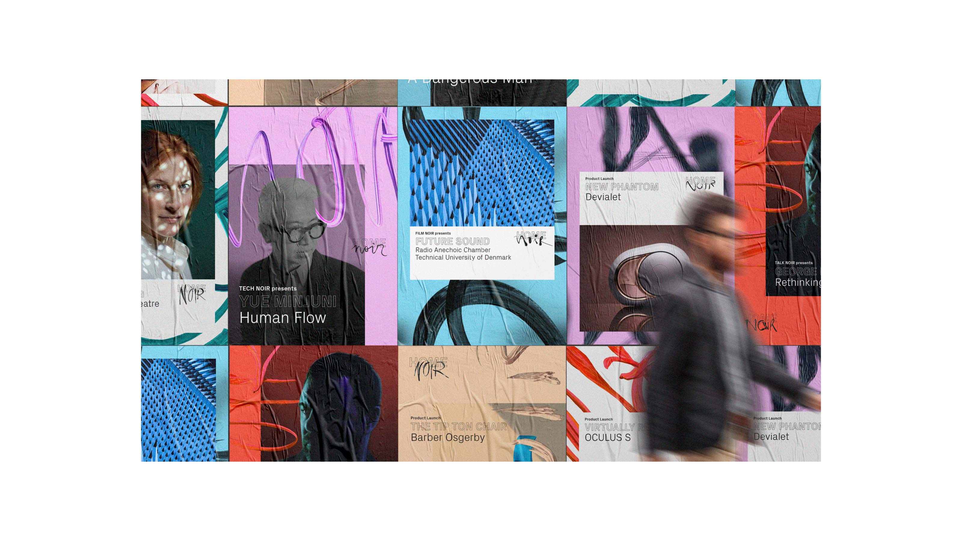
Home Noir — Brand Identity
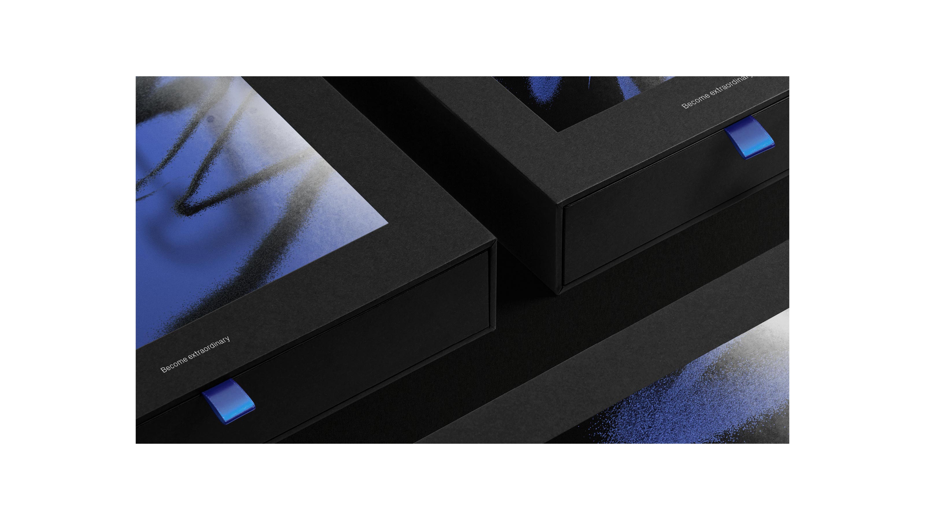
Home Noir is the place where technology and creativity meet. Part private members club part collaborative community, it’s a growing team of engineers, creators, economists, researchers, idealists and activists brought together to celebrate the beauty of invention. And, all made possible using blockchain currency, naturally.
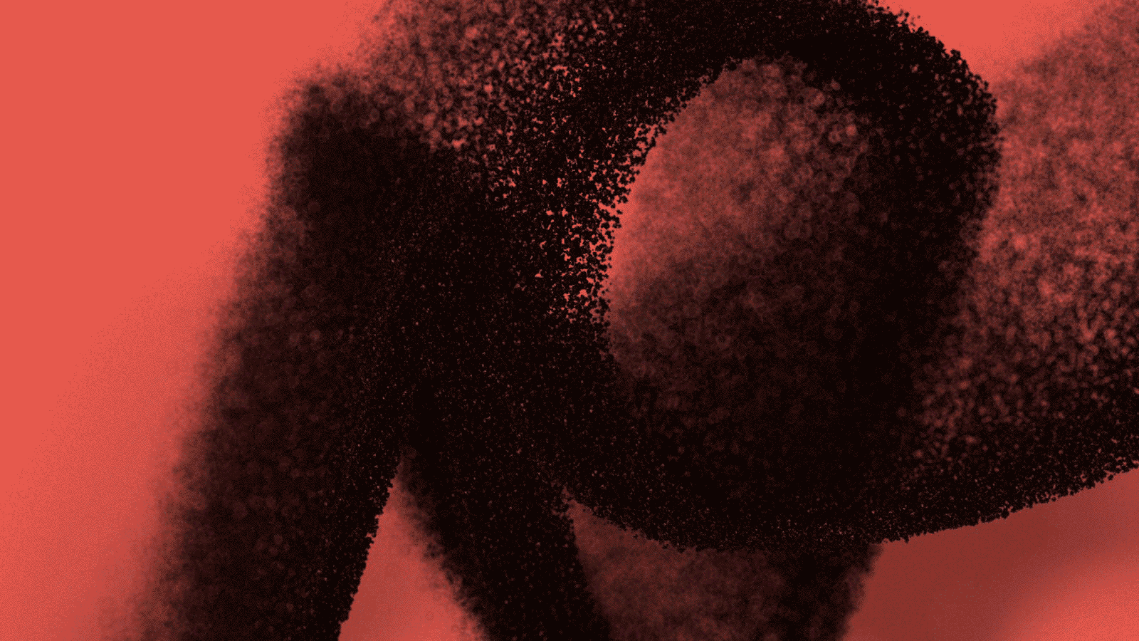
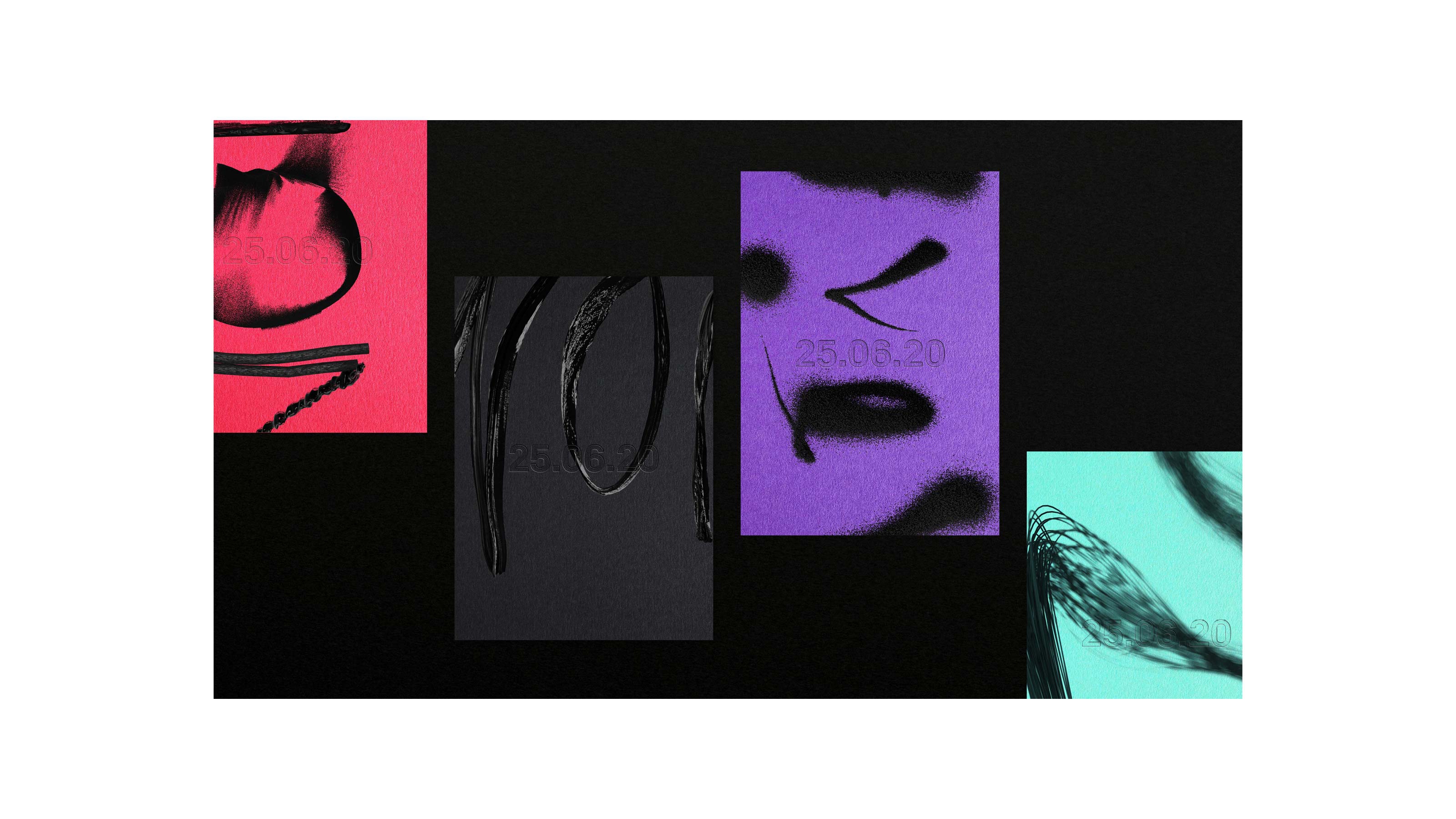
The identity is built around a series of dynamic typographic and textural experiments that allude to both the iterative nature of the creative process and the human side of technology. An identity that’s never the same twice yet remains inimitably Home Noir.
3D Motion Design by Colors And The Kids
Zag, BBH London Concept & Brand Identity
The identity is built around a series of dynamic typographic and textural experiments that allude to both the iterative nature of the creative process and the human side of technology. An identity that’s never the same twice yet remains inimitably Home Noir.
3D Motion Design by Colors And The Kids


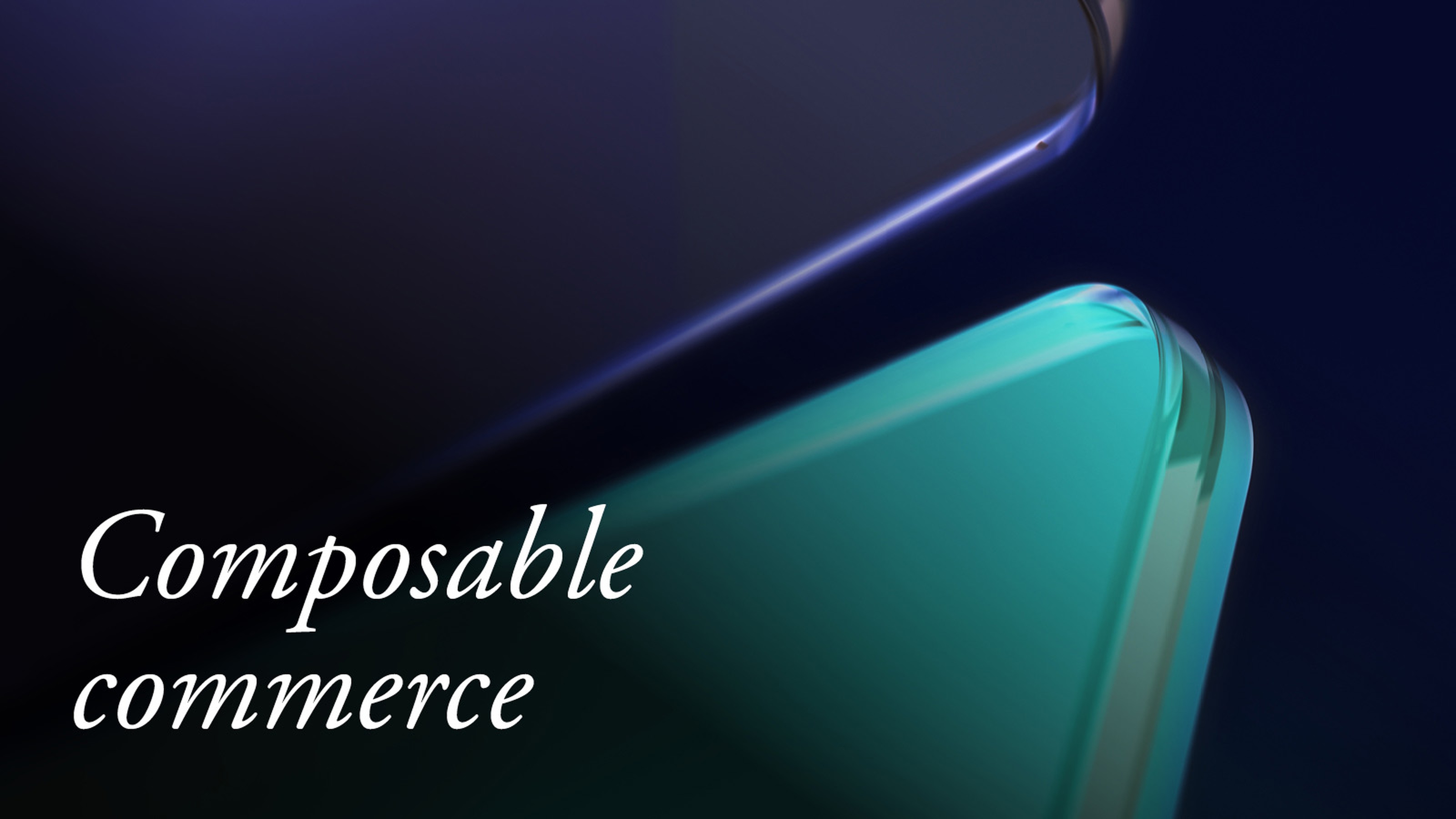
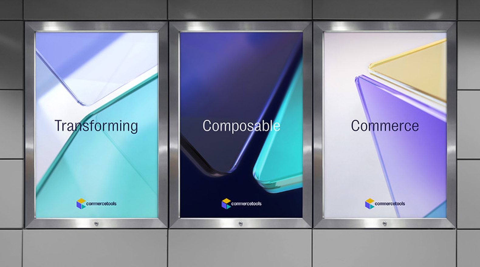
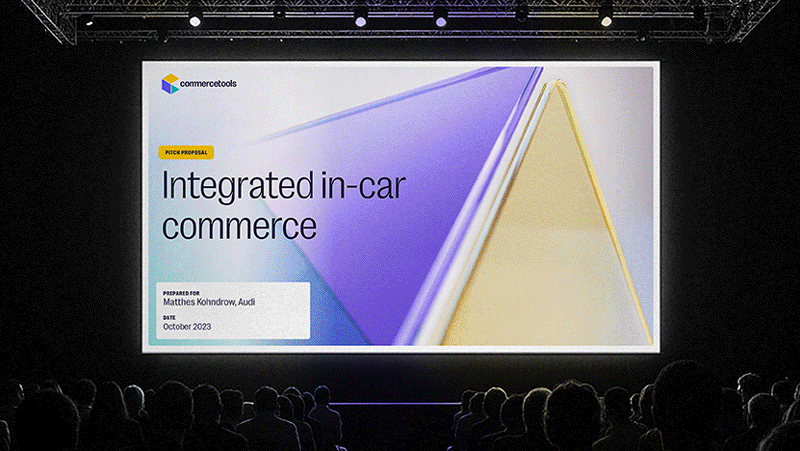
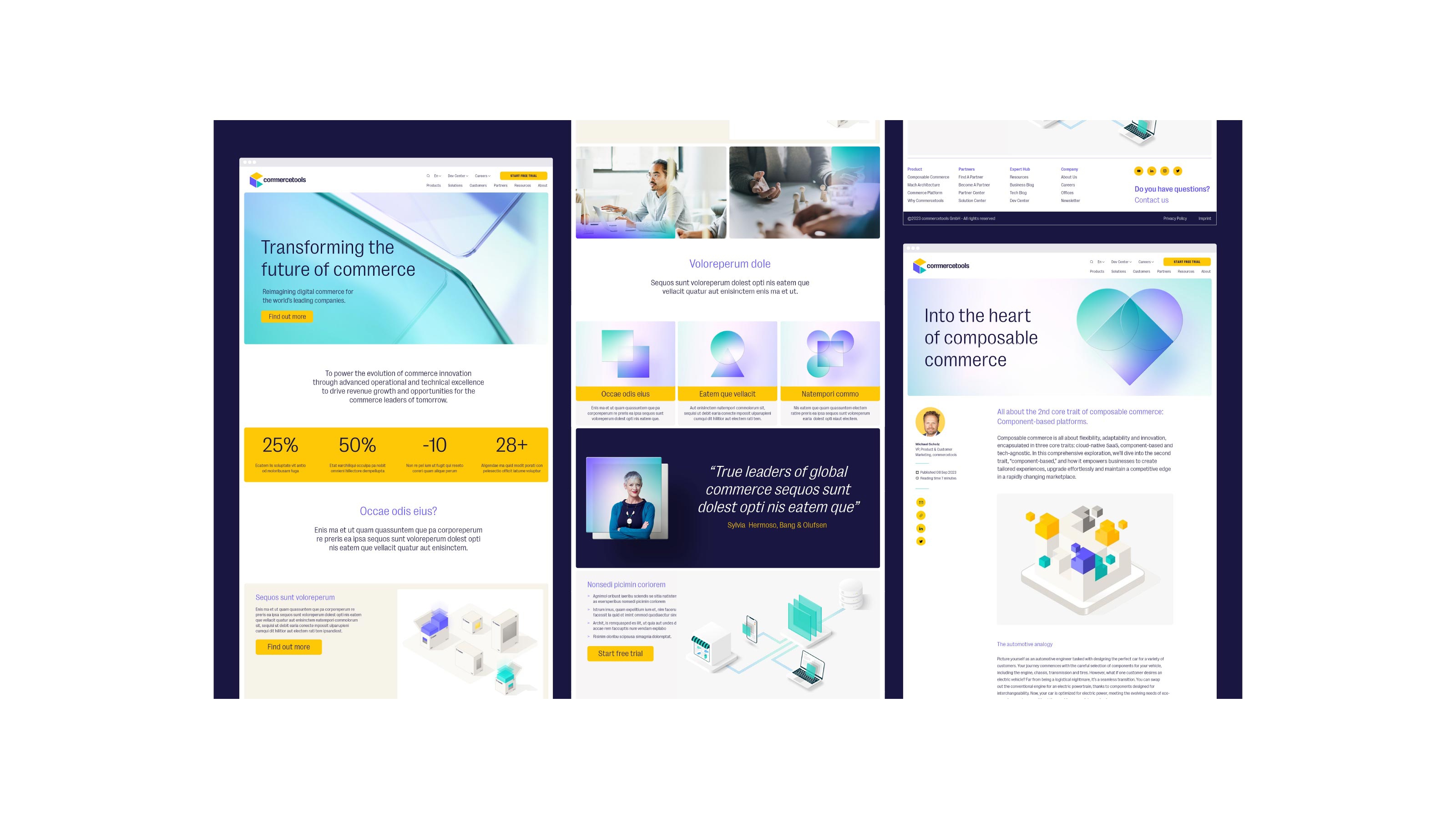
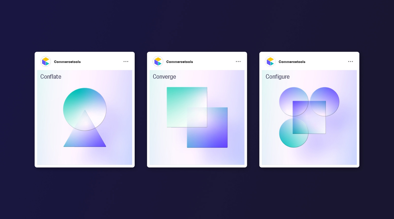
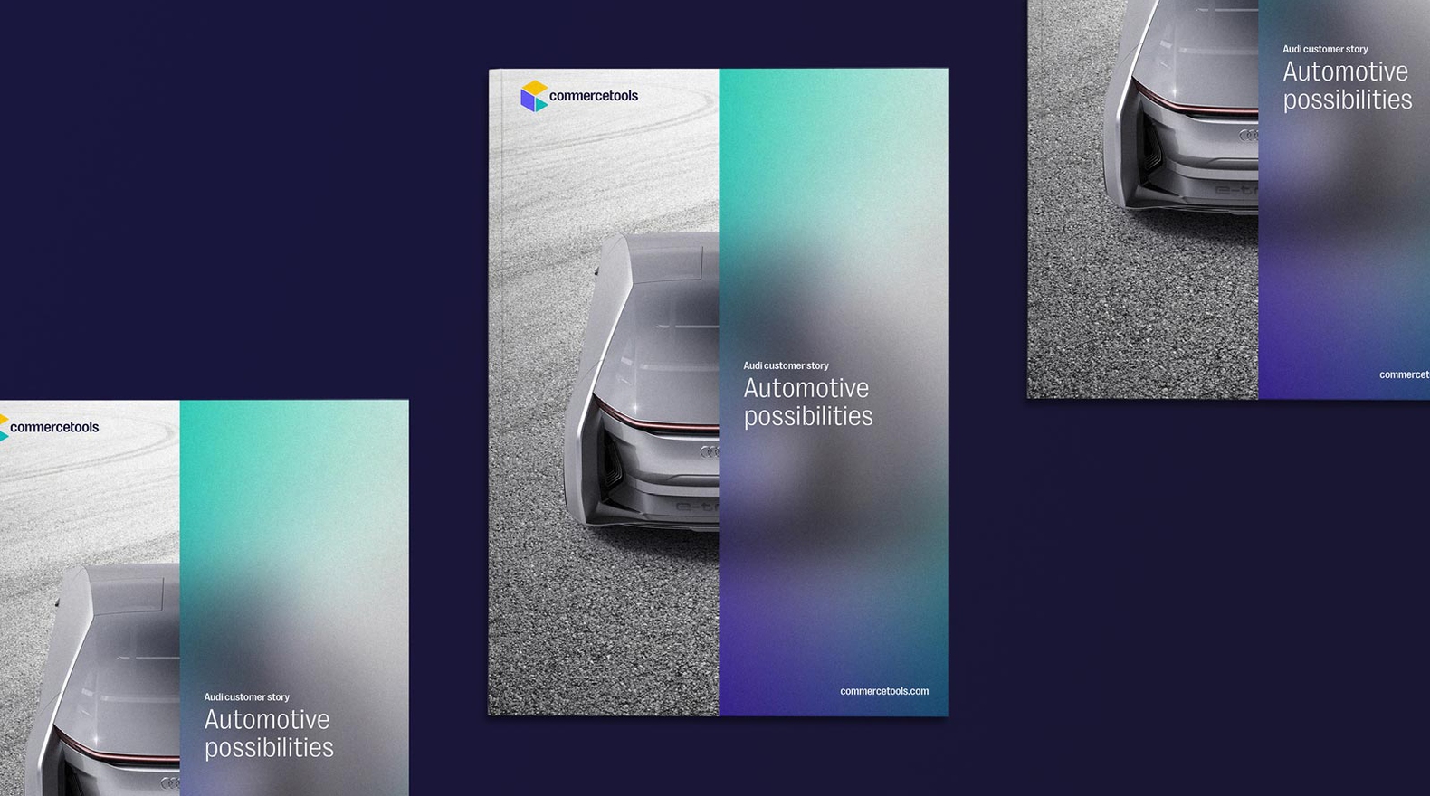
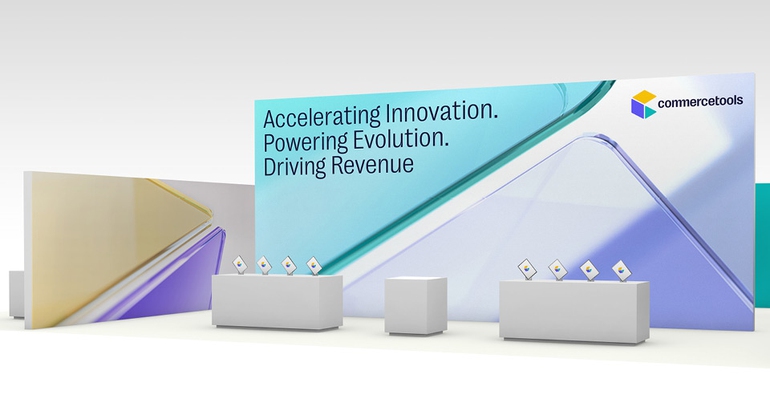
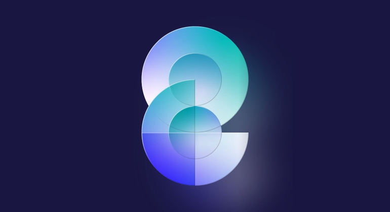
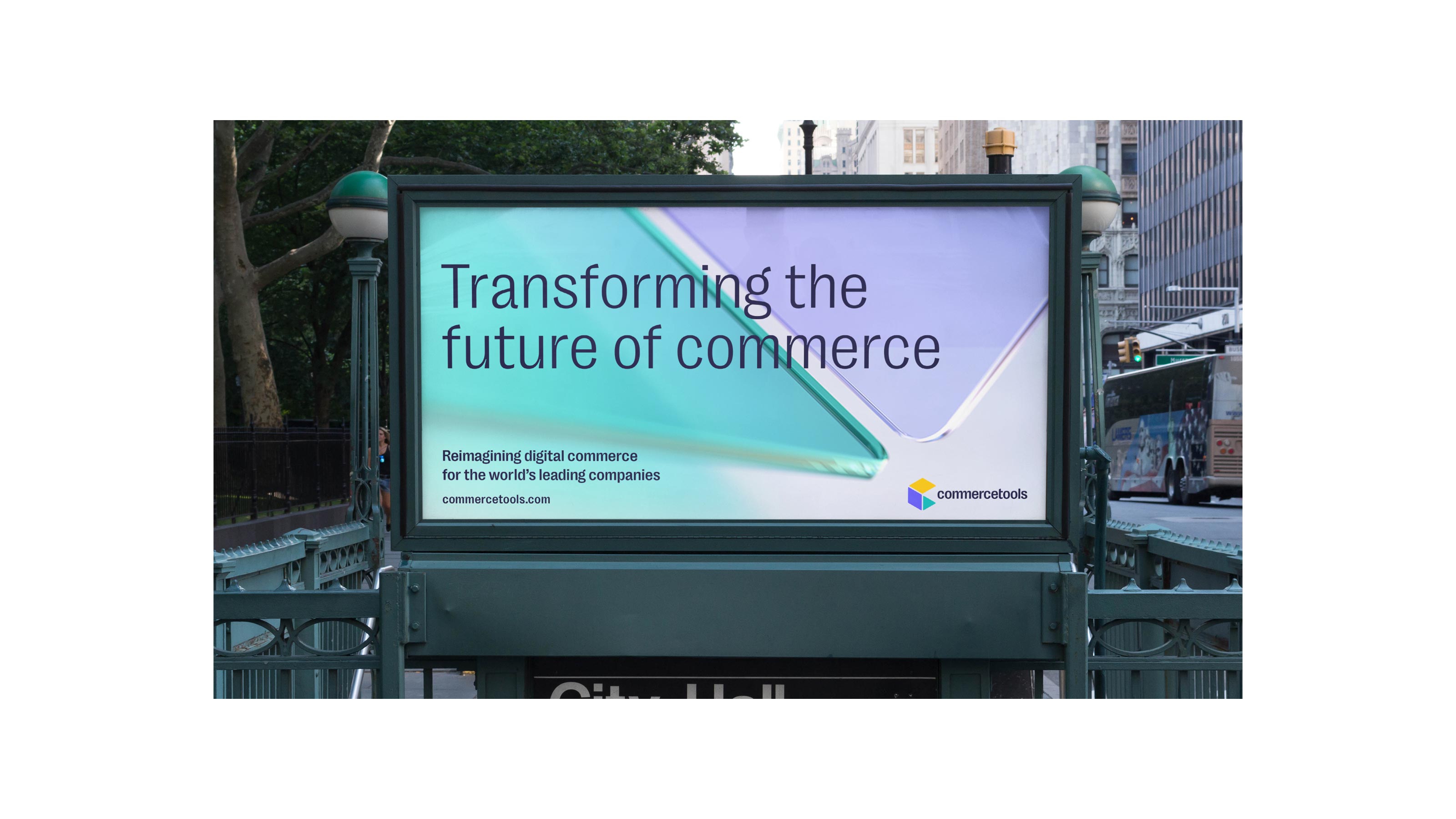
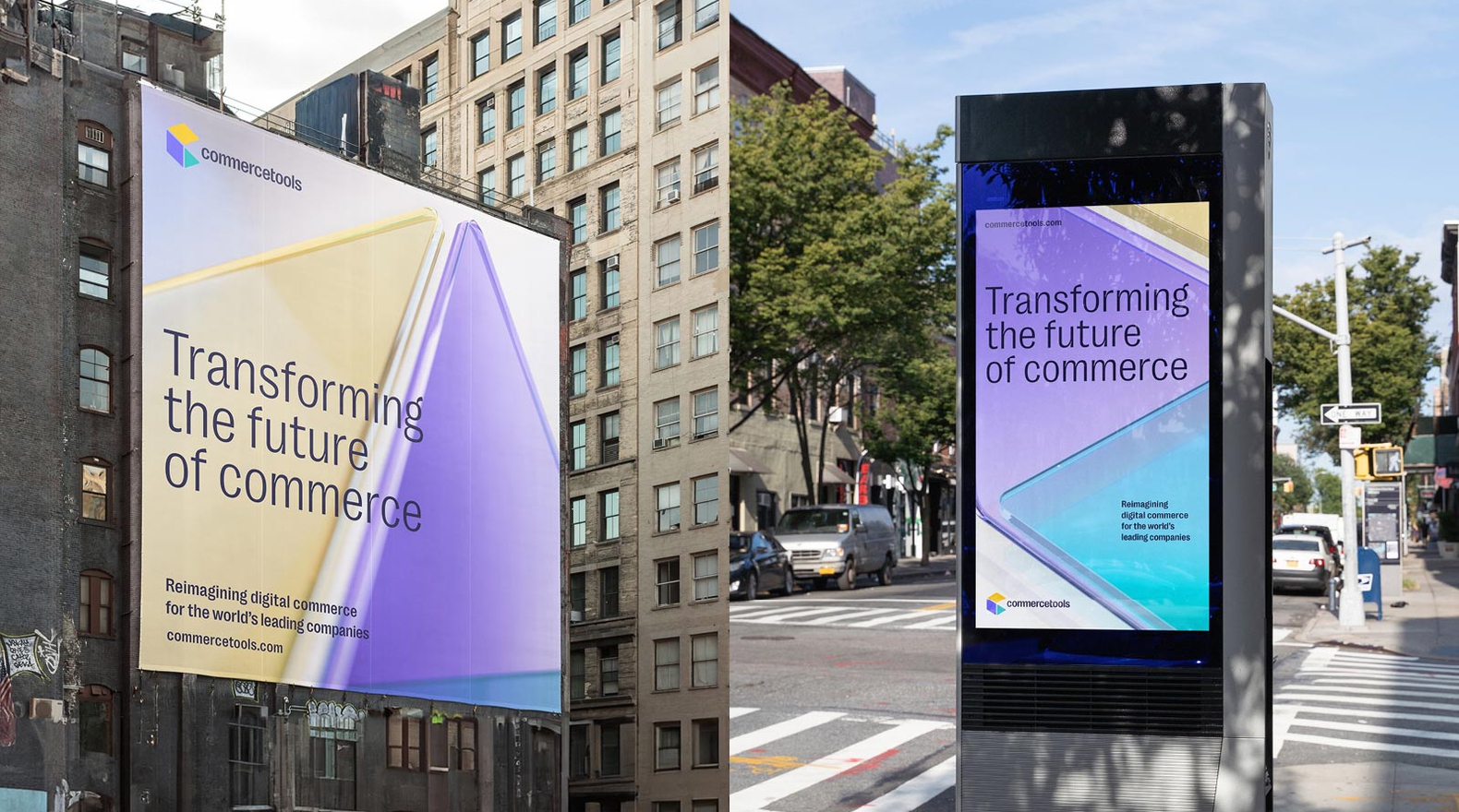
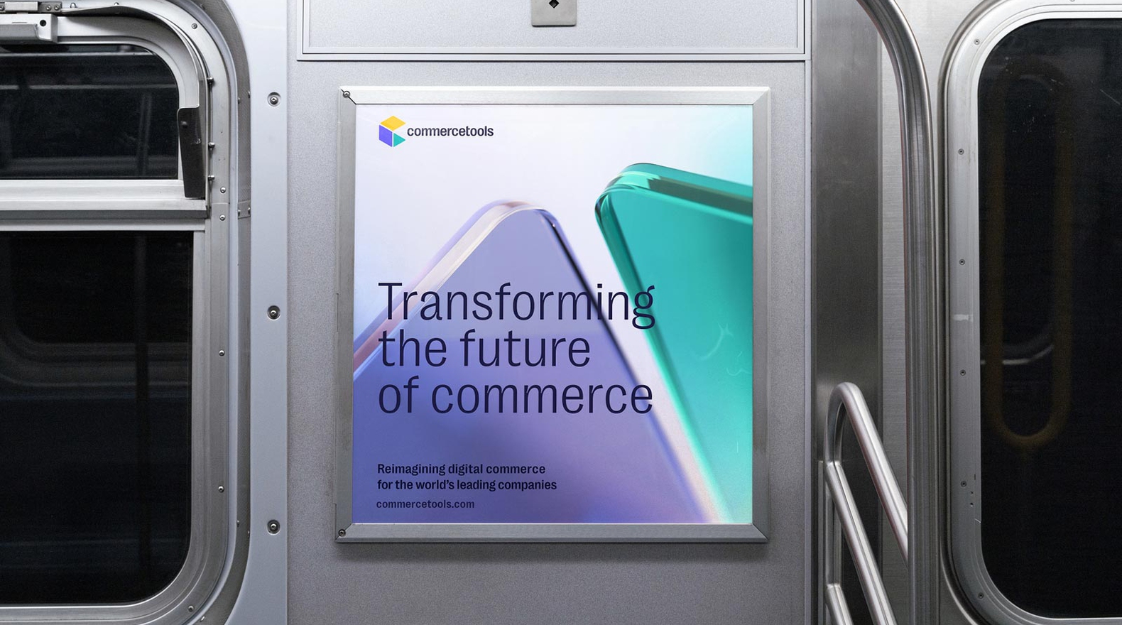
Commercetools — Brand Identity
Commercetools is a global leader in composable commerce, pioneering intelligent, AI-driven solutions for the future of retail. The new identity mirrors the brand’s dynamic, intuitive, and innovative spirit – an adaptable system built to evolve as fast as the technology it powers.
Styles+Partners Brand Identity


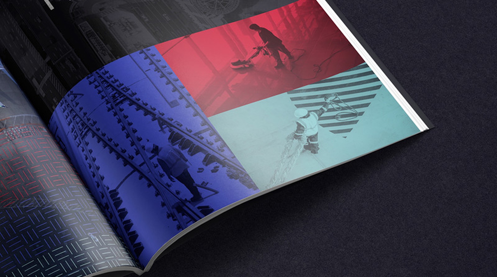
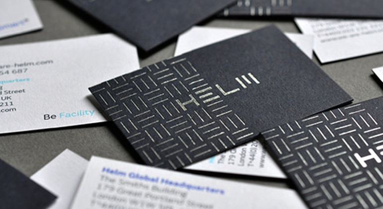
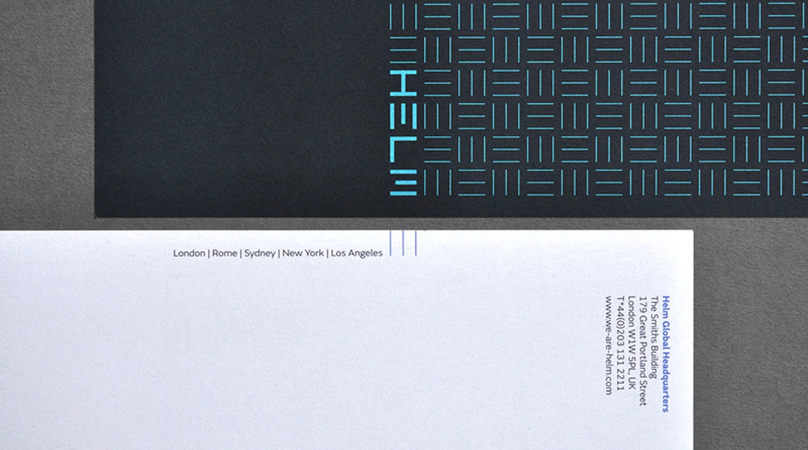
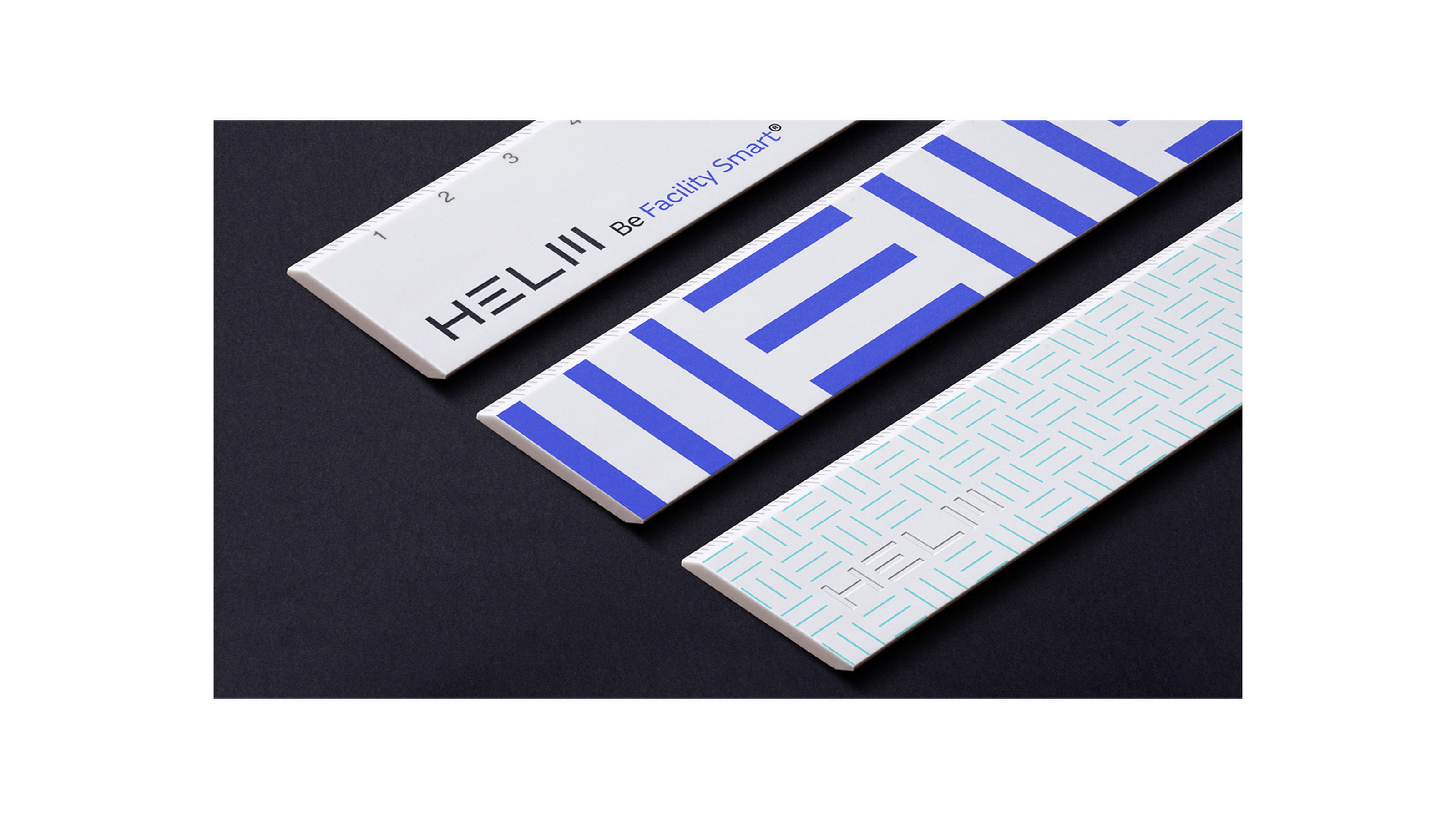
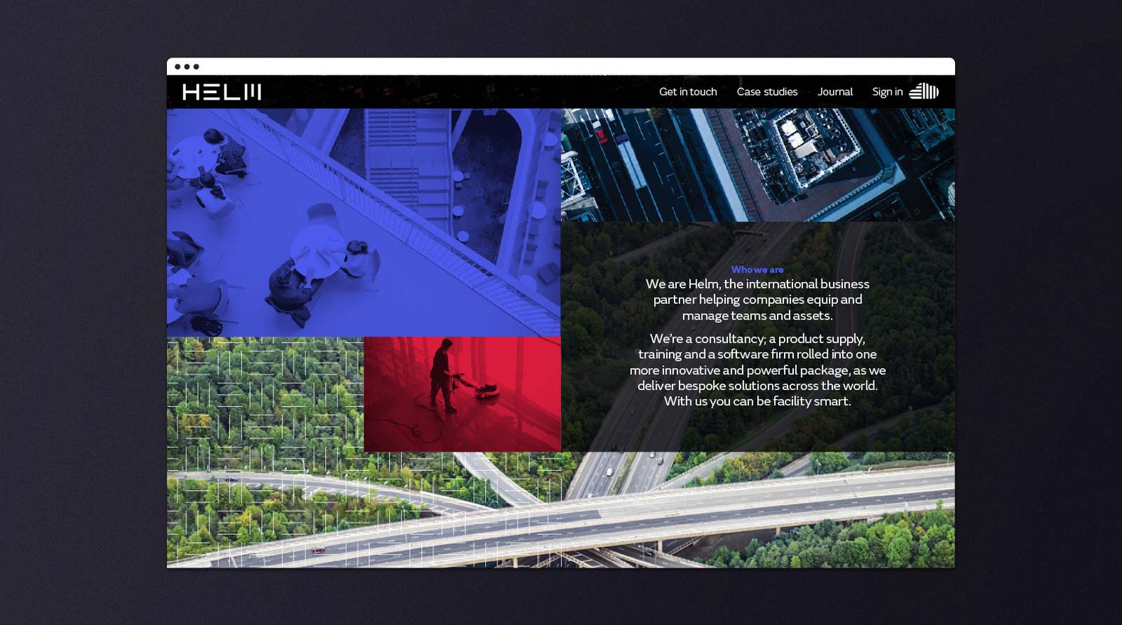
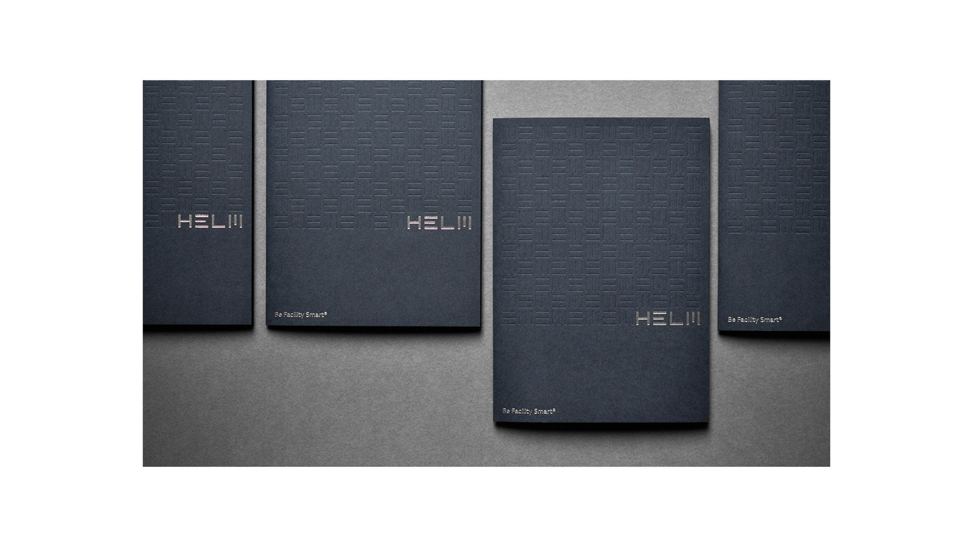
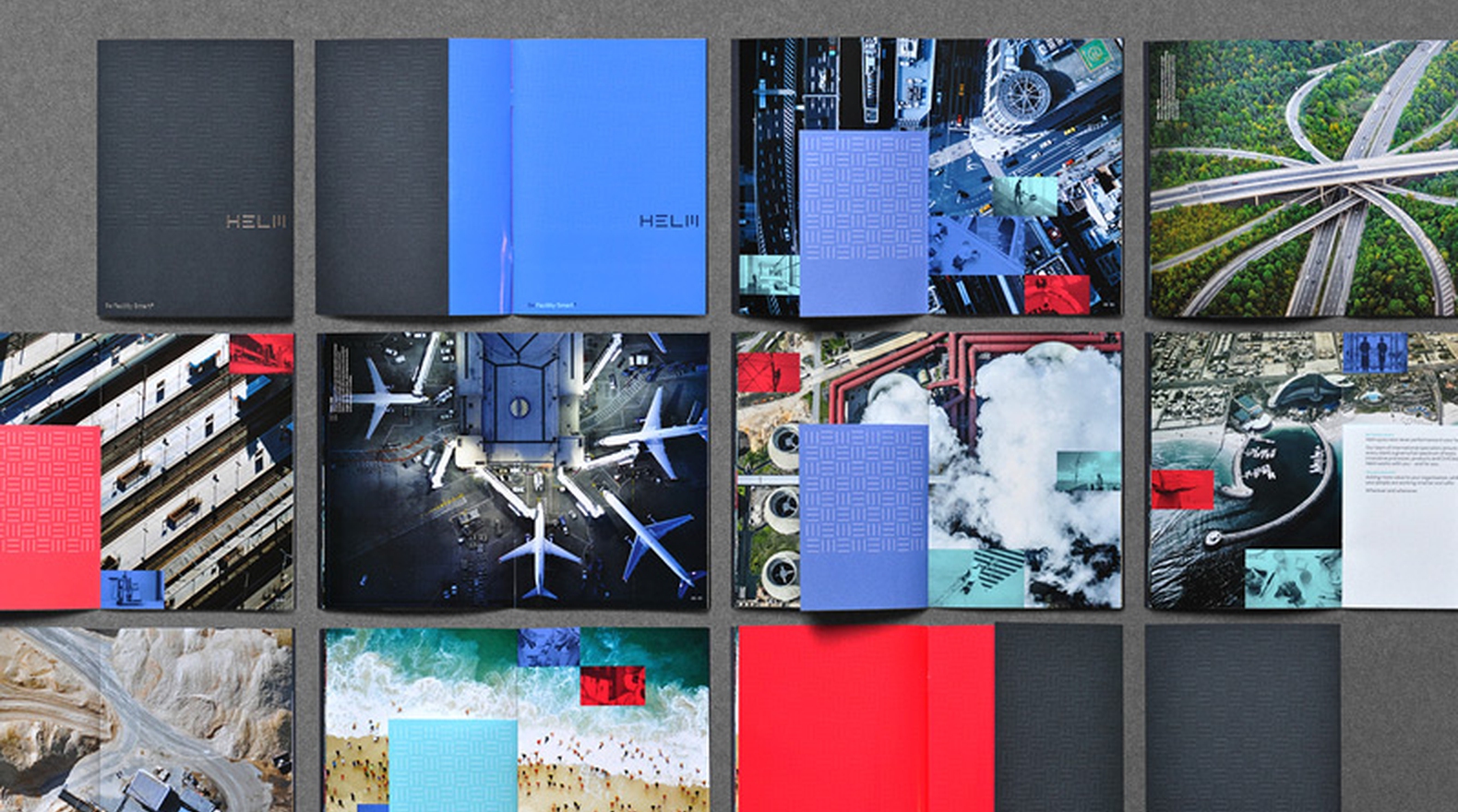
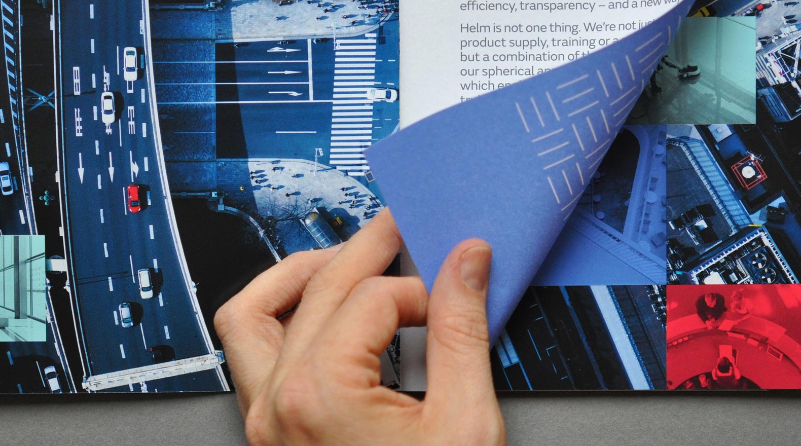
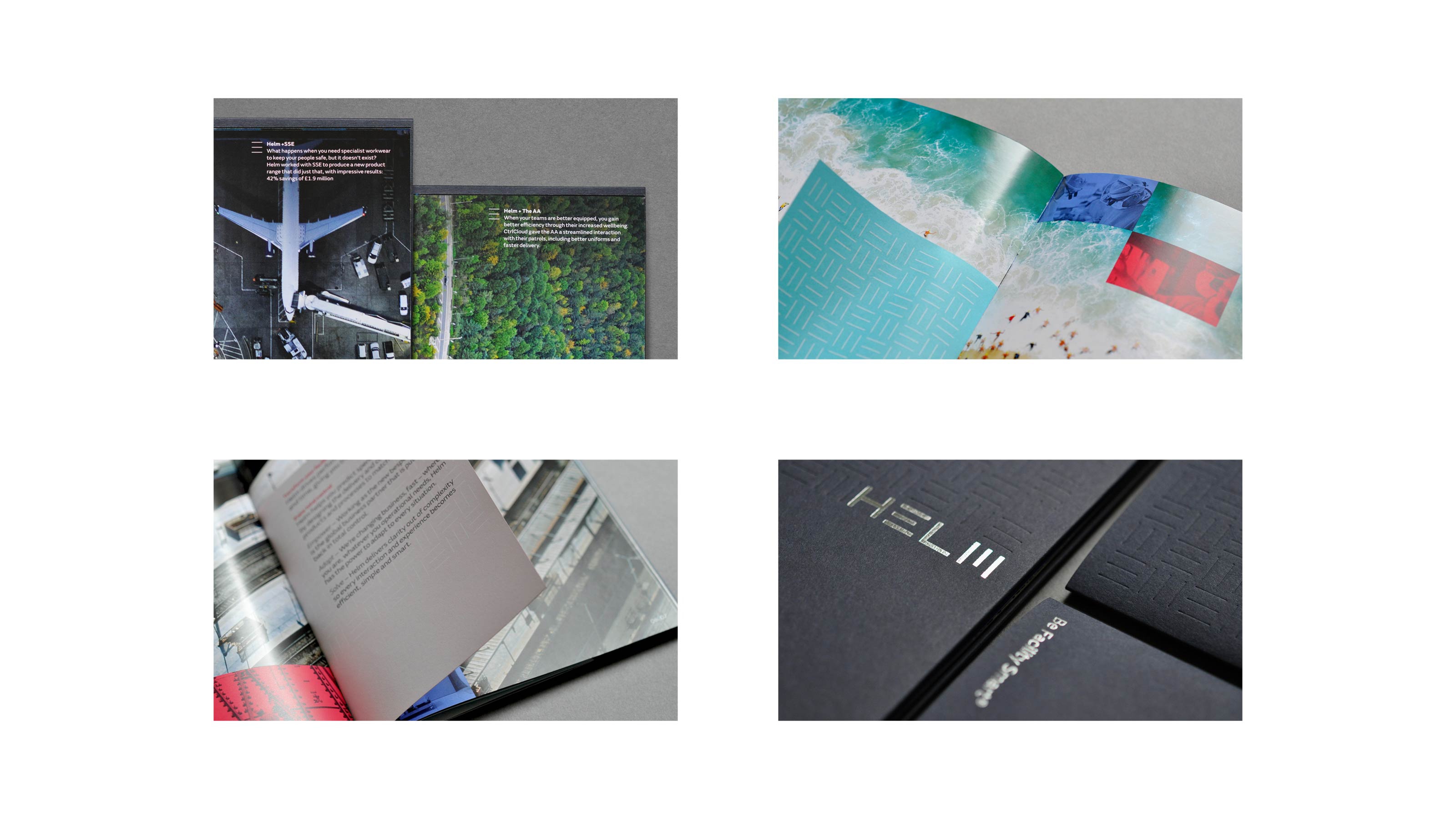
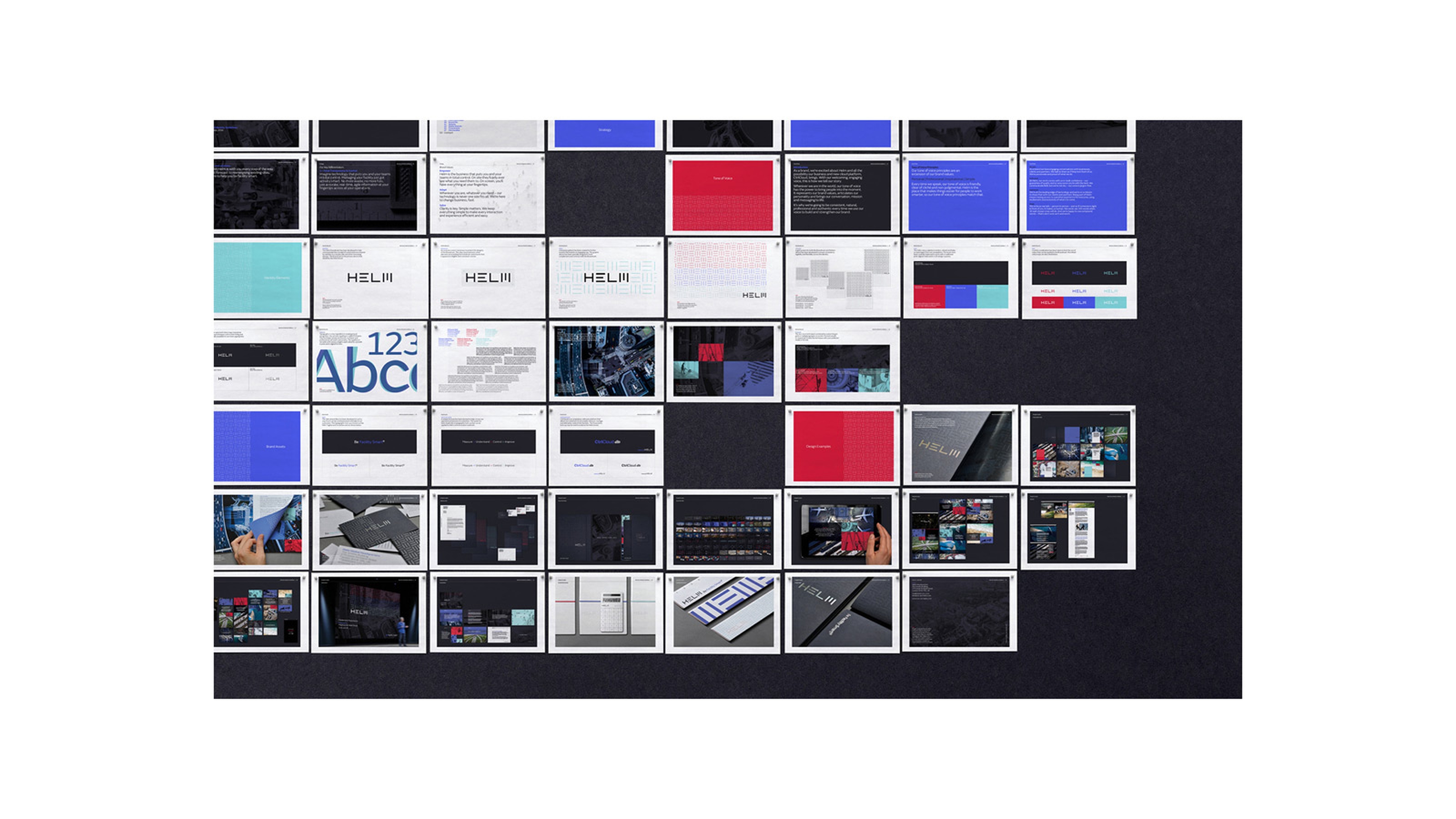
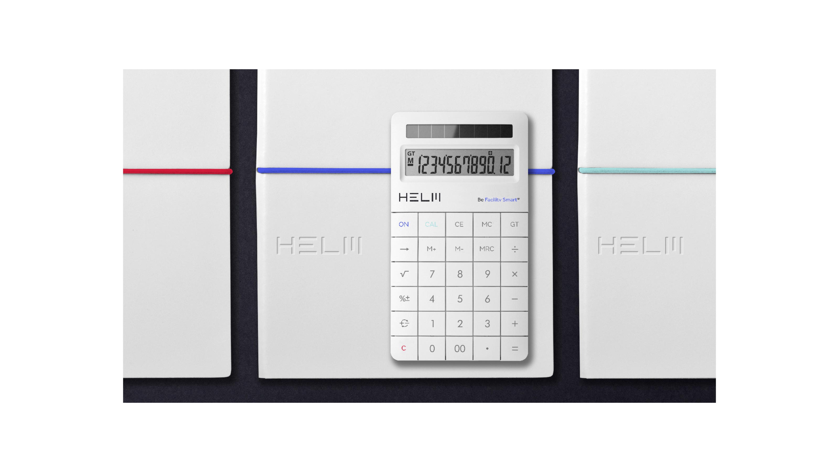
Helm — Brand Identity
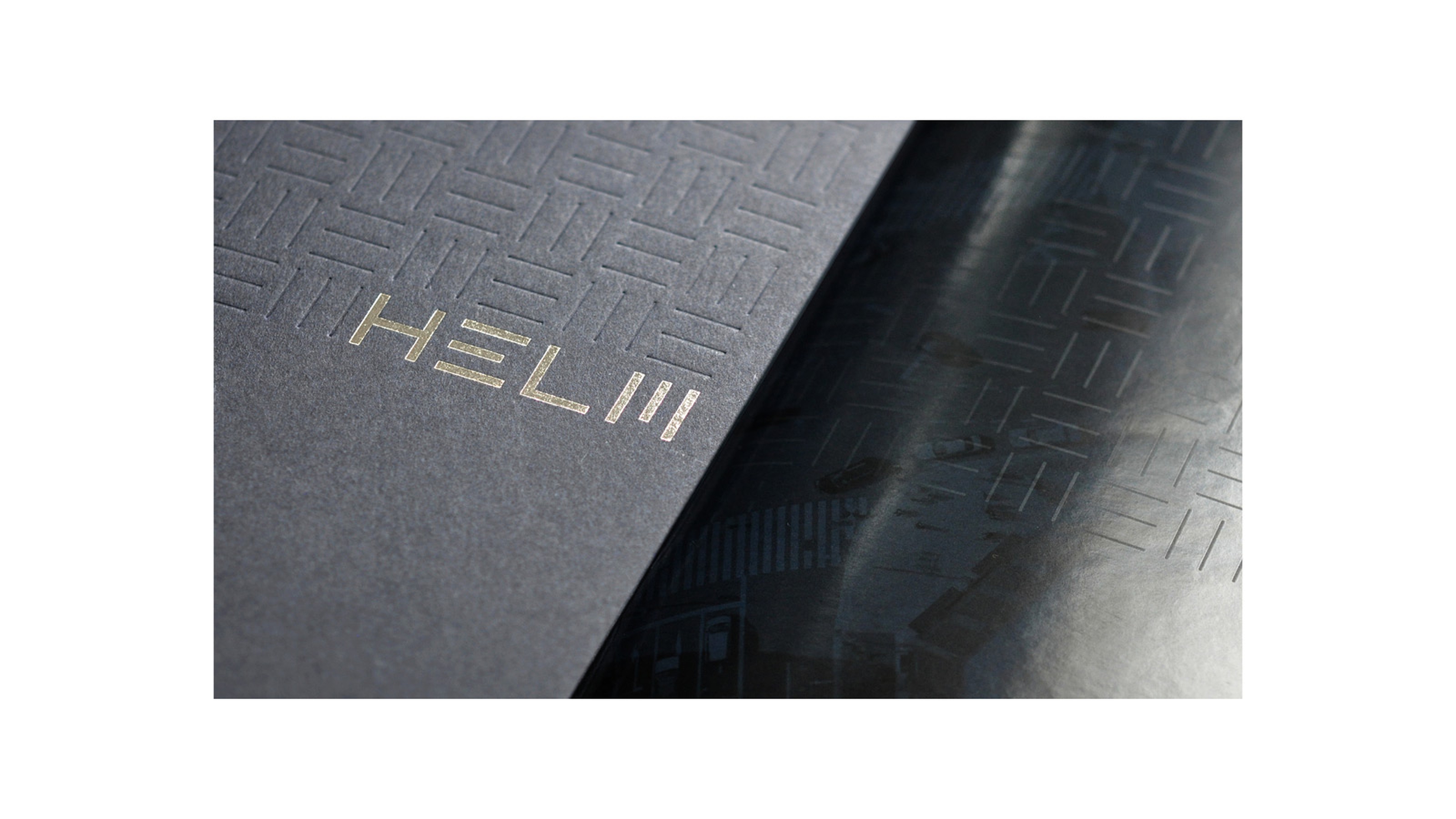
Helm is more than just a facilities management company, through smart cloud technology they enable customers across the globe to have ultimate control of their business. Inspired by the humble ruler, the identity alludes to measurement and control using a precise graphic system with which the brandmark perfectly integrates.
Animation & Motion Design byMatthew Halls
Make Lab Strategy & Naming, full programme Brand Identity
Animation & Motion Design by
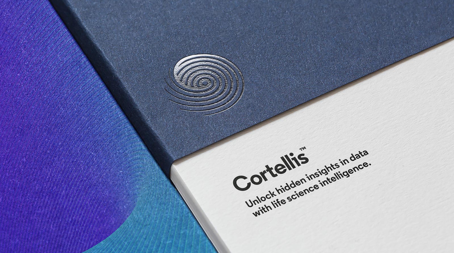
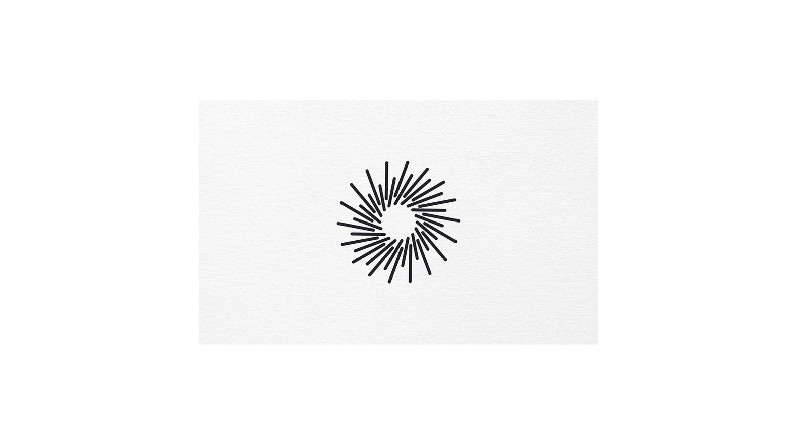
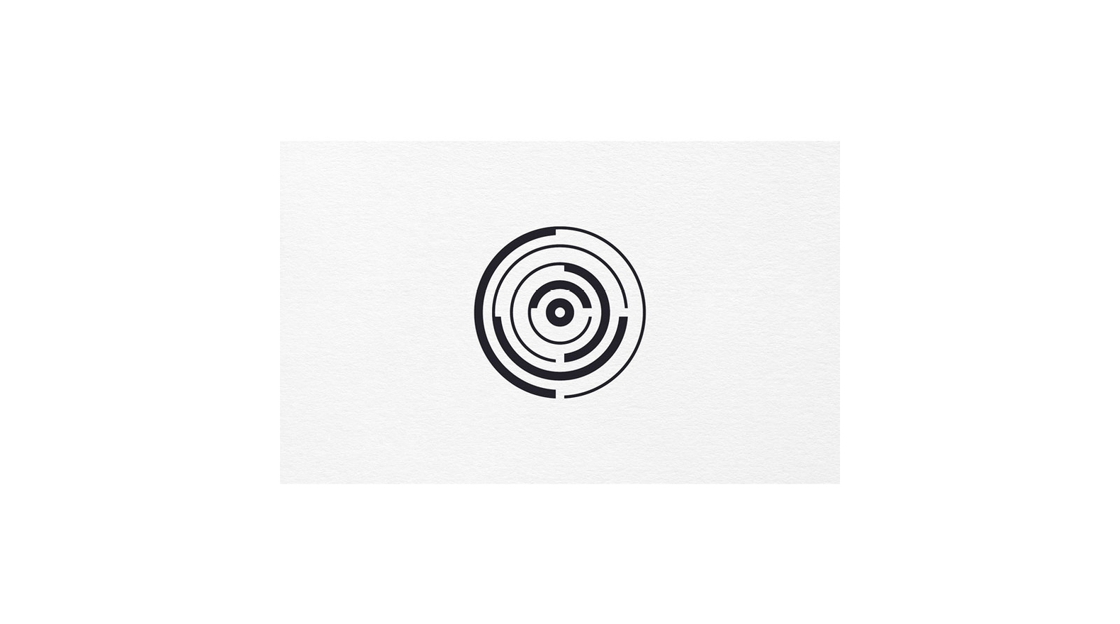
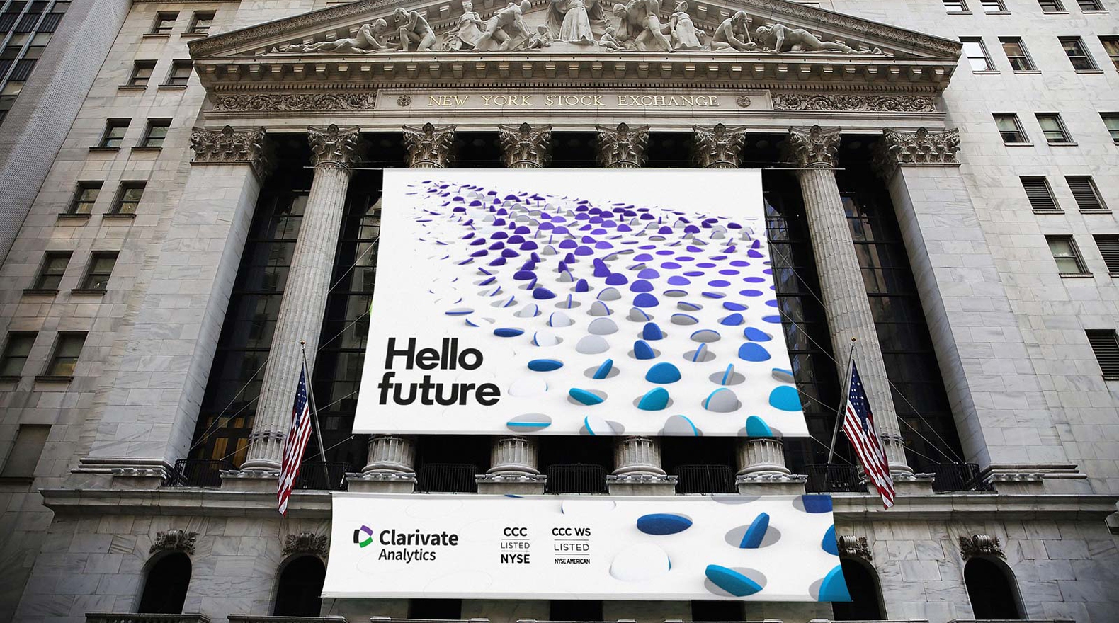
Clarivate Analytics — Brand Identity
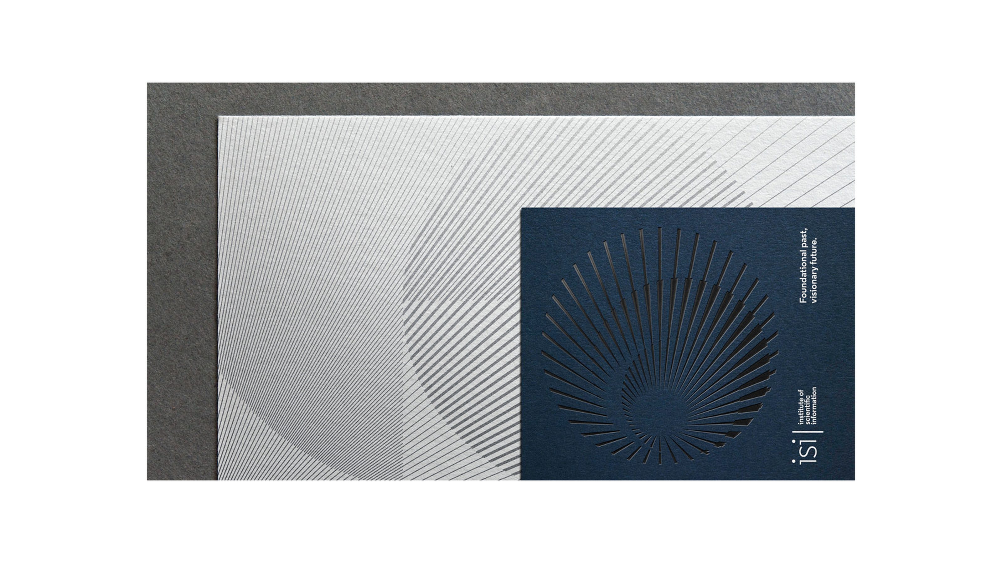
Clarivate Analytics is a global leader in providing trusted insights and data analytics ‘to help accelerate the pace of innovation’ for the life sciences sector. The task was to bring together its flagship brands under the masterbrand, yet allowing each flagship to express individual character.
Re Agency, M+C Saatchi Symbol & Logo Design
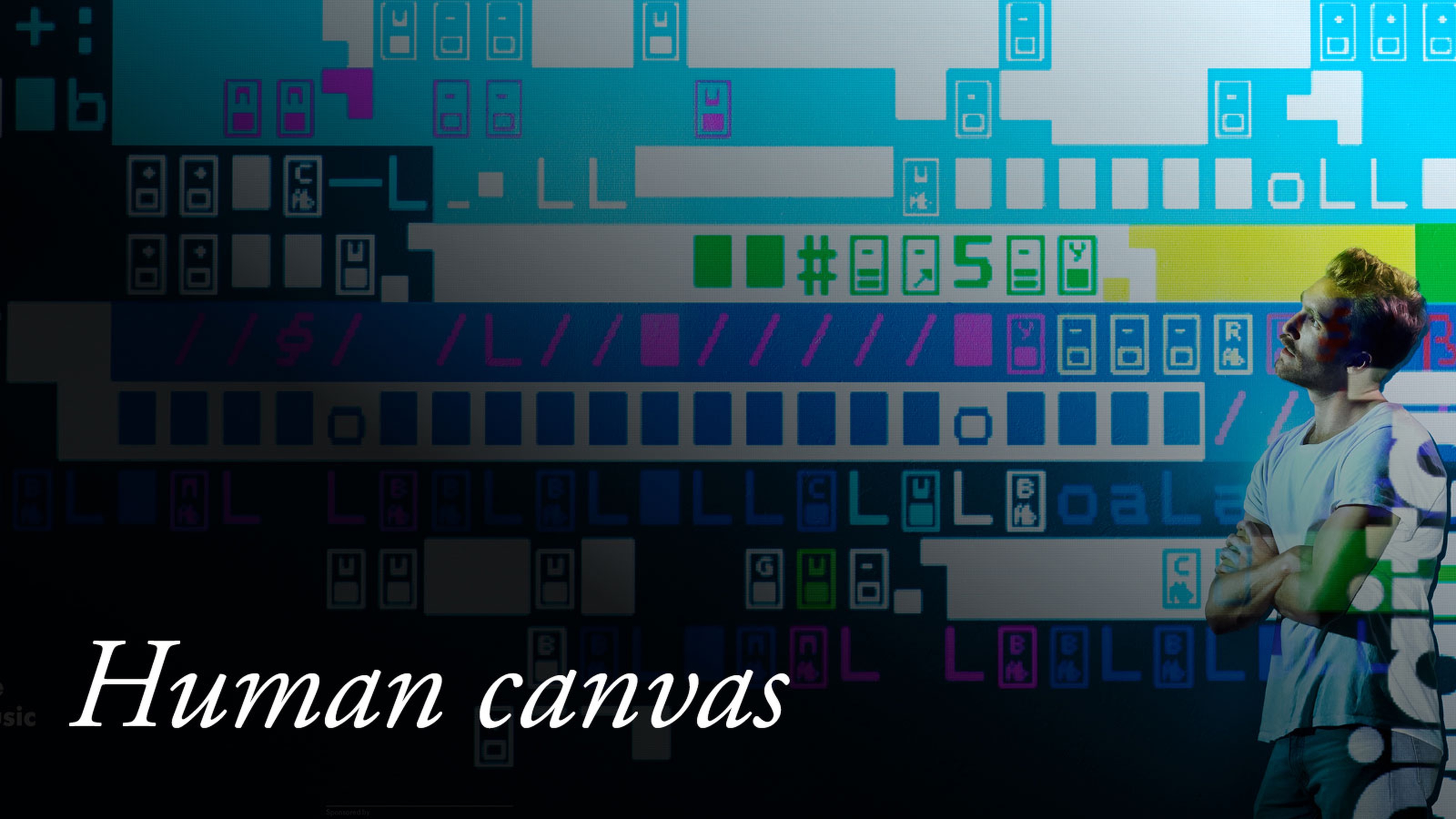
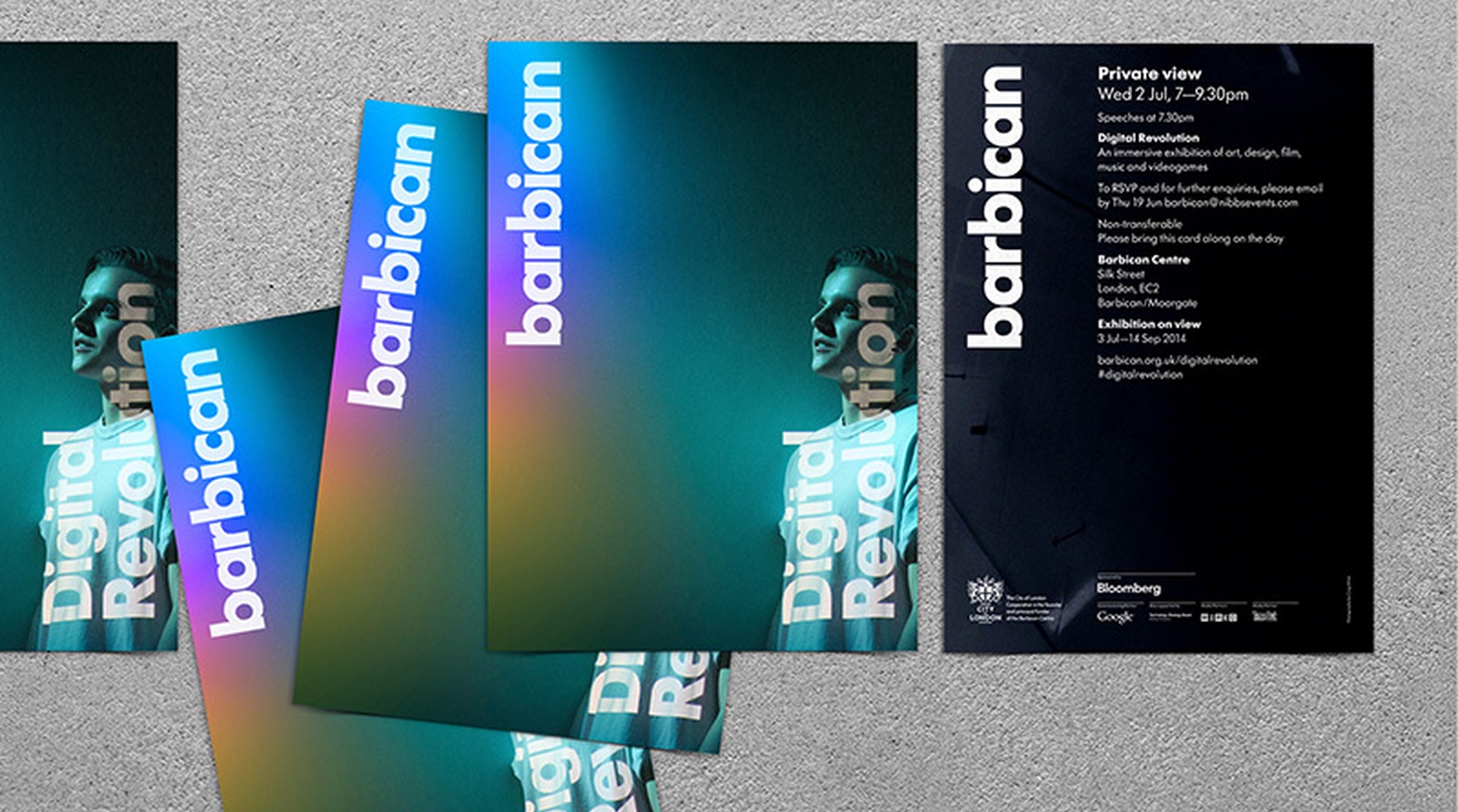
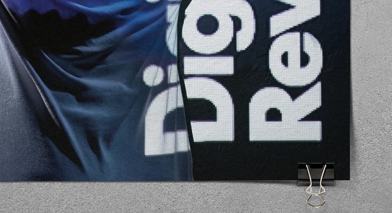
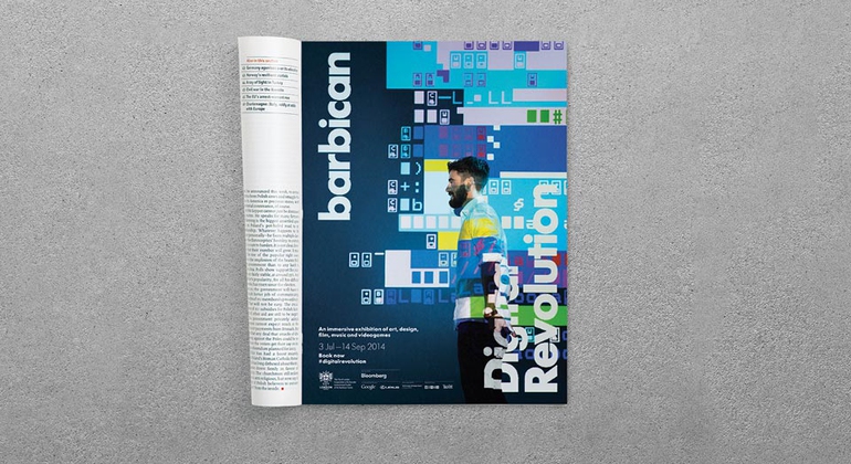
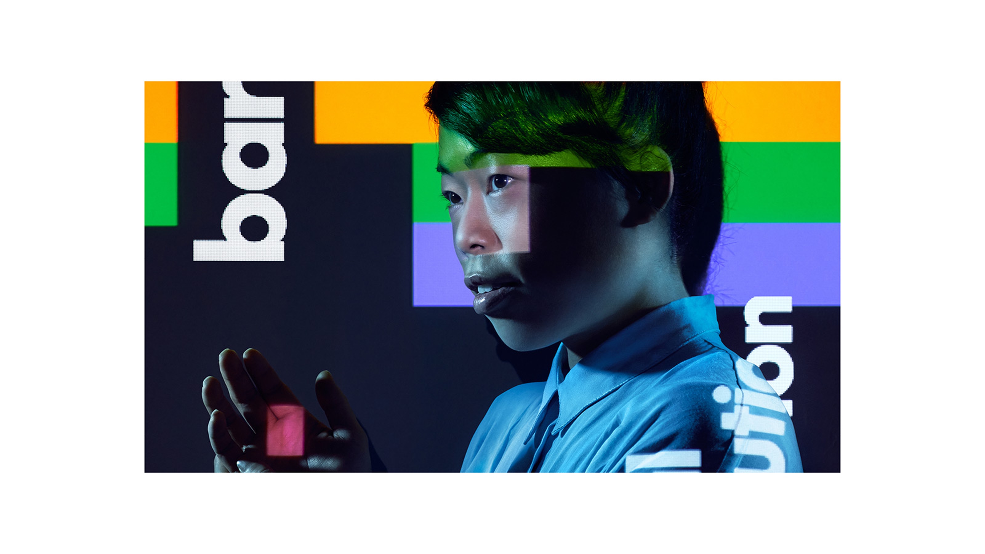
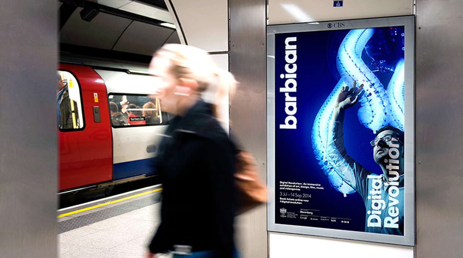
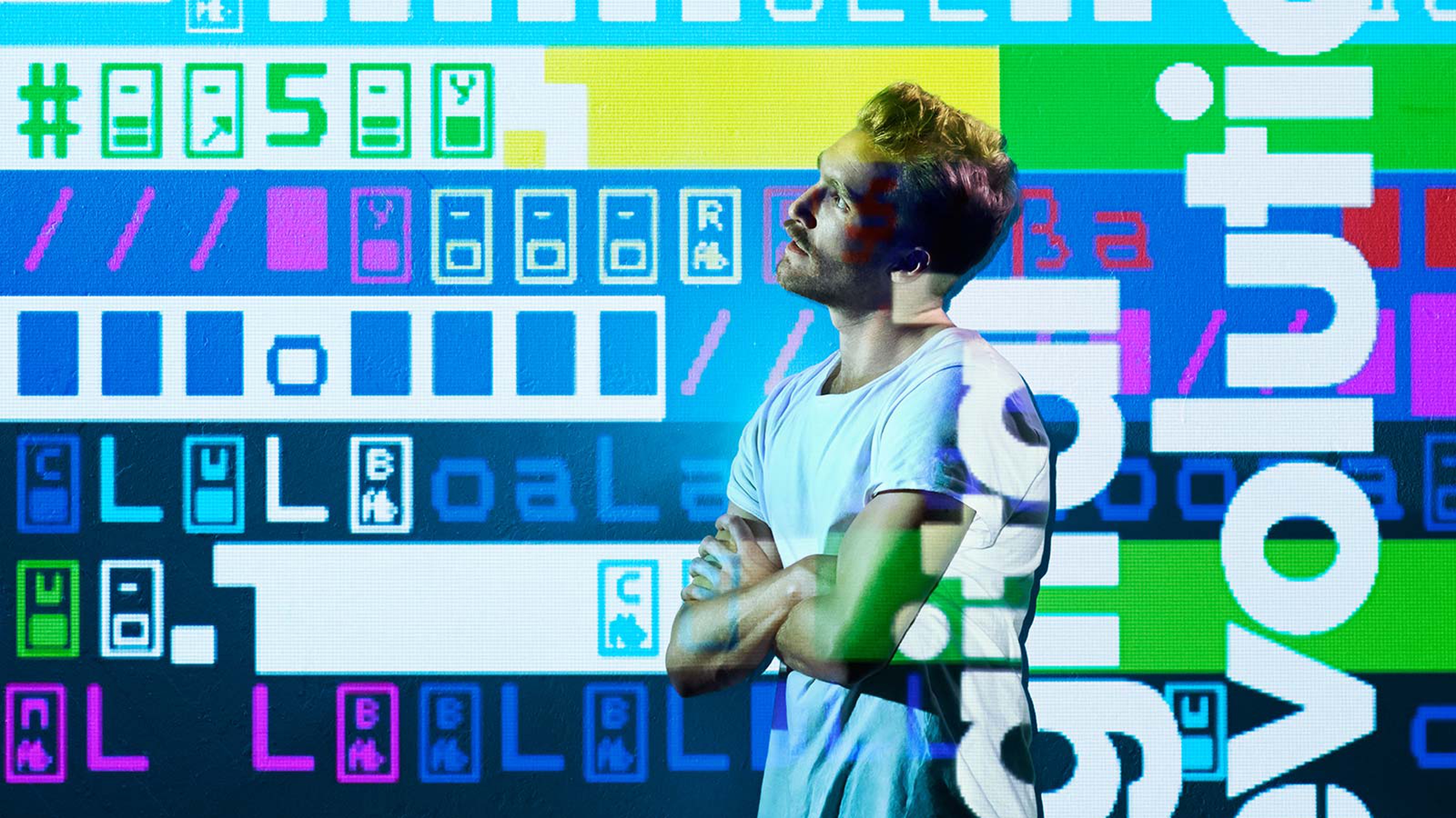
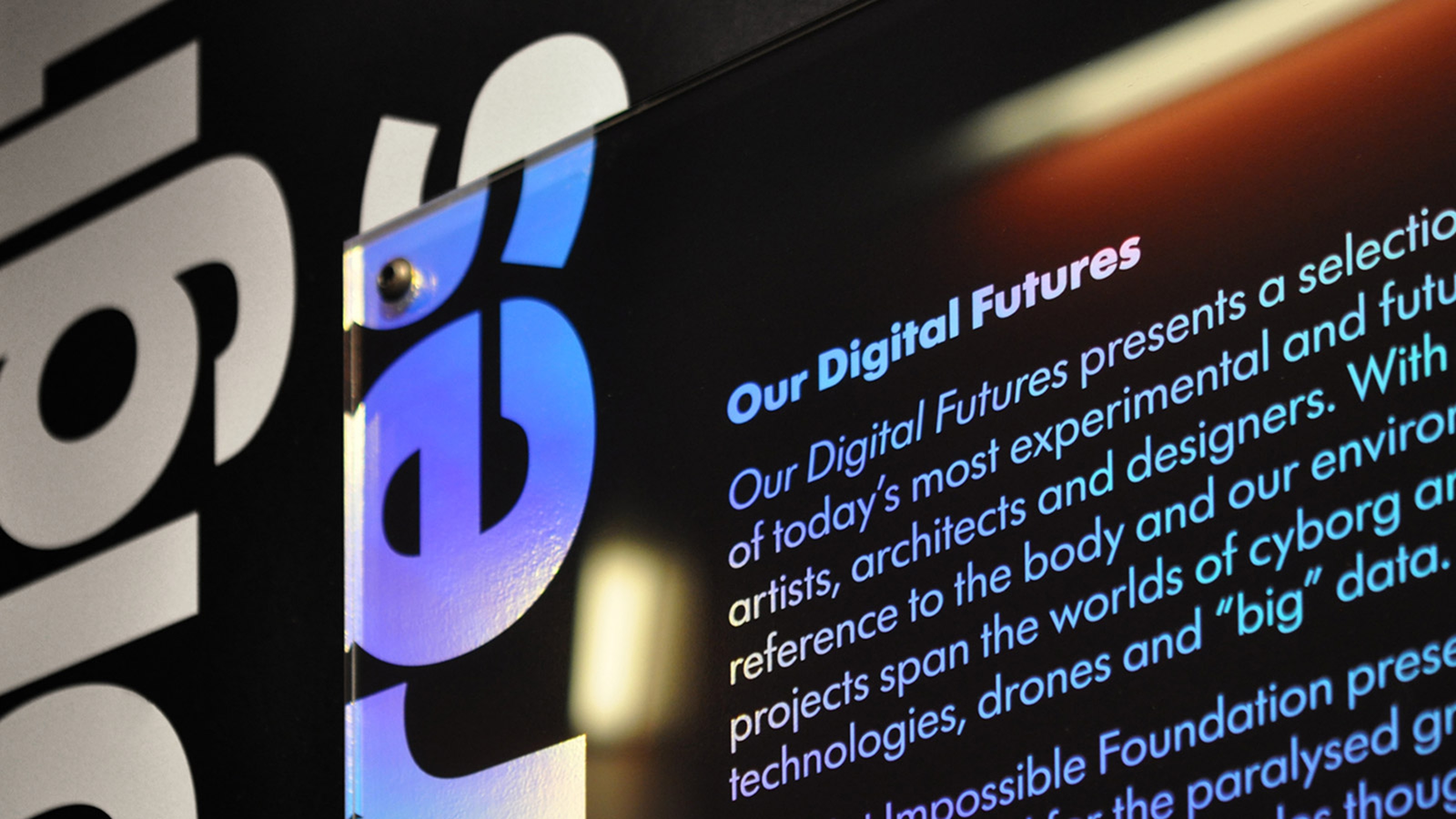
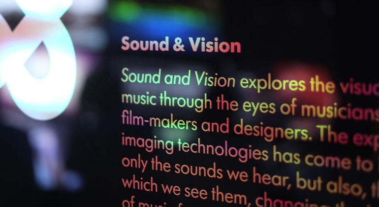
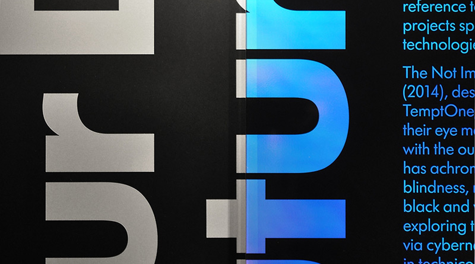
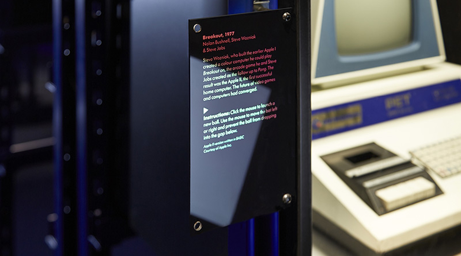
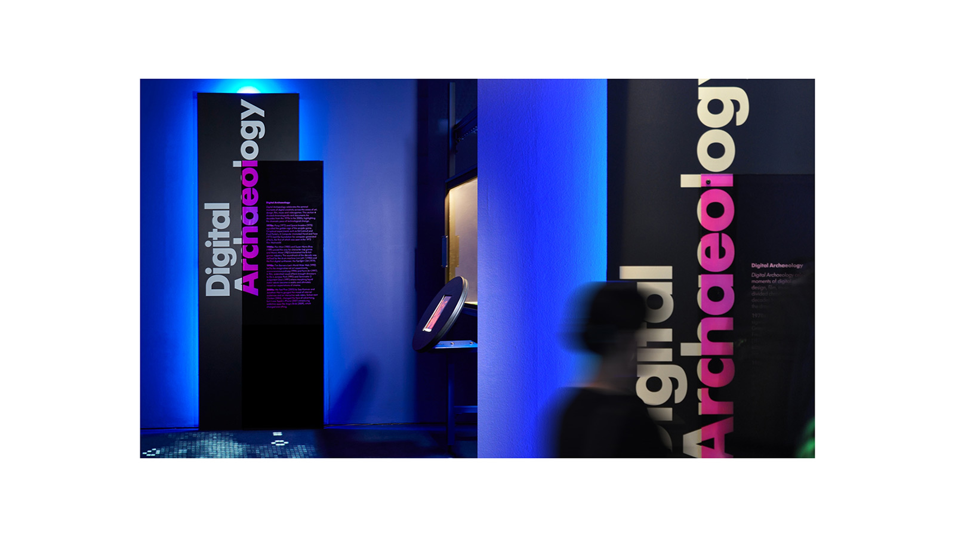
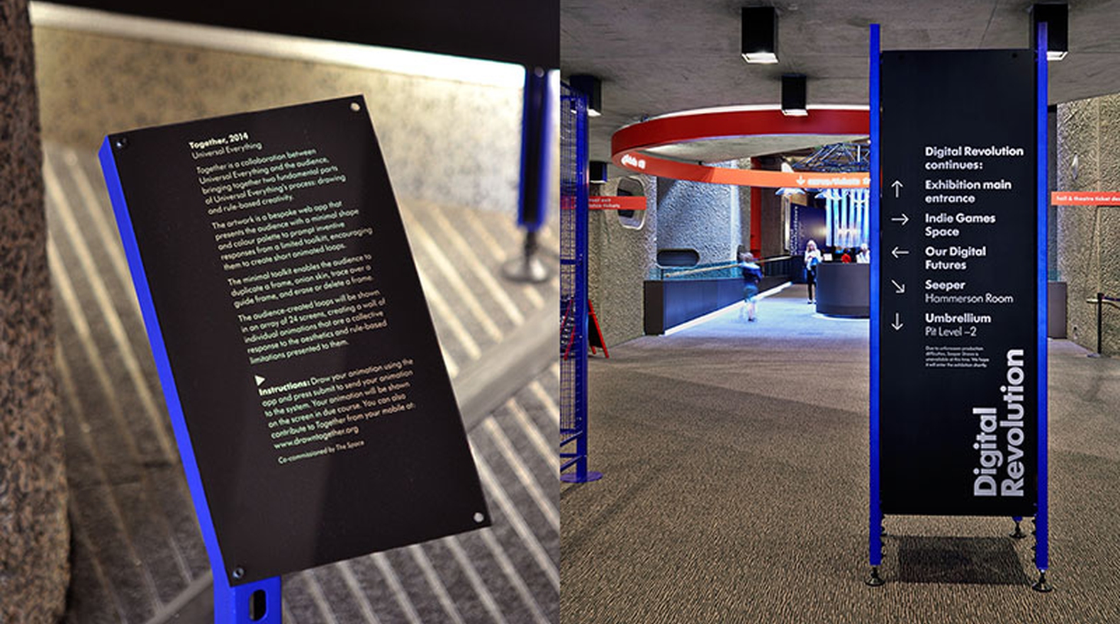
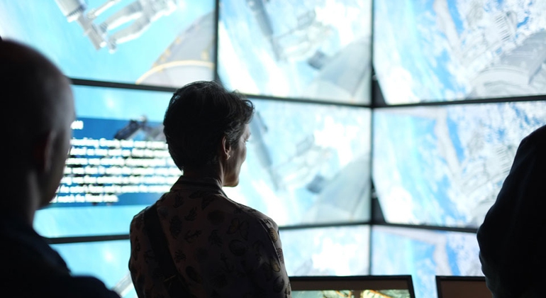
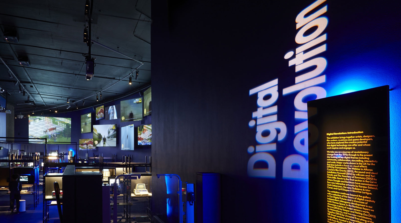
Barbican, Digital Revolution — Campaign Identity & Exhibition Design
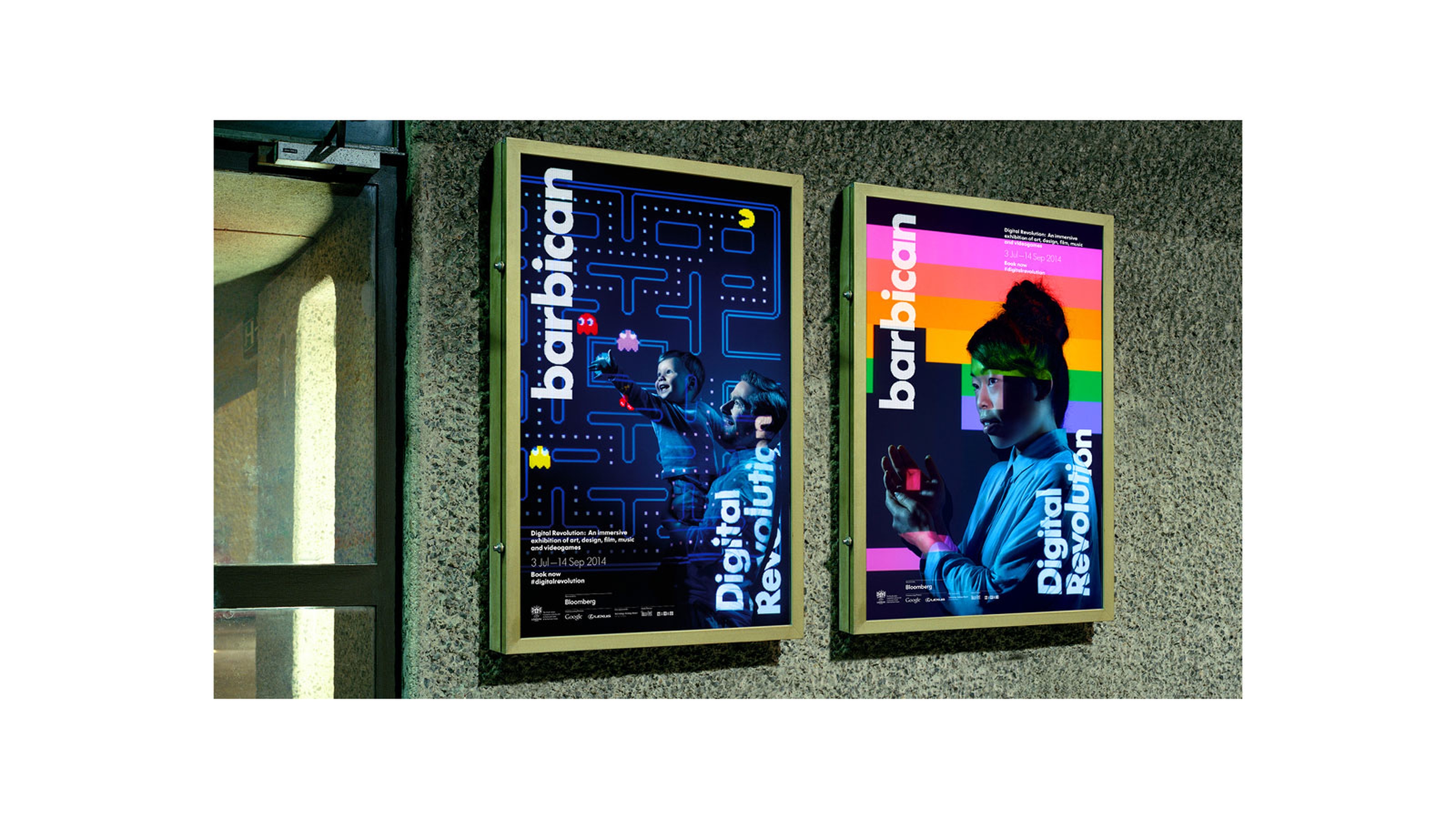
Digital Revolution was an immersive exhibition of art, design, film, music and video-games held at the Barbican Arts Centre, London. Exhibitors works were projected onto the ‘human canvas’ to help convey the intervention, or hacking, necessary to innovate in the field of digital creativity whilst simultaneously communicating the rich multi-sensory visitor experience.
Projection Photography byGreg White
Mother Design Campaign Identity & Exhibition Design
Projection Photography by

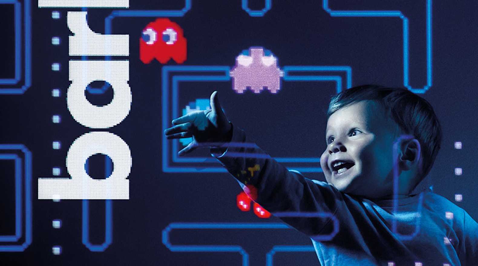

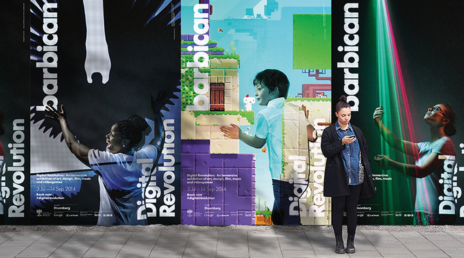
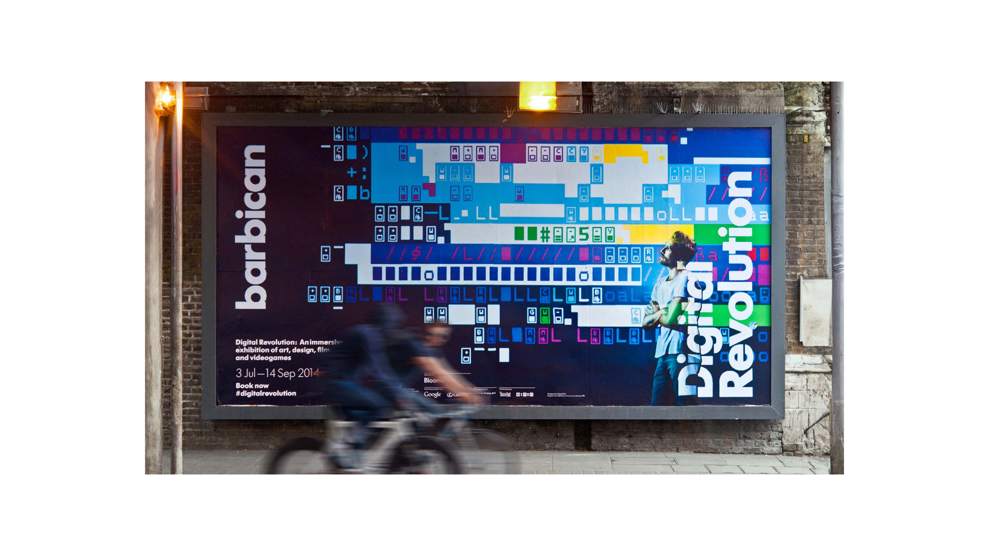
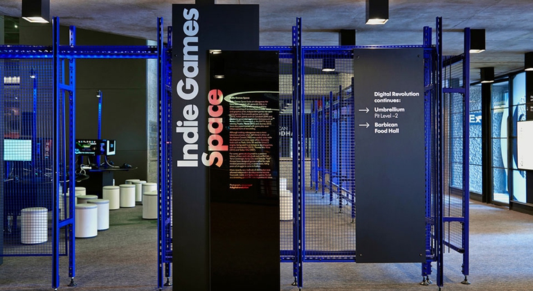
The exhibition design, created in collaboration with Ab Rogers Studio, consisted of projected typography, human proportioned monoliths that marked out the sections of the show and caption panels that integrated with the specially developed powder-coated Unistrut framing system.
Material palettes echoed the innovative nature of the exhibited works while creating a multicoloured optical effect by reflecting the captured light of the surrounding digital artefacts. A signage system was also developed to help visitors navigate the Barbican where the works were arranged across all floor levels of the arts centre.
Material palettes echoed the innovative nature of the exhibited works while creating a multicoloured optical effect by reflecting the captured light of the surrounding digital artefacts. A signage system was also developed to help visitors navigate the Barbican where the works were arranged across all floor levels of the arts centre.


Brand Union, Brandpie, Design Bridge, Dixon Baxi, Don’t Panic Partners, FutureBrand, Forpeople, Greenspace, Interbrand, Koto, Made Thought, Moving Brands, Mother Design, Pollitt & Partners, Ragged Edge, Re Design (M&C Saatchi Group), Siegel+Gale, Studio Blackburn, Studio Small, Styles+Partners, Superunion, Territory Studio, This Is Real Art, Winkreative, Wolff Olins, Zag (BBH London)
Cartlidge Levene, North, Saffron Brand Consultants
Arte, Barbican Arts Centre, BBC, British Council, Cambridge University, Crafts Council, Design Council, Established & Sons, Future Systems, Iniva, RIBA, Selfridges & Co, Sergison Bates Architects, Spacelab, Tate Modern, UCL, Alan Yau (Busaba, Yauatcha)
Adidas, Apple, British Airways, British Land, Candy & Candy, CapGemini, Coca-Cola, DAZN, Derwent London, Diageo, Estrid, First Direct, Fujitsu, GHD, Google, GSK, Hitachi, HSBC, Houst, Hyundai, KPMG, Land Registry, Land Securities, MINI, Motorola, NHS, Npower, O2, Olio, OPPO, Philips, PwC, Qatar Foundation, RAC, Rapha Cycling Club, Royal Mint, Royal Marsden, Sotheby’s, Swisscom, Tesco, Very, Vodafone
To discuss a project or opportunity, please call 07951 156 437 or email me@simon-anderson.co.uk