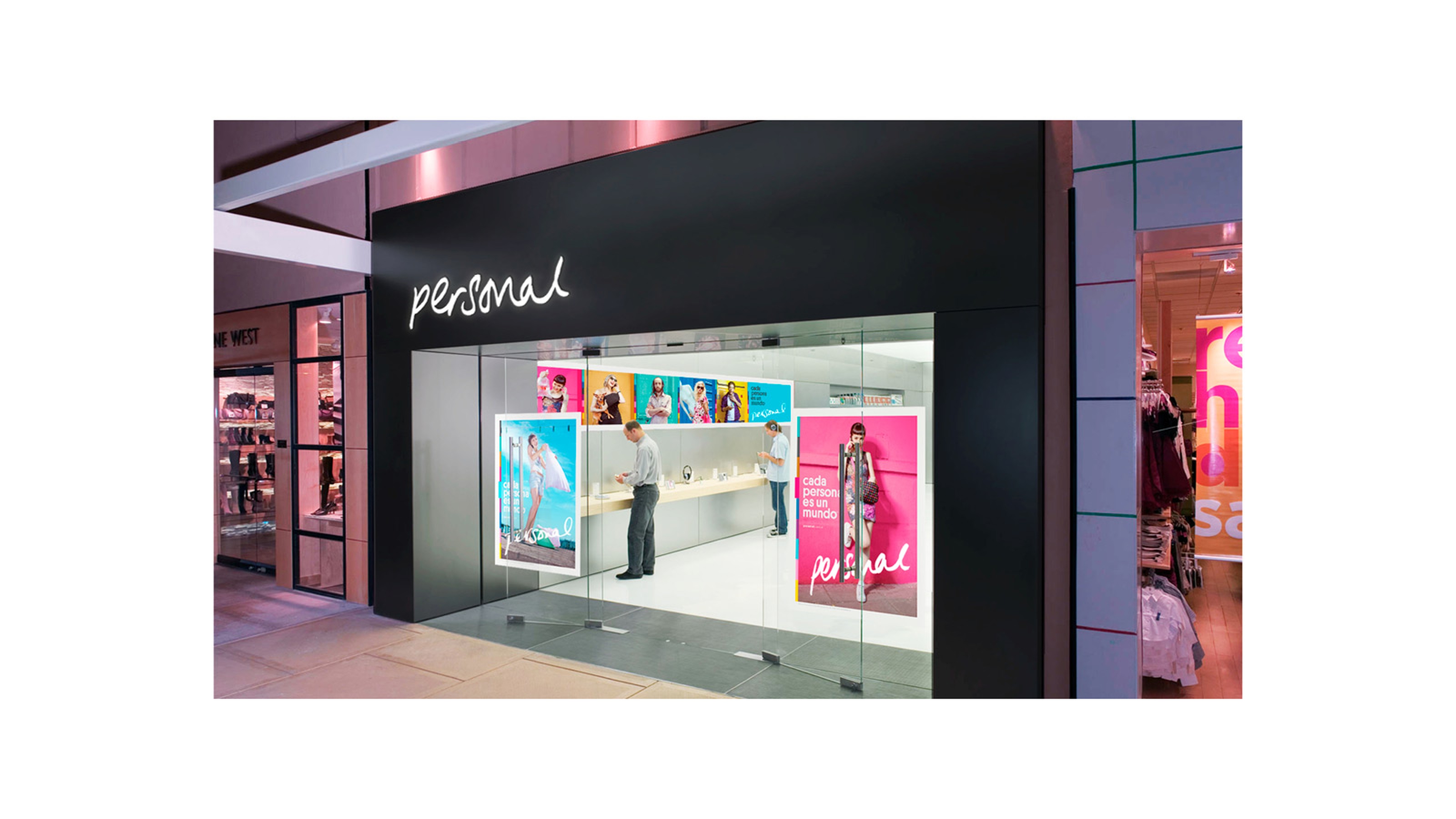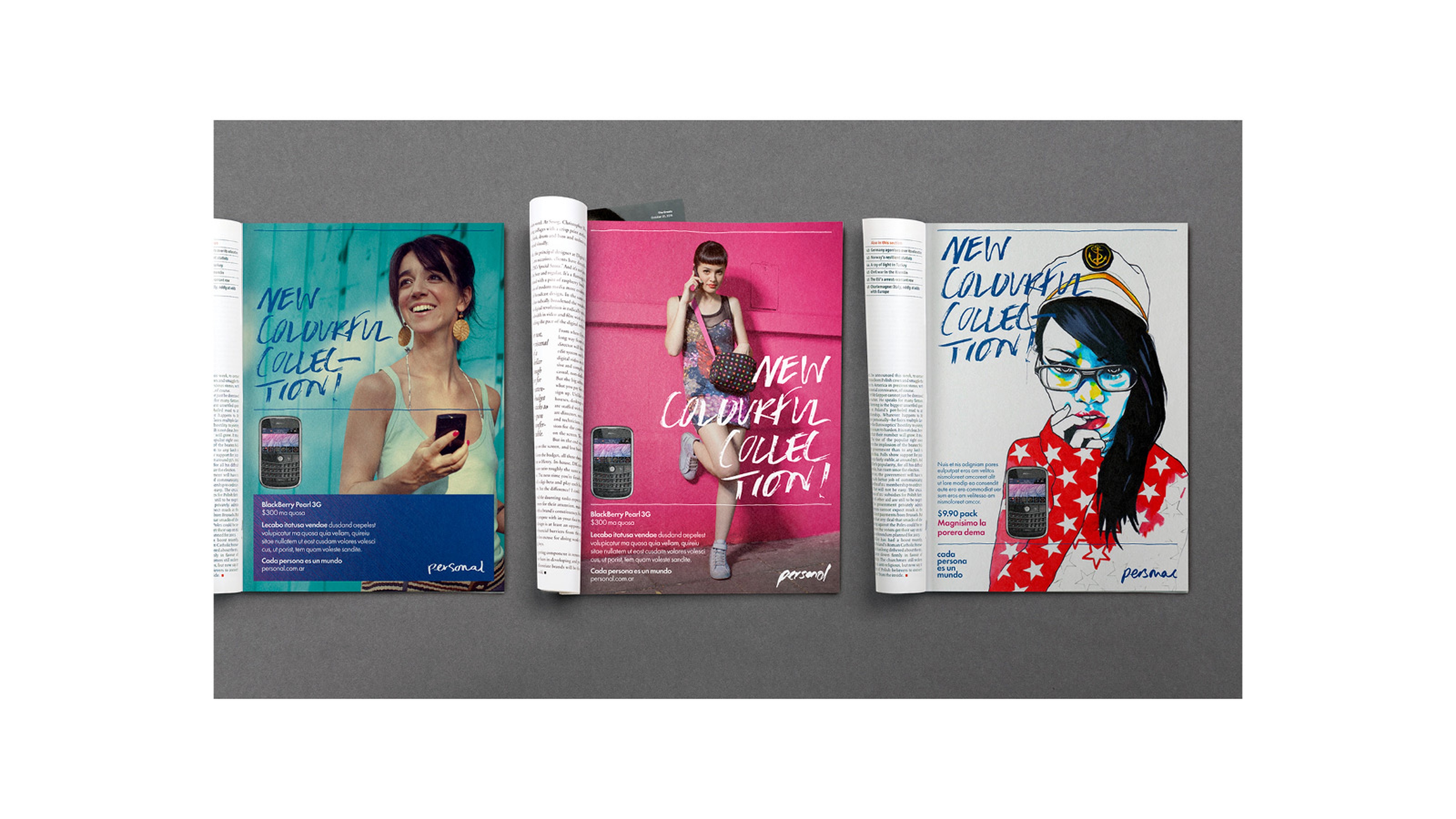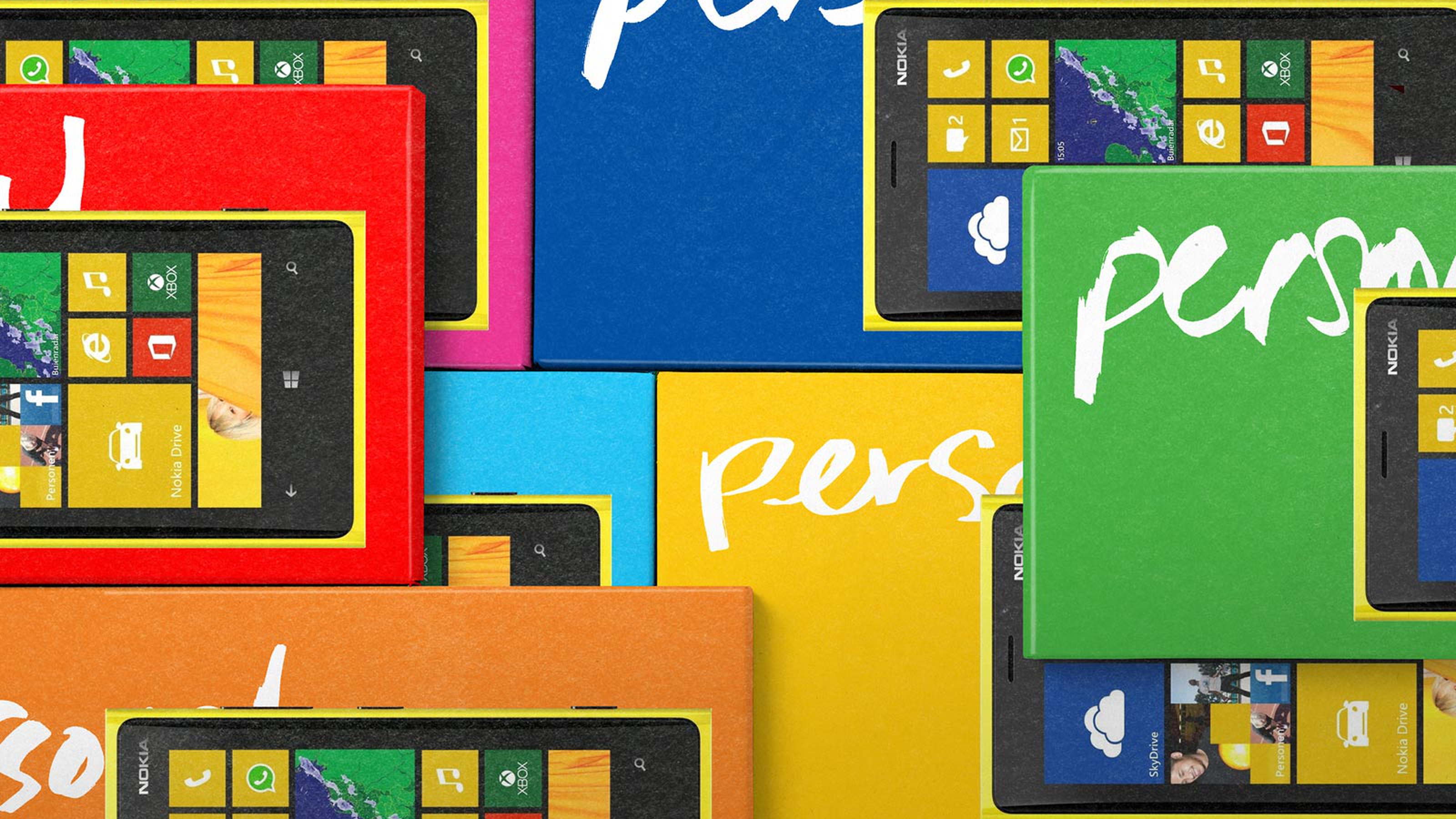
Re-brand of Argentina’s largest telecoms operator. The brandmark was rendered in a multitude of handwriting styles reflecting the strategic positioning of Everyone is a World and the brand name itself. This ‘same but different’ approach helping to celebrate people’s unique differences.
This Is Real Art Concept & Brand Identity, 2011
